As data becomes increasingly complex, traditional charts like bar charts and line graphs often fall short in representing multiple variables at once. This is where Bubble Charts stand out. A Bubble Chart is a powerful data visualization technique designed to display three or more dimensions of data in a single, easy-to-understand visual format.
Bubble Charts are widely used in business analytics, finance, marketing, healthcare, and scientific research to compare relationships between variables while highlighting magnitude and trends. When used correctly, they help decision-makers uncover patterns that would otherwise remain hidden in tables or simpler charts.
In this article, we’ll explore everything about Bubble Charts—from what they are and how they work to their applications, advantages, limitations, and how to create them step by step.
Contents
- What is a Bubble Chart?
- Why Use Bubble Charts?
- Common Uses of Bubble Charts
- Advantages of Bubble Charts
- Limitations of Bubble Charts
- Bubble Chart vs Scatter Plot
- How to Create a Bubble Chart (Step-by-Step)
- Best Practices for Bubble Charts
- When Not to Use a Bubble Chart
- Alternatives to Bubble Charts
- Conclusion
What is a Bubble Chart?
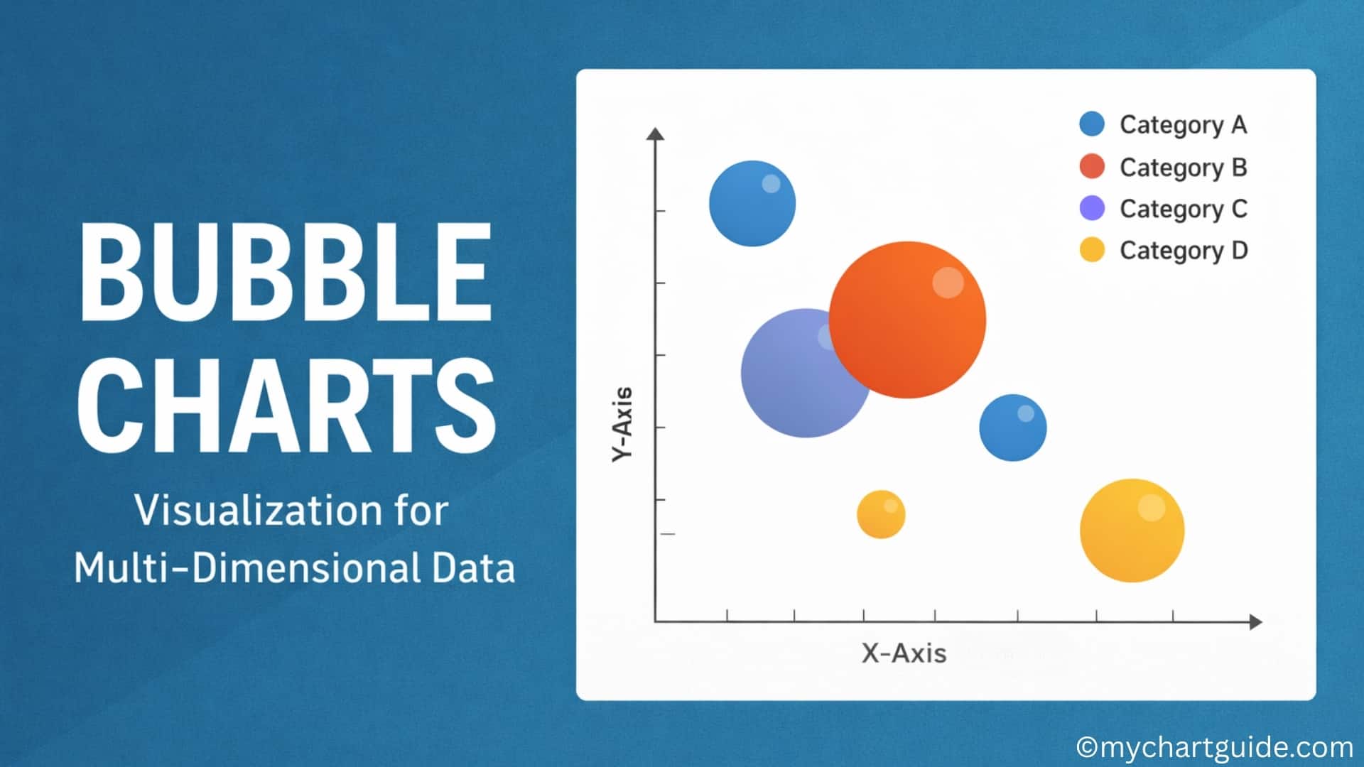
A Bubble Chart is an extension of a scatter plot. It plots data points along the X-axis and Y-axis, similar to a scatter chart, but introduces a third variable represented by the size of the bubble. In some cases, a fourth variable is added using color.
Key Elements of a Bubble Chart
- X-axis: Represents the first variable
- Y-axis: Represents the second variable
- Bubble Size: Represents the third variable (magnitude)
- Bubble Color (optional): Represents an additional category or variable
This multi-dimensional capability makes Bubble Charts ideal for visualizing relationships between several metrics at once.
Why Use Bubble Charts?
Bubble Charts are especially useful when you want to:
- Compare multiple variables simultaneously
- Identify correlations and outliers
- Highlight proportional differences
- Add context without overcrowding the chart
Unlike tables or basic charts, Bubble Charts allow users to visually assess relative importance and distribution at a glance.
Common Uses of Bubble Charts
1. Business and Market Analysis
Bubble Charts are frequently used to compare:
- Market size vs. growth rate vs. revenue
- Product performance across regions
- Competitor positioning
2. Finance and Economics
- Visualizing investment risk vs. return vs. portfolio size
- Comparing company valuations and market share
3. Marketing Analytics
- Campaign reach vs. engagement vs. budget
- Customer segments based on value, frequency, and volume
4. Healthcare and Research
- Disease spread based on location, severity, and population
- Comparing treatment outcomes across groups
5. Education and Data Science
- Student performance across multiple metrics
- Statistical analysis of complex datasets
Advantages of Bubble Charts
- Multi-Dimensional Visualization
Displays three or more variables simultaneously. - Pattern Recognition
Makes trends, clusters, and outliers easier to identify. - Comparative Analysis
Helps compare relative sizes and relationships efficiently. - Engaging Visual Appeal
More visually engaging than traditional charts. - Flexible Use Cases
Applicable across industries and data types.
Limitations of Bubble Charts
Despite their strengths, Bubble Charts have some drawbacks:
- Can Become Cluttered: Too many bubbles reduce readability.
- Size Perception Issues: Humans may misinterpret bubble area.
- Not Ideal for Precise Values: Better for trends than exact figures.
- Requires Clear Legends: Without labels, interpretation becomes difficult.
Bubble Chart vs Scatter Plot
| Feature | Bubble Chart | Scatter Plot |
|---|---|---|
| Dimensions | 3–4 | 2 |
| Bubble Size | Yes | No |
| Complexity | Medium to High | Low |
| Best Use | Multi-variable comparison | Correlation analysis |
How to Create a Bubble Chart (Step-by-Step)
Step 1: Prepare Your Data
You’ll need at least three variables:
- X-axis value
- Y-axis value
- Size value
Example:
| Product | Revenue | Growth Rate | Market Share |
|---|---|---|---|
| A | 50 | 12% | 20 |
| B | 70 | 8% | 35 |
| C | 30 | 15% | 10 |
Step 2: Choose the Right Tool
Popular tools for creating Bubble Charts include:
- Microsoft Excel
- Google Sheets
- Tableau
- Power BI
- Visme
Step 3: Insert the Bubble Chart
- Select your data
- Choose Insert → Bubble Chart
- Assign X, Y, and bubble size values
Step 4: Customize the Chart
- Adjust bubble colors and transparency
- Add labels and legends
- Modify axes for clarity
Step 5: Interpret the Results
Analyze:
- Which bubbles are largest or smallest
- Clusters and patterns
- Outliers and anomalies
Best Practices for Bubble Charts
- Limit the number of bubbles
- Use consistent color coding
- Include clear labels and legends
- Use transparency to avoid overlap
- Keep axes scales meaningful
When Not to Use a Bubble Chart
Avoid Bubble Charts when:
- You only have one or two variables
- Precise numerical comparison is required
- The dataset is extremely large
- Simpler charts communicate better
Alternatives to Bubble Charts
- Bar Charts: Simple comparisons
- Scatter Plots: Two-variable correlation
- Heatmaps: Density-based visualization
- Radar Charts: Multi-metric comparison
Conclusion
Bubble Charts are a powerful visualization tool for multi-dimensional data analysis. By combining position, size, and color, they offer rich insights into complex datasets that simpler charts cannot provide. When used thoughtfully and sparingly, Bubble Charts can significantly enhance data storytelling and decision-making.
However, clarity is key. A well-designed Bubble Chart balances aesthetics with readability, ensuring the insights are clear rather than overwhelming. For analysts, marketers, and business leaders alike, Bubble Charts remain an essential addition to the data visualization toolkit.