Heatmaps: What They Are and How to Use Them
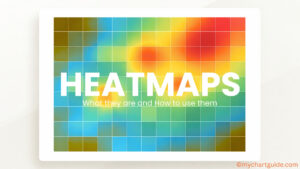
Learn what a heatmap is, how it works, its types, real-world uses, and step-by-step methods to create heatmaps in Excel and modern visualization tools. A complete beginner-to-advanced guide.
Learn what a heatmap is, how it works, its types, real-world uses, and step-by-step methods to create heatmaps in Excel and modern visualization tools. A complete beginner-to-advanced guide.
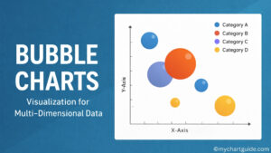
Learn what Bubble Charts are, how they work, their key uses, advantages, limitations, and step-by-step instructions to create Bubble Charts for multi-dimensional data visualization.
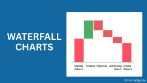
Learn what a Waterfall Chart is, its key uses in data analysis and finance, and how to easily create a Waterfall Chart in Excel with step-by-step instructions.
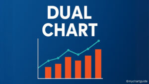
Discover what a Dual Chart is, its importance in data visualization, key uses, and how to create one step by step. Learn best practices, examples, and advantages of using dual charts for comparing two datasets effectively.
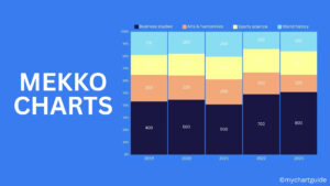
Discover everything about Mekko Charts (Marimekko Charts) — their definition, types, key uses in business analysis, benefits, limitations, and step-by-step guide to create them for data visualization and decision-making.
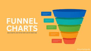
Discover what a funnel chart is, its applications in business and analytics, and how to create one step-by-step. Learn its benefits, limitations, and best practices to present data effectively.
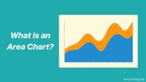
Learn what an area chart is, how it differs from other charts, when to use it, and how to create one effectively. This guide covers everything about area charts with real-world examples.
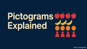
Learn what a pictogram is, how it’s used to represent data visually, and how to create one effectively. Explore examples, benefits, and best practices.
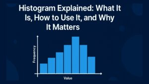
Explore everything about histograms in this guide—what they are, how to create them, types, real-world uses, and the best tools to make one. Learn how histograms can help you visualize and analyze data effectively.
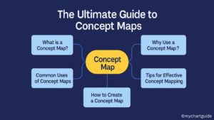
Discover everything you need to know about concept maps—what they are, their benefits, how to use them in education, business, and beyond, plus a step-by-step guide to creating one.