In today’s data-driven world, businesses and analysts need clear visualization methods to understand numbers effectively. Among the many visualization techniques, the Waterfall Chart has emerged as a powerful tool to display sequential changes in values over time or categories. It is particularly useful in financial analysis, helping you trace how a starting value is influenced by a series of positive and negative changes, ultimately leading to a final outcome.
In this article, we’ll cover everything you need to know about Waterfall Charts — what they are, their uses, key benefits, and a step-by-step guide to creating one in Microsoft Excel.
Contents
- What is a Waterfall Chart?
- Key Features of a Waterfall Chart
- Common Uses of Waterfall Charts
- Advantages of Using a Waterfall Chart
- How to Create a Waterfall Chart in Excel (Step-by-Step Guide)
- Example of a Waterfall Chart in Excel
- Best Practices for Waterfall Charts
- Limitations of Waterfall Charts
- Alternatives to Waterfall Charts
- Conclusion
What is a Waterfall Chart?
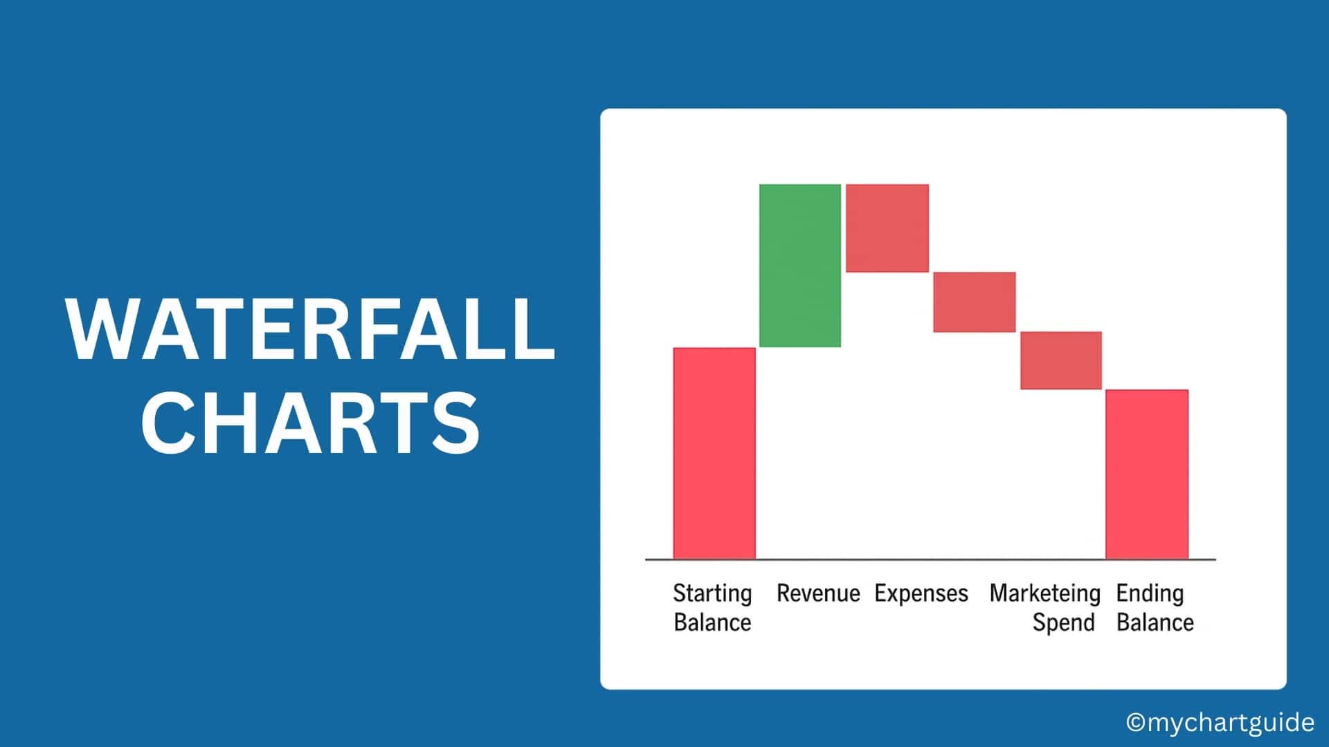
A Waterfall Chart (sometimes called a Bridge Chart or Cascading Chart) is a data visualization tool that shows how an initial value increases and decreases through a series of intermediate values, resulting in a final total.
The chart uses floating columns (or bars) to represent changes, while the starting and ending values are anchored. Positive values are shown as upward bars, and negative values as downward bars, making it easy to track the net effect of multiple variables.
Key Features of a Waterfall Chart
- Sequential Flow: Visualizes the journey from a starting point to an ending point.
- Positive and Negative Values: Clearly highlights gains (increases) and losses (decreases).
- Intermediate Stages: Breaks down contributions from different categories.
- Easy Comparison: Helps users quickly analyze where the largest impacts occur.
Common Uses of Waterfall Charts
Waterfall charts are versatile and can be applied in many industries. Some of the most common applications include:
1. Financial Analysis
- Income statement breakdowns (Revenue → Expenses → Profit).
- Cash flow changes over time.
- Profit and loss tracking.
2. Sales and Marketing
- Showing how regional sales or product categories contribute to total revenue.
- Tracking campaign effectiveness.
3. Operations and Business Strategy
- Cost breakdown by department.
- Tracking budget allocation and variances.
- Displaying project progress or delays.
4. Performance Analysis
- Employee performance impact on overall results.
- KPI tracking over a specific time period.
Advantages of Using a Waterfall Chart
- Clarity – Makes complex financial or business data easy to interpret.
- Focus on Contribution – Identifies the biggest positive or negative contributors.
- Trend Visualization – Shows the direction of change (growth or decline).
- Decision Making – Helps managers pinpoint improvement areas and optimize strategies.
How to Create a Waterfall Chart in Excel (Step-by-Step Guide)
Microsoft Excel (2016 and later) comes with a built-in Waterfall Chart feature, making the process very simple. Here’s how you can create one:
Step 1: Prepare Your Data
Create a table with categories and values. For example:
| Category | Value |
|---|---|
| Starting Balance | 50000 |
| Revenue | 30000 |
| Expenses | -20000 |
| Marketing Spend | -10000 |
| New Clients | 15000 |
| Ending Balance | 65000 |
Step 2: Insert the Waterfall Chart
- Select your data table.
- Go to Insert → Charts → Waterfall or Stock Chart → Waterfall.
Step 3: Format the Chart
- Excel will automatically plot positive values as upward bars and negative values as downward bars.
- Highlight the Starting Balance and Ending Balance columns → Right-click → Select Set as Total. This will anchor those bars.
Step 4: Customize the Chart
- Change bar colors (e.g., green for positive, red for negative).
- Add data labels for better readability.
- Adjust chart title and axis labels.
Example of a Waterfall Chart in Excel
Imagine you are analyzing a company’s annual profit:
- Starting Balance = $50,000
- Revenue = +$30,000
- Expenses = -$20,000
- Marketing Spend = -$10,000
- New Clients = +$15,000
- Ending Balance = $65,000
The waterfall chart would clearly show how each factor contributed to the net outcome.
Best Practices for Waterfall Charts
- Keep It Simple – Avoid overloading with too many categories.
- Color Code Effectively – Use distinct colors for increases and decreases.
- Highlight Key Values – Focus on significant contributors, not minor ones.
- Use Labels Wisely – Data labels help in quick interpretation.
- Combine with Other Charts – Pair with bar or line charts for comprehensive reports.
Limitations of Waterfall Charts
While highly useful, Waterfall Charts also have some limitations:
- Can be confusing if too many data points are added.
- Doesn’t show relationships between variables (only net impact).
- Not ideal for time-series analysis (line charts work better).
Alternatives to Waterfall Charts
If a Waterfall Chart doesn’t fit your need, consider these alternatives:
- Bar Chart: For simple category comparisons.
- Line Chart: For trends over time.
- Stacked Column Chart: For cumulative contributions.
- Sankey Diagram: For more detailed flow visualization.
Conclusion
The Waterfall Chart is a powerful visualization tool that simplifies the understanding of how values evolve through a sequence of positive and negative changes. It is most commonly used in financial and business analysis but is versatile enough for marketing, operations, and strategic planning.
With Excel’s built-in Waterfall Chart function, creating one is quick and easy, making it an essential tool for data analysts, managers, and decision-makers.
By following the steps and best practices outlined in this article, you can effectively use Waterfall Charts to tell a compelling story with your data.