Data visualization plays a crucial role in transforming raw numbers into meaningful insights. While simple charts such as line graphs, bar charts, or pie charts are excellent for representing a single dataset, businesses and analysts often need to compare multiple metrics together. This is where the Dual Chart—also known as a dual-axis chart or combination chart—comes into play.
A dual chart allows you to visualize two different datasets on the same graph, often using two Y-axes (left and right) with one shared X-axis. This powerful visualization technique helps identify patterns, relationships, and differences between two related variables that may otherwise go unnoticed.
In this blog, we’ll cover what a dual chart is, why it’s useful, common use cases, how to create one, and best practices to make them clear and accurate.
Contents
What is a Dual Chart?
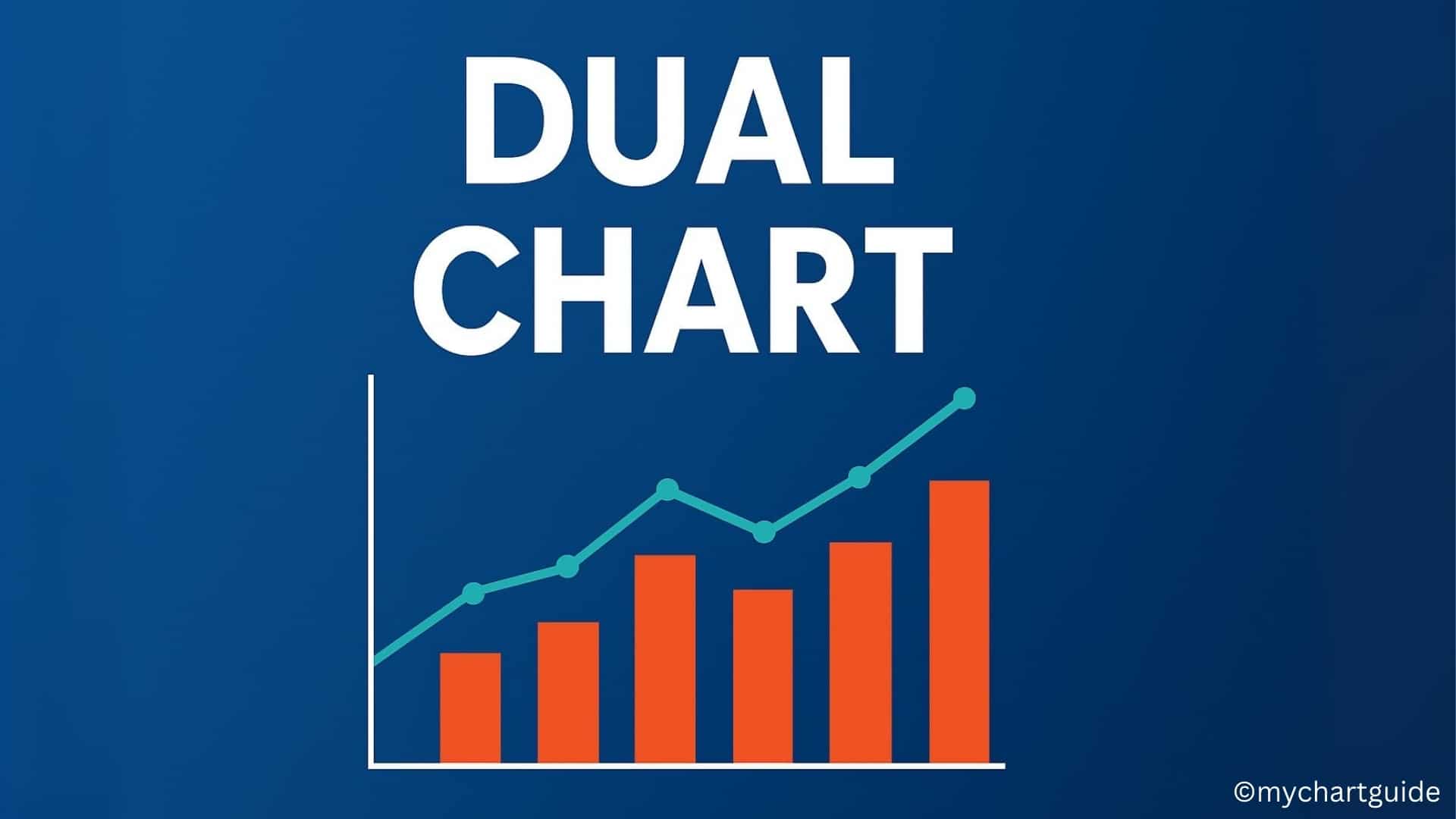
A Dual Chart is a type of visualization that combines two different types of charts (or the same chart with different scales) into one. It typically includes:
- Two Y-axes: One on the left and one on the right.
- One X-axis: Shared for both datasets.
- Two Data Series: Plotted together using either lines, bars, or combinations.
For example:
- Sales revenue may be shown as bars, while profit margin may be shown as a line across the same time period.
- Website traffic (line) can be plotted alongside conversion rates (bar) to see how they interact.
Dual charts are especially valuable when the datasets are on different scales, making it hard to compare them in a single-axis chart.
Key Features of Dual Charts
- Dual Axes: Two vertical axes with different scales.
- Combination of Chart Types: Often bar + line, line + line, or bar + bar.
- Shared Timeline or Category Axis: Usually time (months, quarters, years) or categorical variables.
- Data Comparison: Allows side-by-side analysis of related but different metrics.
Why Use a Dual Chart?
Dual charts are widely used in business, finance, marketing, and research because they solve a fundamental visualization challenge: comparing two datasets with different scales.
Here are the main benefits:
- Compare Related Metrics
Example: Revenue vs. Profit Margin – one shows absolute growth, while the other shows efficiency. - Identify Relationships
Example: Temperature vs. Ice Cream Sales – rising temperature correlates with higher sales. - Show Trends Clearly
Two datasets over time plotted together reveal patterns of cause and effect. - Improve Decision-Making
Businesses can see not just performance, but what factors are influencing it.
Common Uses of Dual Charts
- Finance & Business: Revenue vs. Net Profit, Expenses vs. ROI.
- Marketing: Website Visits vs. Conversion Rates, Ad Spend vs. Sales.
- Sales: Units Sold vs. Average Selling Price, Customer Acquisition vs. Retention.
- Economics: Inflation vs. Unemployment, GDP Growth vs. Investment.
- Science & Research: Temperature vs. Crop Yield, Rainfall vs. River Levels.
How to Create a Dual Chart
Creating a dual chart depends on the software you use (Excel, Google Sheets, Tableau, Power BI, etc.), but the steps are similar:
Step 1: Gather Data
Collect two related datasets. Example: Monthly sales revenue and profit margin.
| Month | Sales Revenue ($) | Profit Margin (%) |
|---|---|---|
| Jan | 50,000 | 12% |
| Feb | 60,000 | 14% |
| Mar | 55,000 | 10% |
| Apr | 70,000 | 15% |
Step 2: Insert Chart
- In Excel: Go to Insert → Combo Chart → Custom Combination Chart.
- In Google Sheets: Insert a chart, then enable “dual-axis” in customization.
- In Tableau/Power BI: Drag two measures and synchronize axes.
Step 3: Assign Chart Types
- Plot Sales Revenue as Column/Bar Chart.
- Plot Profit Margin as Line Chart.
Step 4: Add Secondary Axis
- Assign Profit Margin to the right-hand Y-axis since it has a different scale.
Step 5: Format for Clarity
- Add axis labels.
- Use contrasting colors for each dataset.
- Avoid clutter by minimizing gridlines.
Best Practices for Dual Charts
- Use When Necessary
Don’t overload a chart with unrelated data. Dual charts work best with correlated metrics. - Label Clearly
Both Y-axes should have clear titles (e.g., “Revenue ($)” vs. “Margin (%)”). - Use Different Colors/Styles
Distinguish between the two datasets with contrasting colors or line styles. - Avoid Misleading Scales
Ensure both axes start at reasonable baselines to avoid distortion. - Keep It Simple
Dual charts should highlight the relationship between two variables, not overwhelm with too much data.
Advantages of Dual Charts
- Show correlation between two different metrics.
- Save space by combining two visuals into one.
- Provide insights into cause-and-effect relationships.
- Enable better storytelling with data.
Limitations of Dual Charts
- Can confuse readers if not designed properly.
- Misleading if scales are manipulated.
- Too much data in one chart makes it cluttered.
- Readers may misinterpret relationships as causal when they’re only correlated.
Examples of Dual Chart Applications
- Revenue vs. Profit Margin: Helps managers see if rising revenue actually improves profitability.
- Website Visits vs. Conversions: Shows whether higher traffic translates into actual sales.
- Rainfall vs. Crop Yield: Useful for agricultural planning and forecasting.
- Ad Spend vs. Sales Growth: Helps marketers evaluate return on investment.
How Dual Charts Differ from Other Charts
- Single-axis charts: Only compare one dataset.
- Stacked charts: Show contributions but not scale differences.
- Dual charts: Best for side-by-side analysis of different units and scales.
Conclusion
Dual charts are powerful visualization tools that combine two datasets on a shared axis, allowing businesses, researchers, and analysts to uncover hidden relationships. Whether comparing revenue with profit margin, marketing spend with conversions, or natural variables like rainfall and crop yield, dual charts simplify complex insights into actionable information.
When designed carefully—with clear labels, distinct colors, and logical axes—dual charts can be one of the most effective ways to tell a story with data.
By understanding their uses, advantages, and limitations, you’ll be able to create dual charts that not only look professional but also drive better decision-making.