
Bar charts are a staple of data analysis—clear, comparative, and incredibly versatile. Whether it’s sales performance over quarters, website traffic by source, or task progress by team, bar charts give structure to data that drives decisions.
In 2025, the bar chart maker landscape is filled with tools that not only produce stunning visuals but also empower users to animate charts, sync real-time data, and embed them directly into reports and dashboards. These tools cater to everyone—from business analysts and researchers to teachers and marketers.
This article showcases the best bar chart creators in 2025, selected for their balance of design power and user-friendliness. If you’re looking to turn your insights into impactful visuals that spark discussion and lead to action, the tools listed here are your best starting point.
1. Visme – A Top Bar Chart Maker for 2025
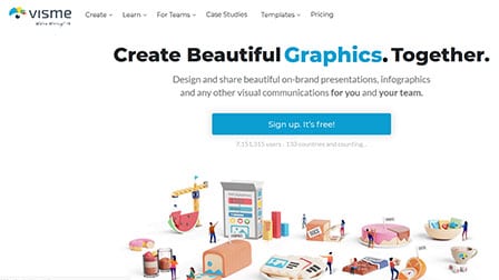
Visme stands out as one of the best bar chart makers of 2025, offering an intuitive and powerful platform for creating visually compelling bar graphs in just minutes.
Designed with simplicity and flexibility in mind, it caters to both professionals and beginners looking to present data clearly and attractively.
Key Specs:
- Pre-designed bar chart templates (vertical, horizontal, stacked, double bar, and more)
- Drag-and-drop editor with customization for colors, fonts, legends, and backgrounds
- Supports hover-over labels and animations for enhanced interactivity
- Data import via manual entry, Excel, or Google Sheets
- Save charts as reusable content blocks
- Download as image or embed as live/interactive chart
- Branding tools with custom fonts, colors, and logos
- Millions of icons, images, and assets for added context
Pros:
- Beginner-friendly interface with powerful customization options
- Variety of chart types and flexible layouts
- Branding support for cohesive designs across projects
- Visual polish with animations and design effects
- Easy integration into presentations, reports, and websites
- Quick sharing and download options
Cons:
- Advanced features like real-time collaboration and full export options may require a paid plan
- More design-focused, so might lack some deep statistical functionalities compared to data-centric tools
Whether you need a quick visual for a presentation or a branded chart for a business report, Visme’s bar chart maker delivers excellent results with ease. It strikes a balance between simplicity and visual quality, making it a go-to tool for marketers, educators, and project managers in 2025.
2. Edraw Max
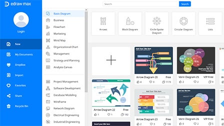
EdrawMax Online is an advanced and powerful all-in-one web-based diagramming tool that helps users convey their illustrations by creating engaging and professional bar charts with enhanced visual content.
The software lets curate a dozen categories of bar charts, ranging from stacked to infographic and clustered in not beyond 4 simplified steps.
EdrawMax can be also considered more powerful over Visio on account of its broad-spectrum and cross-platform compatibility as it can be accessed in Windows, Mac and Linux and popular browsers such as Firefox, Chrome, IE, and Safari.
The application, with over 25 million users across the world, is further best known to secure all the information and file transfers with the highest SSL encryption levels and to offer access permission rights to the files.
The wide pallet of over 1000 types of templates that come in handy with EdrawMax also ensures the easy creation and customization of the charts.
Pros:
- Easy to use software
- Interactive customer service
- Affordable pricing
Cons:
- Doesn’t enable users to combine templates
- Export and sharing options aren’t great
3. Vizzlo
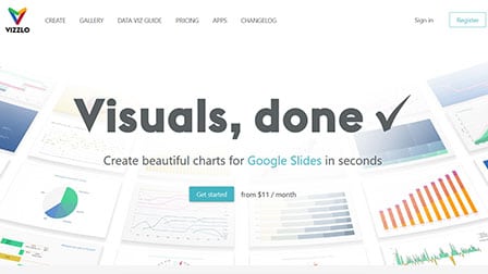
Vizzlo is a data visualization platform that can be accredited as one of the best bar chart making applications in 2025 with renowned multinational firms as some of its esteemed users.
The bar charts build in Vizzlo can be enhanced with some advanced analysis functions for vertical and horizontal view projections and to adjust as well as customize the colors of the bars.
The tool also offers to change the values for the axes lines and grid lines and to sort the bars in different orders.
The data needed for creating the graphs can be accessed by simply opening the spreadsheet or importing the XSLX or CSV files.
Once all the data is available, the bar graphs can be tailor-made into specified requirements for colors, textual fonts, layouts and other beautifying elements to increase their visual quotient. The finalized graphs can be then easily shared and saved as per convenience.
Pros:
- Takes a few seconds to create charts
- Basic version is pretty resourceful
- Stylish and sophisticated UI
Cons:
- Not very efficient
- Templates are limited
4. Fotor Bar Graph Maker

With Fotor Bar Graph Maker, you can turn your raw data into a bar graph in a matter of minutes. Its efficient, effortless and enables you to report your data very intuitively.
Since every user’s demands are different, it isn’t surprising that the tool comes with multiple professional templates to choose from.
You get access to the single vertical bar graphs, stacked bar graphs, group bar graphs, etc. With this chart maker, you have complete autonomy to choose the template that works the best for you and go with it.
Presenting your data using Fotor Bar Graph Maker makes data visualization a lot easier and effortless. Also, if you are working with multiple data sets, you can compare them side-by-side using this tool for a better understanding of differences.
If you have to change your data or even correct something that you have entered wrong, Fotor Bar Graph Maker takes care of all your needs with their easily editable templates.
All you need to do is import your data and fix the issues in the chart. Integrated with diverse customization features, this bar graph maker is here to make your life a lot easier.
Pros:
- Excellent features even at free level
- Customization is great
- Real-time collaboration features
Cons:
- Templates for table charts are limited
- Not an interactive UI
5. Piktochart
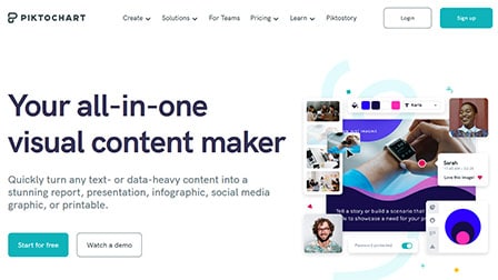
Data visualization is an extensively important need at present times. Not only does it make everything look presentable and easy to understand, they are equally interactive with all the pre-made templates.
Among all the bar chart makers, Piktochart is one that deserves a special mention. All you need to do is press a few clicks, select the design of the chart that best works for you and create an online bar chart in no time at all.
The editable templates make the best part of Piktochart, allowing you to adjust and customize things according to your needs. Once you are done creating the bar chart, there is an easy export and download option, where users can save their bar charts in different formats, including PDF, PNG and JPG too.
With hundreds of templates, data visualization is a breeze with Piktochart. You can streamline things without any hassle at all.
Pros:
- Easy sharing options
- Out of the box designs and templates
- Simple and intuitive UI
Cons:
- Templates are sometimes too complicated
- Resizing feature isn’t flexible
6. Miro

Miro is a comprehensive and versatile data visualization tool. Among all the services and features offered, the bar graph maker is one that deserves a special mention.
This built-in bar graph maker saves you a lot of time and effort when you are presenting your data in a more organized format.
With this feature, users have the convenience and upper hand to make contrasting bar graphs and compare the data without any shortcomings. Featuring customizable features, users can quickly edit titles, add descriptions and add variables to the bar chart in no time.
Furthermore, Miro’s bar graph maker supports collaboration feature, wherein the users can add sticky notes to streamline the chart making process. It also enables team members to leave real-time feedback, making things a lot more interactive.
Once done, the finished bar graph can be exported in different formats for easy convenience. Lastly, the software has a specific presentation mode, which allows the users to integrate the finished bar graph to the presentation in no time at all.
Pros:
- Amazing collaboration features
- Extensive templates
- Easy to use
Cons:
- Limited offline functionality
- Premium plans are pricey
7. Xara
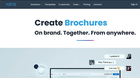
Want to compare your raw data for a more organized appearance? Well, Xara’s bar chart makes things a lot easier for you to check through.
With a few simple taps, users can create a bar chart or bar diagram in no time at all.
The highlight of this platform is the convenience. You have pre-made templates, which are here to streamline things and make it easier for you to create the desired choice of bar graphs within a matter of minutes and with a few clicks.
Used by 40,000+ businesses of varying sizes, creating bar graphs on Xara doesn’t take much. All you have to do is input your data and let the software do the rest of the heavy lifting for you. Also, the prepared graph can be integrated into the presentations quite seamlessly, making user experience a lot seamlessly.
Pros:
- User-friendly interface
- Features drag and drop editor
- Ideal for beginners
Cons:
- Pricey premium plans
- Templates are limited
8. Canva

With Canva, there’s nothing you can’t do in terms of graphics. Ideal for beginners and professionals, Canva is a time-saving platform that gives you access to versatile resources to streamline your graphic designing journey.
The list of templates for creating a bar chart on Canva is endless. You have a plethora of options to choose from and the best part is that every one of these templates are customizable. This means that you can edit and align them according to your brand’s aesthetics or taste in a matter of minutes.
With Canva’s bar graph maker, you can showcase your data in a more presentable and organized manner, especially when it comes to presentations or even work projects. There are over 20 different types of professional bar graph types to choose from.
If you are on a time-crunch, the already created templates can streamline the work for you. With the easy UI, you no longer have to master a complicated tech to break down the steps of creating a bar graph for your work.
With easy embed and sharing options, you can directly share the high-resolution bar chart or even embed them into your presentations in a matter of seconds. It also comes with multiple drag and drop editor features for the user to play around.
Pros:
- Professionally designed templates
- Easy sharing options
- Embedding in presentations is seamless
Cons:
- Offline features are limited
- Real-time collaboration isn’t available
9. Adobe Express
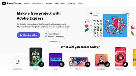
Another free platform to create bar graph in minutes is Adobe Express. There’s no need for you to have design skills or even technical knowledge to be able to create this graph, which is always a win for most users.
Integrated with numerous pre-made professional templates, creating your best graph chart shouldn’t take any more than a few minutes. All you have to do is select a template, enter your data and the software should take care of the rest.
The best thing about using Adobe Express is the fact that their Free plan contains more or less everything you’d need to streamline your designing experience. There’s a Premium plan as well but its not mandatory for you to purchase.
Besides their web application, Adobe also has a mobile app for Android and iOS. So, you can create bar graphs, even when you are on the go and don’t have access to your laptop all the time. Adobe Express is highly efficient in interpreting the data you enter, enabling you to create the bar graph in a matter of seconds.
Overall, this is quite a great bar graph maker, especially given the fact that its 100% free and comes with easy sharing options.
Pros:
- Provides 100GB of cloud storage
- Quick and easy creation
- Available on web and mobile
Cons:
- Not that snappy
- Lacks collaboration features
10. Infogram
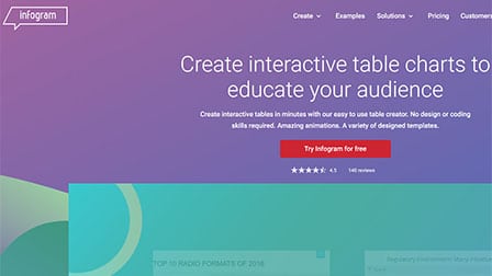
Infogram can be regarded as one of the top-rated and reviewed, cost-free online tool for generating high-quality, polished interactive bar charts without any designing skills in minimum time.
The users can come up with six variations of charts from basic to complex structures that include simple bar charts, column charts, grouped bar charts, radial bar charts, stacked bar charts and progress bar charts through this tool.
All these charts can be effectively tailor-made to give them an attractive and impressive appearance to enhance their optical value.
The logged-in users can choose from a massive range of attractive looking templates to begin constructing the bar charts and provide a personalization touch as per users demand and the charts can be saved and shared as image files.
The bar charts garnered from Infogram are massively employed and find varied uses in several applications like blog survey results, statistical results and many others.
Pros:
- Clean design
- Easy to use
- Professionally designed templates
Cons:
- Embedding process isn’t seamless
- Drag and drop features aren’t that great
Verdict
Taking insights for each of the bar chart maker in the communication above, one can estimate that the application tools and software are powerfully equipped with animated interfaces to build bar charts.
Apart from an impressing variety of visually impacting and attractive templates, the chart maker are loaded with features, navigation commands and tabs, and customization settings to enhance the bar charts.
The applications come with various live editors, integrated workspaces, and chart making generators and interactive interfaces with tables or pop-us to enter the relevant data items.
PIktochart can be noted for its effortless operativity and workspace for furnishing and editing the charts. Vizzlo is a leading chart making software with a live editor explicitly used to design and develop bar charts that can be magnified with additional plug-ins.
EdrawMax is online tool which assist in making regular and 3D bar charts empowered with personalization options. Infogram is highly recommended for use in garnering splendid variation in bar charts and is professionally approachable.
Adobe Express and Visme can be acknowledged as the best-used bar chart making applications in 2025 owing to their ease of use and execution and are affordable with multifaceted customization graphics.
I like to use Vizzlo as they support projections, level difference arrows etc. Especially in the finance business really useful features.