What you witnessed here is a simple video illustrating the application of Data Visualization in our daily lives. We haven’t yet realized how much we’ve become dependent on the tools of Data Visualization to aid us in our projects and research. Before we begin to discuss on the various industries in which Data Visualization is being used, let’s look at the history of Data Visualization and how it began.
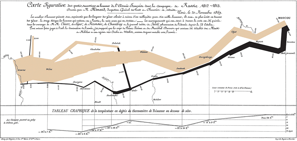
It all started way back in 1861 when French Civil engineer Charles Minard drew a statistical graph of Napoleon’s invasion of Russia. The graph clearly depicted all the variables such as the Army size, temperature and time scales etc. It also stated the factors that led to the retreat from Russia. After that, Data Visualization saw a very slow growth until it began to be used in Textbooks in subjects such as Math, Physics, Biology, etc…
It was only in 1962, that John Tukey wrote a manifesto calling for the recognition of Data Visualization as a separate branch of statistics and in 1967, the French cartographer Jacques Bertin published the graphic semiotics, which laid the foundation for all Data Visualization.
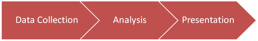
With the advancement in technology, collection, analysis and presentation of Data has been more simplified than ever. Microsoft office tools such as Word and Excel help in creating Charts, Graphs, etc. based on the data provided. Facebook analytics will be able to give you precise numbers in terms of ad revenue and expenditure as well as exposure and engagement. In terms of Social media data sampling and analysis, Facebook’s structure and design stands at the top of the ball game to understand and gather numerous amounts of data.
Whether you’re in the business of Acting & Entertainment, Teaching, Lawyer, etc. Essentially almost all non- mathematical related jobs, numbers still have a role to play.
For Actors, the numbers at the Box Office and how many seats were sold in a theater are more crucial than the amount of Oscars he/she has won to book another role.
For Teachers, the pass rate of students in her class has to be high otherwise he/she is not doing their job right. Now the teacher can claim innumerable amount of excuses but the numbers speak have the last word at the end of the day.
Conviction and Confidence alone is not enough, you got to have numbers to back up your words. Just like coffee without milk tastes bland, you can’t call yourself the most successful actor without your box office numbers to back you up.
Now let’s look at a little bit in detail about the various ways in Data Visualization. Essentially, there are three primary ways which are most commonly used. These are the Charts, Graphs & Diagrams.
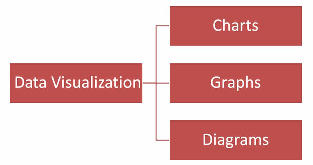
Charts & Graphs essentially come under one category i.e. they are both graphical representations of data from which we are able to extract meaning. They also contain a title and other variables such as age group, demograph, etc. to help classify the data better and understand what all factors were considered during the collection period.
Diagrams are mainly three-dimensional visualizations of information. Diagrams are used to understand how the flow/process of certain phenomenon takes place. They are seen in Biology textbooks to help understand the main functions of the human body such as Digestion, Breathing, Excretion, etc.
The use of visual representation of such process helps students better retain the process in their heads. It is a known fact that humans are able to retain visual information better than written ones. That is why the narrative in communication today has shifted from written word to visual word. You can see people creating videos online for various topics and showcasing proof in terms of Graphs, charts, source clips, etc.

In late 2018, Netflix launched a weekly Satirical show called ‘Patriot Act with Hassan Minhaj’. The show is mainly centered around a single topic in each episode and an in depth analysis of how it began, how’s it going and how bad is it going to get or what could be the solution. Until now the show has covered a variety of topics such as ‘Indian Elections’, ‘Student Loans’, ‘Protests in Sudan’, ‘Affirmative Action’, etc. What sets the show apart from its peers such as ‘The Daily Show’, ‘Last Week Tonight with John Oliver’, etc. is its use of graphics to present during the communication of facts. The show makes extensive use of graphs and pie charts to help the audience understand and also retain the information being conveyed.
This is just one of the many industries where Data Visualization tools are being used. Before I get into some of the other industries, I want to talk a little bit more about Entertainment and how Data Visualization improvements & technology came hand in hand to make it more advanced than ever.
Back in the day, a research company known as AC Nielsen measured TV ratings for a running show or a pilot on a channel. Bear in mind, this is during the infancy stages of technology. Most of the processes back then still involved moving from place to place. Nielsen conducted the analysis process by creating a sample audience and asking randomly selected audience to participate in the experiment.
The company then counts how many in that audience view each program. The sample has to be extremely representative because the process was during a time when 99/100 households owned a Television set and had cable service as well. A black box is kept to monitor what they watch and the data is sent overnight to the company system for storage. The stored data is analyzed and shared with Television networks, Advertisers, etc. So overall, the data is not 100% accurate. It’s more on estimation, which was the only possible means at the time.
Now, with the introduction of streaming services, the algorithm helps to understand consumer behaviour 10 times better and helps navigate the viewership of each and every consumer from all regions and demographs. The advantage is the ability to understand what the consumer is watching, when they are watching, how much are they watching and what kind of content are they watching.
With the help of this data, the algorithm is able to recommend shows based on viewing habits and also decide as an organization what shows to keep and what to remove. The accuracy and reliability in data because of the advancement in technology has been a huge boon to the streaming service giants who are likely to take over the entertainment viewing space within the next 4-5 years.
Another interesting area where Data Visualization is used is the Healthcare industry. Data in terms of Patient history, commonly diagnosed diseases, etc. are collected, analyzed and shared among other Hospitals and Medical researchers to help better understand what the most prominent Health risk issues in society are. This data is mainly used to not only communicate but also help identify and tackle the diseases head on before they get a chance to affect populations. The Centers for Disease Control and Prevention shares Data in the form of Bubble Charts, Line Charts, etc. to show data for a variety of concerns such as Birth Rate, Infant Mortality Rate, Leading causes of Death, etc.
End Note
To conclude, ponder on the thought of how difficult things would be if there were no tools to present Data in a more simpler form. How much more complicated & delayed would the process be to understand even the basic of information. By the time a conclusion is reached, it might even be too late. The world is moving at a rapid pace. I don’t think people have given into the thought that this fast paced rapidness is only due to the fact that we were able to analyze data on time and very efficiently which helped us fill the gaps and grab opportunities that lead us to the front of the race. Data is one of the foundational pillars of progress and with the next phase in technological revolution on its way, we must begin to upgrade our existing tools to keep with the pace.