Diagrams are illustrations which present information on relevant subject matter in a structural format. There are many creative ways to present diagrams. Sometimes in the form of shapes such as Triangle, Circle, etc. Sometimes in the form of charts. It’s origin comes from the Latin word Diagramma. Diagrams can be presented in the form of three-dimensional images on a two dimensional surface. They showcase a variety of information from graphical data, data hypothesis, structure of living organs etc.
To put it in hindsight, they are drawings which help us to retain information and give us a quick synopsis on topics. Diagrams are the cross point between Science & Art in some way. The history of Diagrams takes us back to the Stone Age where Cave Drawings were studied to understand how the people lived during that era. The drawings were also studied to understand the earliest stages of innovation with Man’s discovery of Fire and the Wheel.
Eunsoo Lee, a PHD student in classics from Stanford University discovered the change and evolution in Diagrams throughout history. He opened his thesis on the same with the statement, “Language we speak affects how we think, but the visual images we draw shapes our thoughts.”
Lee’s thesis study involved looking at the ignored importance of visual translation and change in diagram throughout history through Elements. Elements is a mathematical treatise containing 13 books which were written by the Greek mathematician Euclid. It is supposedly the second most printed book after the Bible and is one of the most influential and successful pieces of text ever written. Euclid’s Elements provided the logical foundation for Science & Mathematics.
Lee discovered that during the translation of the text in Elements from Greek to other languages, the diagrams were left out of the picture. So he decided to take it upon himself to fill the missing gap.
Lee’s discovery provides us with interesting insights on how Diagrams not only translate new information to the readers but also how it manages to reflect the culture and custom of that particular time and age.
Since we’re focusing on the History of Diagrams, an investigative journalist and documentarian published a book in 2012 titled 100 Diagrams that changed the world. As the title suggests, the body of work talks about a collection of significant and fascinating pieces of sketches, illustrations, drawings that have shaped our thinking and perspective of the world. Here’s a few below.
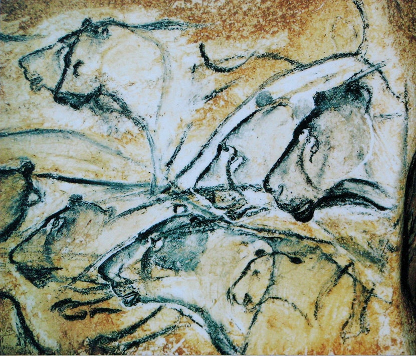
The Chauvet Cave Drawings which date back to 30,000 BC. The cave is located in Southern France. These paintings are significant because they are assumed to be one of the oldest cave paintings known to man. They are rich in aesthetic quality and have a certain sense of antique to them because of their great age. The paintings are believed to show youngsters during that time what kind of animals they would encounter during the hunt.
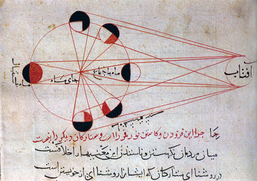
Above is the illustration of the Lunar Eclipse by Abu Rayhan Al Biruni from his manuscript, Kitab al Tafhim (Book of instruction on the principles of the Art of Astrology.)
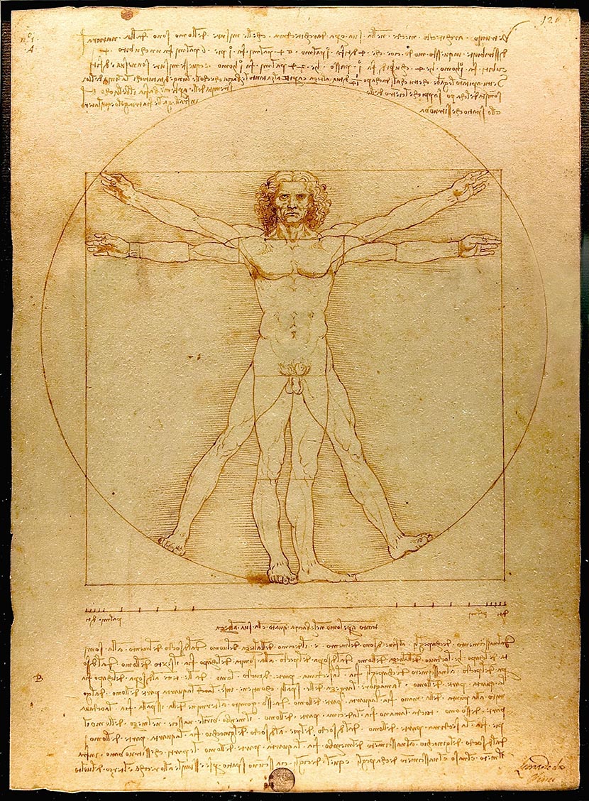
Leonado Da Vinci was famous for a variety of Paintings from the Mona Lisa to the Last Supper but one of his lesser known works include the Vitruvian Man. The Vitruvian Man is a drawing of the proportions of the Human Body accompanied by the notes of the Roman Architect Vitruvius. It is one of the most recognizable symbols of the renaissance because it demonstrates the blend of mathematics and art during that time period along with Leonardo’s deep understanding of proportion.
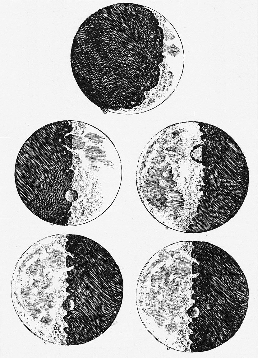
Galileo Galilei’s drawings of the moon were a revelation. With the help of his telescope, the Moon Drawings which he published in 1610 changed society’s perspective on what the moon looked like. Before his drawings, the public had assumed the moon to be perfectly smooth and round but the sketches painted a whole another picture of the moon being mountainous and pitted with craters.
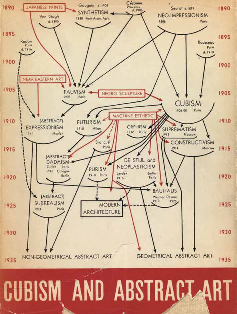
In 1936, Alfred Barr created a rather complicated figure which displayed the two most dominant trends in Art at the time, one which was curvi-linear in nature while the other rectilinear. Barr’s Diagram was also a symbol of Political resistance and symbol of repression by the European Regime against the freedom of expressing Art. This stands as the reason & birth for Cubism and why it is a revolutionary art movement.
Now that we have an idea of the what the history and impact of Diagrams in various disciplines, let’s categorize the different types of Diagrams and their applications in modern day subjects. Diagrams are usually classified according to purpose, for use or explanation. But there two general types under which all the different types are classified under.
General Diagram Shapes
General Diagram Shapes with a typical basic shape. Under this section there are various types of diagrams.
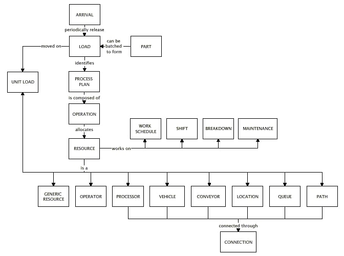
Block Diagram
A block diagram is a diagram where information is categorized into various blocks with a line to navigate the process and help the viewer understand the relationship between the various blocks.
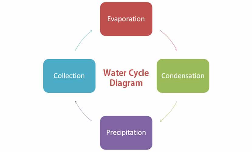
Cycle Diagram
They are used to showcase processes which have neither have no beginning nor no end. They show how different functions are related to one another in a repeating cycle.
Cluster Diagram
Also called cloud diagrams, they help to systematize the generation of ideas based upon a central topic. These ideas are clusters or a mesh and the diagram gives it a direction.

Ladder Diagram
In computer science, Ladder Diagrams are used to visualize Ladder Logic. Ladder Logic is a computer programming language that creates and represents a program through ladder diagrams that are based on circuit diagrams. The name ladder diagram comes from the simple idea that the diagram resembles a ladder.
Network Diagram
A network diagram is a visual representation of the structure of a network. It presents to the viewer the different layers of an established network with the help of lines and images. They are heavily used by corporations for both employees as well as stakeholders.

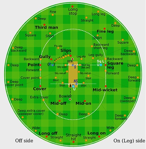
Round Diagram
While Round Diagrams and cycle diagrams are similar in shape, cycle diagrams showcase a process while round diagrams showcase different types of elements all interconnected with one another. For example, below you can see a round diagram of all the different fielding positions on a cricket pitch.
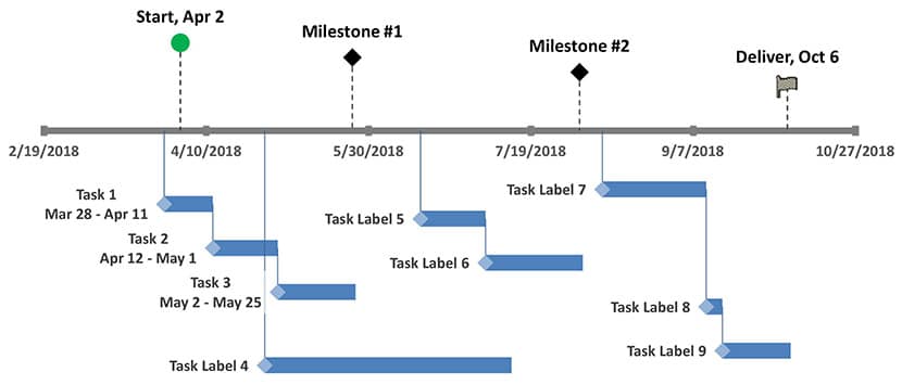
Timeline Diagram
Timeline Diagrams are used to represent a series of events in chronological order to understand how different variables have evolved or changed over the years.
General Concept Diagrams
General Concept Diagrams are diagrams with a base concept on which the entire diagram is designed. These are used in various fields of study.
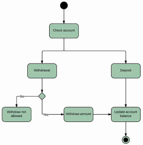
Activity Diagram
These diagrams show the various activities that goes on within a system. They are very popular in the computer and software industry to showcase how different systems work and what all activities happen internally within a system.
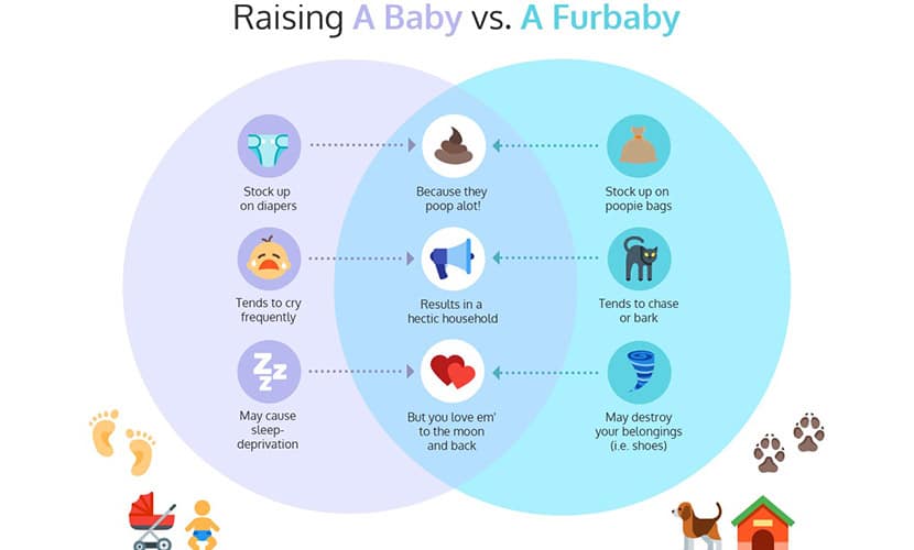
Comparison Diagram
Comparison diagram is a type of diagram in which comparison is made between two or more objects or groups of data to achieve a result. They offer both qualitative and quantitative information.
Flow Diagram
A flow diagram is a visualization of the flow process from start to finish. With the help of a flow diagram, we are able to understand how a goal is achieved from start to finish.

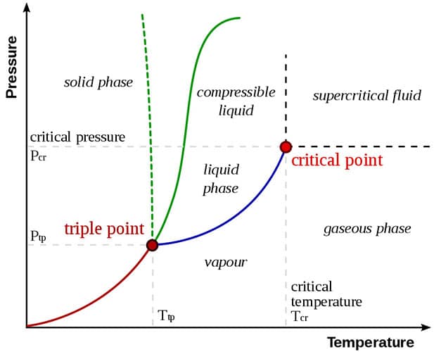
Phase Diagram
Phase diagrams help us to visualize the physical state of a substance under different conditions.
The End Note
There are whole varieties of types of Diagrams we have yet to discuss but they tend to be a little bit similar to one another. We’ve covered all the commonly used ones above. The intent behind each diagram is the same. The only differentiating factor is the idea which we’re intending to showcase and the type of application or subject in relation to it.
These days, visual imagery and representation is becoming more and more prevalent in a variety of industries. There’s no denial that the attention span of audience is limiting by the day. We cannot blame the audience for it because it isn’t their fault per say.
Today the world is moving at a rapid speed and the pace is only increasing by the day. The kind of content we consume and the overdose on variety tends to make every entity be quick and concise. Today the world is moving at a rapid pace and it doesn’t look like it’s going to slow down any time soon. So, we have two choices, Adapt or Die. That’s what everyone is doing. From brands, employees, communities etc. Keep up or be left behind. So in such a fast paced world, the most valuable commodity is time and we want to utilize much of the time that we have.
Hence when you look at things from the perspective of saving time, a diagram or visual illustration helps to save more time in understanding than reading even a three page summary on a certain topic. And you can bet the majority will lean over to the former regardless of whether they have time to spare or not.
We live in an era of instant gratification where everything is at our doorstep whether it be food, transport service, clothes etc. So naturally to save time a synopsis is given more value than a detailed description. And a visual synopsis trumps over a written one in any scenario. Maybe in the near future, we can expect to see a new innovation where we can slow down or even freeze time for us to be able to breathe a little longer and live more calmer.