Data visualization plays a crucial role in helping businesses interpret and act upon data insights. Among the many chart types available, the funnel chart stands out as an excellent tool for showing the progressive reduction of data through various stages of a process. Whether in sales pipelines, marketing campaigns, or operational processes, funnel charts offer a clear picture of conversion and drop-off rates.
This article will cover everything you need to know about funnel charts, from their definition and uses to how to create one and interpret the results effectively.
Contents
What is a Funnel Chart?
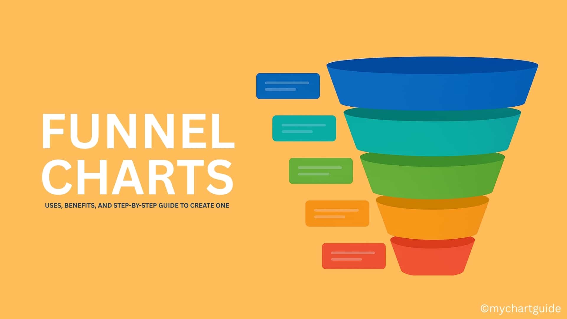
A funnel chart is a type of chart that visualizes a process starting with a large initial stage and narrowing down progressively to the final stage. The shape resembles a funnel — wide at the top, tapering toward the bottom — indicating how data diminishes through each step.
For example, in sales, it can show how leads progress from initial contact to final purchase, highlighting where potential customers drop out.
Key Features:
- Depicts stages in a linear, sequential process.
- Represents decreasing values as the process advances.
- Often read from top to bottom.
Why is it Called a Funnel Chart?
The name comes from its shape. Just like a physical funnel narrows from a wide top to a narrow bottom, data in these charts typically reduces stage by stage. This makes it an intuitive visual for showing conversion and attrition.
Common Uses of Funnel Charts
Funnel charts are used in various domains where processes have sequential stages and some form of drop-off occurs.
1. Sales Funnel Analysis
- Visualize the journey from lead generation to closed deals.
- Identify where potential customers abandon the process.
2. Marketing Campaign Tracking
- Track user engagement from ad impressions to clicks, sign-ups, and purchases.
- Optimize campaign strategies based on conversion drop-offs.
3. Website Conversion
- Show how visitors progress from landing page to checkout.
- Highlight pages or steps where users exit.
4. Recruitment Processes
- Illustrate candidate filtering from applications to final hiring.
- Pinpoint where the largest candidate drop-offs occur.
5. Customer Support Workflow
- Track support tickets from creation to resolution.
- See where bottlenecks happen in the resolution process.
Advantages of Funnel Charts
- Clear Visual Representation: Easy to understand at a glance.
- Stage-by-Stage Insight: Highlights specific stages with high drop-off.
- Comparative Analysis: Great for comparing similar processes over time.
Limitations of Funnel Charts
- Oversimplification: May not capture complexities or overlaps between stages.
- Static Representation: Doesn’t show time duration for each stage.
- Single Dimension Focus: Only represents quantitative decline, not qualitative factors.
How to Create a Funnel Chart
Step 1: Identify Your Process
Determine the sequential stages you want to visualize. Example:
Website visitor → Add to cart → Checkout → Purchase.
Step 2: Collect the Data
Gather quantitative data for each stage. For example:
- Stage 1 (Visitors): 10,000
- Stage 2 (Added to cart): 3,500
- Stage 3 (Checkout initiated): 2,000
- Stage 4 (Purchases): 1,200
Step 3: Choose a Tool
Popular tools to create funnel charts:
- Microsoft Excel
- Google Data Studio
- Power BI
- Tableau
- Visme
Step 4: Input Data
In your chosen tool, enter the stage names and their values.
Step 5: Customize the Design
- Adjust colors for better readability.
- Label each stage clearly.
- Include percentages to show conversion rates.
Step 6: Interpret the Chart
Analyze where the biggest drop-offs occur and identify possible reasons.
Example: Sales Funnel Chart
| Stage | Count | Conversion Rate |
|---|---|---|
| Leads Captured | 5,000 | 100% |
| Contacted | 3,500 | 70% |
| Qualified Leads | 1,800 | 36% |
| Proposals Sent | 1,200 | 24% |
| Deals Closed | 600 | 12% |
From the above, you can see a significant drop between “Contacted” and “Qualified Leads,” suggesting a need for better lead qualification criteria.
Best Practices for Funnel Charts
- Limit the Number of Stages: Too many can make the chart hard to read.
- Show Percentages: Helps in quick interpretation.
- Use Consistent Colors: Keep the design clean and readable.
- Label Clearly: Avoid confusion with descriptive stage names.
- Focus on the Story: Use the chart to highlight key insights.
Funnel Chart vs Other Charts
| Chart Type | Best For | Data Shape |
|---|---|---|
| Funnel Chart | Sequential drop-off across stages | Tapered vertical |
| Bar Chart | Comparing values across categories | Horizontal/vertical |
| Pie Chart | Showing part-to-whole relationships | Circular |
| Line Chart | Tracking trends over time | Continuous line |
Conclusion
Funnel charts are an invaluable tool for understanding and visualizing sequential processes where attrition occurs. From sales pipelines to marketing campaigns and recruitment processes, they allow businesses to pinpoint weaknesses and optimize for better conversion. By following the creation steps and best practices outlined here, you can effectively use funnel charts to improve decision-making and business outcomes.