In a data-driven world, understanding how to visualize large sets of data is crucial. One of the most common and powerful tools for this purpose is the histogram. If you’ve ever wondered what histograms are, when to use them, or how to create them effectively—this guide is for you.
What is a Histogram?
A histogram is a type of bar chart that represents the distribution of numerical data. Unlike regular bar charts, which are used for categorical data, histograms group continuous data into intervals (also called bins), allowing you to see the frequency of data points within each range.
Each bar in a histogram represents how many data points fall into a specific interval. Taller bars show intervals with more data points, helping you quickly identify trends, patterns, and outliers.
Histogram vs Bar Chart
Though histograms and bar charts look similar, they serve different purposes:
| Feature | Histogram | Bar Chart |
|---|---|---|
| Data Type | Continuous data | Categorical data |
| Bars Touching? | Yes (adjacent intervals) | No (gaps between categories) |
| Use Case | Data distribution & range | Comparing categories |
Uses of Histograms
Histograms are used across a wide range of fields and industries to analyze data distributions. Here are some key applications:
In Business:
- Analyze customer age, income, purchase frequency
- Monitor product performance across time
- Evaluate the frequency of complaints or returns
In Education:
- Understand exam score distributions
- Measure student performance ranges
In Manufacturing:
- Quality control (Six Sigma)
- Analyze defects or tolerance levels in production
In Healthcare:
- Analyze patient recovery times
- Study the frequency of various symptoms across age groups
In Data Science & Statistics:
- Visualize skewness or normality of data
- Identify outliers or anomalies
Types of Histograms
Depending on the shape of the data distribution, histograms can take several forms:
- Symmetrical Histogram
- Bell-shaped (normal distribution)
- Example: Height of students in a class
- Skewed Right (Positive Skew)
- Tail is on the right side
- Example: Income distribution
- Skewed Left (Negative Skew)
- Tail is on the left side
- Example: Retirement age
- Bimodal Histogram
- Two peaks
- Example: Test scores of two different classes
- Uniform Histogram
- Bars are roughly the same height
- Example: Rolling a fair die many times
How to Create a Histogram
Here’s a step-by-step guide to creating a histogram, whether manually or using software tools.
Step 1: Collect Your Data
Gather a list of numerical values you want to analyze.
Step 2: Determine the Range
Find the minimum and maximum values to calculate the range.
Step 3: Decide the Number of Bins
A good rule of thumb is Sturges’ formula:
k = 1 + log2(n)
Where k = number of bins, n = number of observations
Step 4: Calculate Bin Width
Divide the data range by the number of bins:
Bin width = (max – min) / k
Step 5: Create Intervals
Divide the data set into bins based on the calculated width.
Step 6: Count Frequencies
Count how many data points fall into each bin.
Step 7: Draw the Histogram
Plot the bins on the X-axis and frequency on the Y-axis. Make sure bars are touching.
Tools to Create a Histogram
You can create histograms using various platforms:
Microsoft Excel
- Go to Insert → Charts → Histogram
- Customize bin width, axis, and labels
Google Sheets
- Use Insert Chart → Chart Type → Histogram
- Customize through “Chart Editor”
Python (Matplotlib / Seaborn)
import matplotlib.pyplot as plt
data = [10, 20, 15, 35, 40, 50, 60, 70, 80]
plt.hist(data, bins=5)
plt.show()
R Programming
data <- c(10,20,30,40,50,60)
hist(data, breaks=5)
Online Tools
- Visme: Create interactive, design-focused histograms
- ChartBlocks, Meta-Chart, Canva: Great for quick visualizations
Best Practices for Designing Histograms
- Choose Appropriate Bins
Too many bins = noise, too few = oversimplified data. - Label Clearly
Use descriptive axis titles and a legend if needed. - Avoid 3D Effects
They can distort perception of bar height. - Maintain Uniform Width
All bins should have equal width for accuracy. - Include a Title
Clearly state what the histogram represents.
Common Mistakes to Avoid
- Using histograms for categorical data (use bar chart instead)
- Inconsistent bin sizes
- Ignoring outliers
- Not labeling axes or units
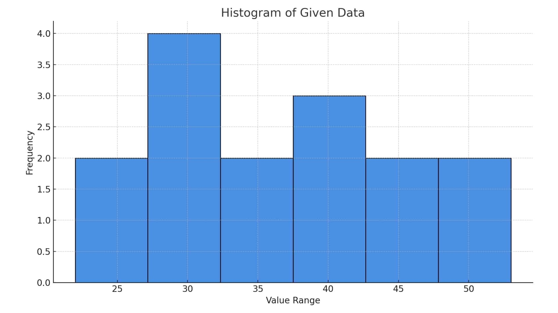
Real-World Example
Scenario: A company wants to analyze delivery times (in minutes) for their logistics team.
Data Sample:
[22, 24, 29, 30, 31, 32, 35, 37, 39, 40, 41, 45, 46, 50, 53]
Histogram Output:
The histogram shows most deliveries occur between 30-40 minutes, suggesting a performance benchmark.
Histogram in Statistics: Deeper Insight
Histograms allow statisticians to assess:
- Central tendency (mean, median)
- Spread (range, variance)
- Shape (skewness, modality)
- Outliers and anomalies
They’re often the first step before conducting deeper statistical tests like normality checks or regressions.
The Future of Histograms in Data Analytics
As data continues to grow, histograms remain crucial in AI, machine learning, and big data applications. Tools like Visme and Power BI now integrate smart histograms for dynamic reporting and storytelling, making data interpretation easier and more accessible than ever.
Conclusion
Histograms are one of the simplest yet most powerful data visualization tools available. Whether you’re a student, marketer, engineer, or data scientist, learning how to create and interpret histograms is a valuable skill.
Take your data a step further—use histograms to spot trends, tell stories, and make smarter decisions.