Statistics play a vital role to render tremendous support to all corporate organizations. Numbers and figures are in current day scenario used to portray how well the companies are progressing along with determining their profits and their anticipated share of revenues.
Additionally, statistics in business assists to examine observations in the form of data fluctuations, economical predictions, revenue generations and uncertainties. A frequency distribution is one of the representations of numerical data that is usually a list in a tabular or graphical format that addresses the uniformity of data or in simple words shows the user how frequently an activity is repeating in a specified time interval.
The most basic depiction of such frequency distributions in graphical structures is manifested through histograms. Apart from almost resembling a bar chart in appearance, histograms have more to them in terms of communicating the functioning of critical data processes and their approximations.
Observing differences or changes in operations and analytically inspecting outcomes are some of the auxiliary attributes associated with histograms. Bins or class intervals are the most quintessential elements of a histogram that are used as blocks to merge data values before deciding their frequency.
Histograms can be procured with the help of various applications, tools or software with the primary purpose of getting hold of the graphs in minutes. These chart makers are loaded with features for colors, fonts, among several others.
Microsoft Excel makes up for one of the highly recommended and most sought after applications to create histograms for its efficiency of use. This application is readily available at a user’s disposal, cutting down the need for users to get into paid subscriptions and curtails off any registration formalities, along with projecting simplicity of use.
Here is a sneak peek into the steps involved in deriving histograms in a flash from of this Microsoft application.
Steps involved in creating and crafting a histogram in Microsoft Excel
The histogram making process in Microsoft Excel is extremely basic and does not involve any rocket science. It does not demand any expertise in designing and can be accomplished from the predefined data that needs to be manipulated. The steps can be advanced by incorporating a few clicks of the mouse.
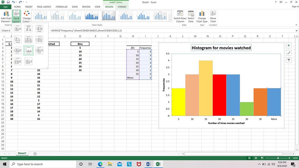
Available Data: 20 people giving their inputs on how many movies they watched in the last month.
Step 1:
The prerequisite for kick-starting the chart making process in Excel would be manually penning down the values for observations. In this case, the number of movies watched by each individual from the whole lot of 20 in the previous month will be considered the first column.

Step 2:
After placing the data, we have to determine the bins or regular class intervals for this data. These figures can be accessed by determining the lowest and the highest values among the available data list. Here, out of all the 20 numbers, the minimum and maximum value can be recognized as follows.
Minimum value: 2
Maximum value: 38
To establish the bin values, intervals of 5 from 1 to 40 can be logically utilized to yield the bars that depict the frequency distributions in the chart. The bins also need to manually inputted into the excel sheet and they make up the second column in the spreadsheet. We will input the last value in the bin column as 35 as the least value is automatically considered by the chart maker.

Step 3:
To create the histogram for this data, one must navigate to the Design tab in the menu bar, and click on Data Analysis. From the pop-menu, select Histogram and click on OK.
Design Tab >> Data Analysis >> Histogram

Step 4:
Upon confirming Histogram, a dialogue box pops up to input the column values and the Output range specifies the location, where a user would want the histogram to be placed on the sheet. On clicking OK, the chart appears at the desired location on the sheet.


Step 5:
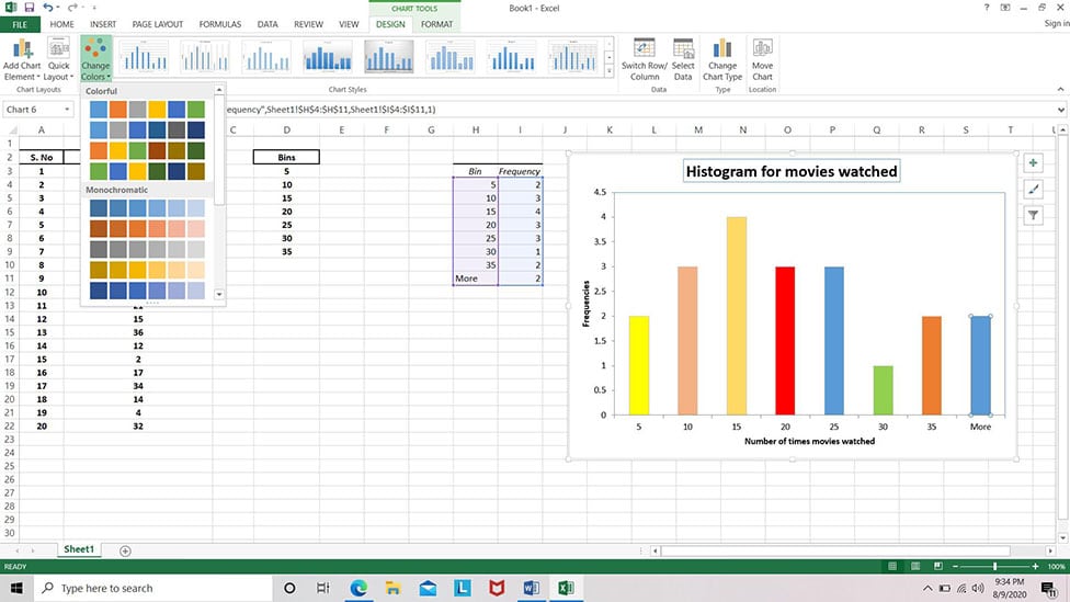
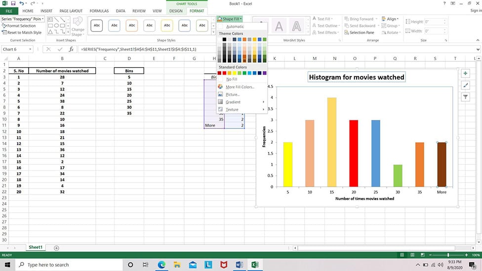
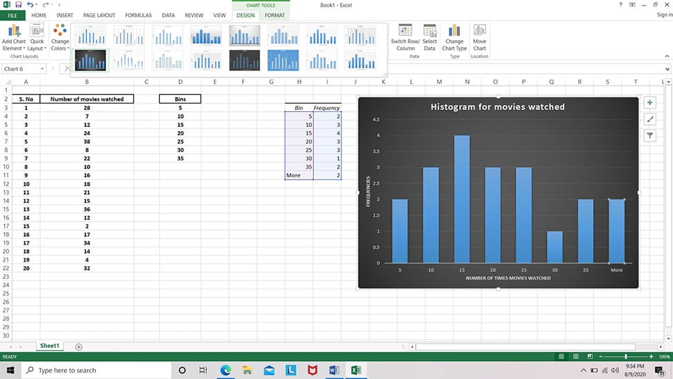
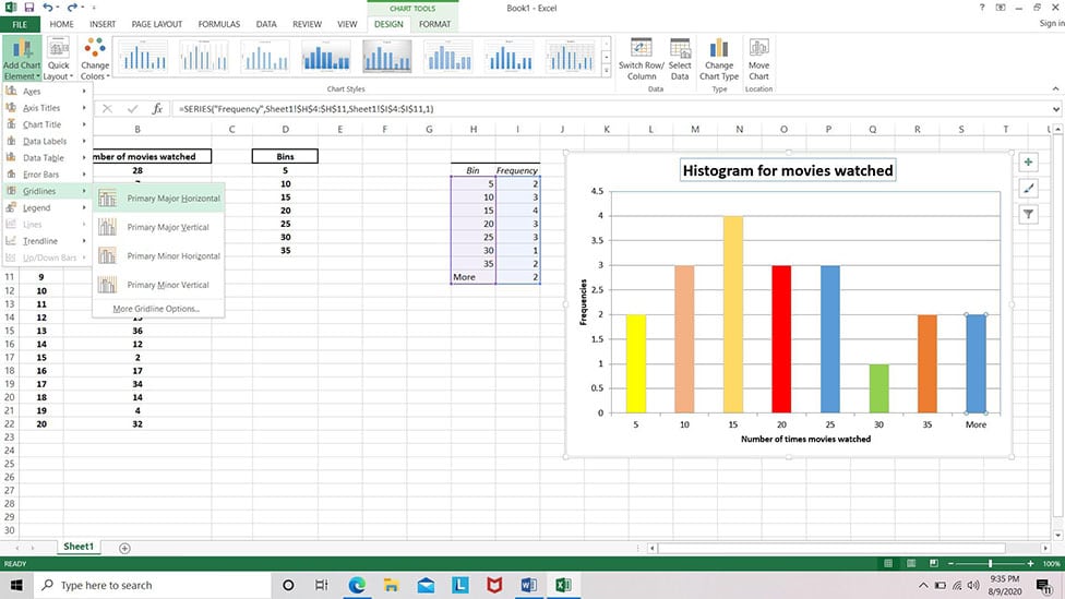
Once present on the sheet, the histogram can be resized and rested on any location as per one’s convenience. To personalize the graphical structure, Microsoft Excel offers a handful features like colors, font, shape colors and outlines for the bars along with the layout for the chart that can be traversed to within the sheet in a flash.

Reminiscing the chart making procedure of histogram in Excel, users can seamlessly rely on this application to furnish some high-quality, visually attractive histograms in a quick-fix.
Related: