Organizational Charts are something that we have been using all this time to represent data in a more efficient way. We use them in office presentations, school and college exams, and to understand things in a better way.
As we have been using them so frequently, it is important for us to get to the depth of organizational charts. We should know its origin, its formal way of representing it, and its importance in the field of graphical representation.
An organizational chart is a diagram that shows the graphical relation between components of a structure or organization. It also depicts the relative ranks and positions of its parts. It creates an uncomplicated visual illustration of the hierarchy that makes up the organization.
These organizational charts are also called Organograms, Hierarchy charts, Org charts, etc. They have many uses and can be structured in different ways and used as managing tools, planning purposes, or as a staff directory.
Going Down the Memory Lane of Organizational Charts
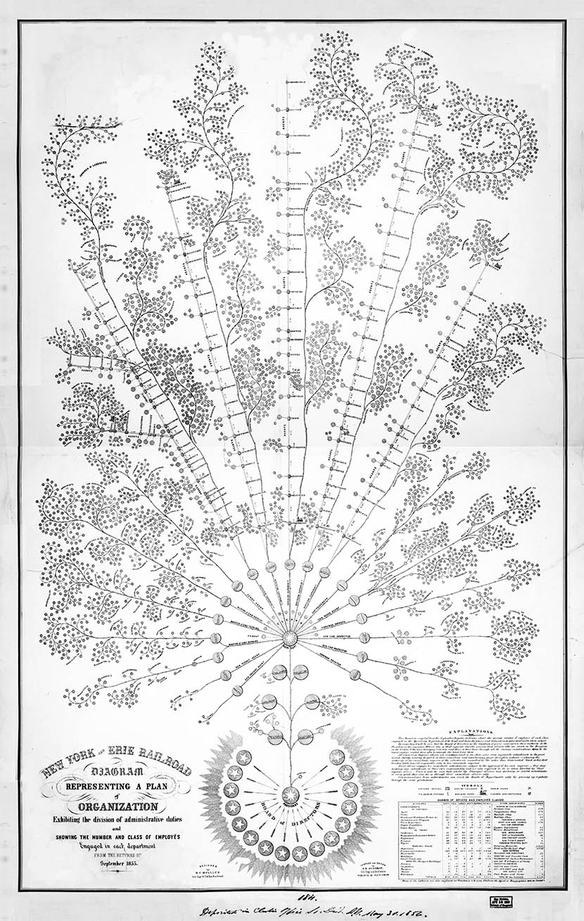
Daniel McCallum, a Scottish-American engineer, is credited for designing the first org chart for American business in 1855. It was an embellished structure of New York and Erie Railroad; it was drawn by George Helt Henshaw. He believed that designing structures could bring the division of responsibilities and make the working transparent. His idea of org charts was successful in laying out his plan as through them a sense of order and control could be established.
But, the term organizational chart came into practice in the early 20th century. In 1914, Willard C. Brinton, a consulting engineer, used the term for the first time in his textbook – Graphic Methods for Presenting Facts. He declared that these charts should be more widely used, they are not as common as they should be.
Org Charts were mostly used by the people of engineering groups till the 1920s, after that they started to become prominent in the corporate world. The less popular term which is ‘Organigram’ became more common in the 1960s.
Organigraphs are very much similar to org charts, but it is dissimilar to it in the sense that it is less linear than an Organigram and serves to describe alliances and opportunities among departments or supply chains.
Different Types of Org Charts in Use
Organograms have a number of formats which can be made; we can decide one depending upon our requirements. These described below are the main genus of charts used.
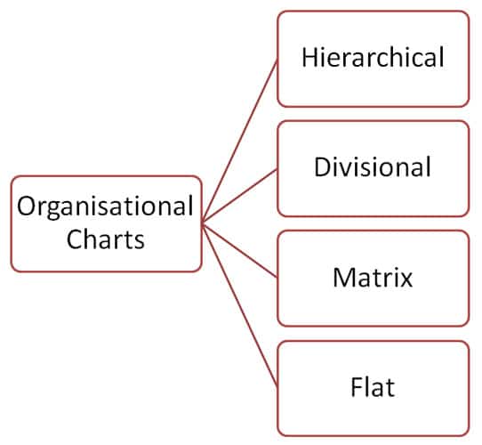
1. Hierarchical Charts
In a hierarchy, one group is at the top, and the subsequent groups which are less important or have less power are put below them in a pyramidal way.
It is almost like a monarchy where the king is at the top with the maximum power and the people with weak command come under them.
In such a type of hierarchy, members are in direct contact with the people who report directly to them and the ones they report directly to.
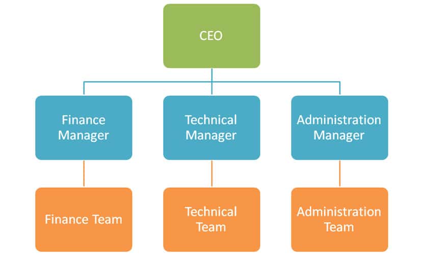
If this made for a company where many employees work in different or similar position; the CEO would come at the top, and the people with the same skill-set, position, and specialization are grouped together.
2. Divisional Chart
It depicts a company organized along a product line or specific geography. Divisional set up is used when one part is sufficiently free from another.
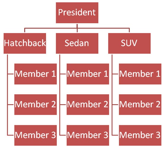
One example is that it can be used in a car company and the divisions can be SUVs, sedans, hatchback, or electric cars.
3. Matrix Chart
These are meant to combine hierarchical and divisional structures to work on certain specific projects. Matrix org charts come into use when you want to have more than one reporting point, and the scope of changing your division or multitasking with more than one division is acceptable.
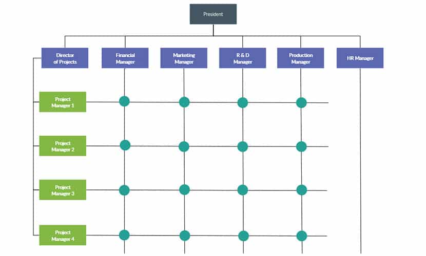
It helps in better and more open communication which simultaneously creates a superior dynamic work environment where shifting of resources is easy.
But if not utilized properly, it can create mental problems due to workload and frustration.
4. Flat Chart
Such type of org charts are also known as Horizontal Org Chart. It shows less number of levels of management. In structures like these, the groups below have more responsibility and are more involved in decision making.
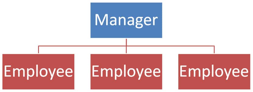
Everyone is treated equally, job skills and resources are shared, and there are no direct lines of command. It is mostly opted by small businesses & sometimes by the ones on the large scale too.
The need for the different layouts arose because we could not handle all types of structures with a single one. So there might be some limitations to a certain type of chart, there are some pros and cons to every type of chart we are using.
- In matrix chart, you have more than one reporting point; this might create some confusion and conflicts of interests though it is helping with cross-department relationships.
- In a hierarchical approach, the structure is built upon the qualities of clarity and firmness, but its potential drawback may be rigidity. It might not be flexible when we want it to. The layers of management sometimes also bloat the organization.
- A flat or horizontal structure is good with fewer levels as it builds up a sense of teamwork among the workers. But there is always a chance of conflicts as fewer people are doing the work.
Some Mainstream Uses of Org Charts
- Due to the modern technology, the org charts are not only catching dust in the folders, they are now accessible to you anytime, anywhere on your smartphones. It has some basic uses which we are going to discuss here-
- Describe Management Structure: As we have already discussed, the prime focus of these charts is to embellish the structure of an institution and the relationship between companies and the various components of it.
- To Enhance Conveyance Between Employees or Groups: It helps to perceive the entire working of the company properly such as who reports to whom, adding photos can also help.
- Planning: Drawing is the best way to plan things. You can easily figure out the need for engaging more employees, switching roles and cut down on capital misuse.
- The Personal Details of Your Employee: You can add photos, telephone numbers, or email id to maintain a directory of your employee which will help for smoother communication between the head and his employee and among employees of the company.
The Best Way to Plan an Organizational Chart
Nowadays, Organizational Charts are used in every business presentation and are very useful in describing your point, you should, therefore, be comfortable in designing and understanding them. If you do not know to work with the organizational charts, then you might be left behind in the race of the corporate world.
Also, everybody has different requirements and expectations for their job. So, you need to mould according to the kind of chart you want and modify the basics.
Thus, it is important that you understand the basics of an org chart.
1. Know Your Cause to Implement
Keep in mind for who you want to make the chart, for what purpose. If you are charting it for the whole company or just a department or a group. Think about the best for your company and your purpose.
2. Have All the Information from the Nooks
While drafting the chart, you need information about the topic of your chart; you cannot design it without having the correct and whole information.
First get to know all the important points in mind which will form the base of your chart, define an initial point for you to begin, know the different levels of management, and collect all the resources.
3. Decide the Platform You Are Going To Use
There are many platforms which provide a user-friendly, powerful chart making software like Lucidchart, PingBoard, etc. So, decide what is best for you and get going to work.
4. Plan for a Volatile Chart
In this fast-changing world, nothing remains constant, neither do these organizational charts. You should always design a chart which can cope with the updations with things changing in the organization. These things become a lot easier with online collaborative platforms.
Org Charts form the foundation of any organization; it depends on us – how well do we manage the thing.
Your chart should depict the structure of your organization; it may be a pyramid, cake, or in the form of circles. Choose the software tool which offers templates to simplify designing the chart.
Your product which you are going to sell should be visually appealing to its buyers; here are some tips to add the color to your org chart.
- Breaking the load into pieces would allow you to manage the work more efficiently. Divide your areas into different categories.
- Include details of departments or employees like contact, name, photo, location for increased efficiency and less confusion.
- You can use colors and shapes to make it attractive visually.
Some Secret Tips to a Flawless Org Chart
After learning all these basic steps to an ideal org chart, there are still some minor points left which can further allow you to hone your work.
1. Choosing format
You should choose the format according to the space available to you; it may be vertical or horizontal. When you input the person with lower authority or position in a chart, they should be connected with lines box to box.
Try to keep the boxes of the same size throughout the chart, but it can be lenient if you want to keep the box larger of the one at the top.
2. What content is required and what to include
For what specific task we are going to use our chart becomes the main cause in determining the content.
If the prime reason for your chart is to get the key positions for information on the structure of the company, then the person holding the responsibility does not matter much. It is preferred to put the title before the mane in such cases; it helps in changing the person’s name if he is shifted to another department, changed his role, or got promoted because the employee may change but the position is going to remain the same.
We can add additional data like telephone number, head-shots, e-mail, etc.
3. Displaying non-traditional roles
If a person holds two or more positions, it is best to write both positions in the chart and show the person occupying both of them. Try not to make your chart complicated keeping simple and easy to read; you are always advised to avoid exotic formatting. It increases the functionality of the chart.
If there is an employee who works under more than one manager, then you can connect it to all the managers with a dotted line. However, it is better to draw separate charts in such cases.
4. Choose the best orientation
Figure what type of orientation is going to suit the best for you. We generally make it in a pyramidal fashion, but earlier, the inverted pyramid was more common.
One side to other like left to right flow is not that popular, but you can also go for it if you want. Choose the orientation which reflects your point the best.
5. Adjustments
Try to adjust the whole chart on a single page. Go for horizontal arrangement at the top and vertical after that to fit all its content in a single page.
6. Modernize with online Org Charts
Distributing your chart online is very helpful; you can interact with the contents of the chart. Finding names or any other information becomes easy with online charts, you can directly contact anybody just by clicking on the name, and the e-mail would be directly linked to it.
You can also add hyperlinks to the employee’s record in the chart; you can make your chart an interface for additional informational.
7. Break it into smaller parts
A large chart is complicated and difficult to understand, what we can do is break it into smaller charts each with a reasonable size and link them back together. By linking them together, no matter what you can always find your way back to where you started.
Nothing is perfect! Not Even Org Charts
- With this fast-changing era, nothing is bound to be perfect or error-free, with this pace of development and updates even org charts lack behind and show certain limitations.
- They become outdated frequently if the turnover of the company is high. Online charts are a better option in this scenario, but even they lack behind if not tended regularly.
- You can describe only formal relationships with them, but it’s actually the informal things which get the work done.
- They can show the sequence of authority but not the exercise of the power or how the things are done.
- As the chart shows the status of employees in different positions and status, a feeling of superiority or inferiority might develop among them.
- In some cases, Organigraphs which are a close relative of org charts prove to be more useful in illustrating other departments.
- They only include the workers in an organization, not the customers.
The End Note
This was all the information regarding organizational charts, its history, appreciation, drawbacks, steps to make a decent chart, and its corporate use. These charts are very useful in depicting data and give you an edge over other chart makers if you follow the steps correctly and try to make it as appealing as possible.
There is much online software available to further ease your work; these prove to be very helpful from designing the layout for the final finish. It depends on you, how you use them to your benefit.