Data visualization plays a pivotal role in interpreting large data sets, making it easier for decision-makers to identify patterns, trends, and insights. Among the various types of charts and graphs used for visualization, area charts stand out for their ability to convey data in a visually engaging and cumulative manner.
In this comprehensive guide, we’ll explore what area charts are, when and why to use them, their types, how to create them, and best practices for optimal use.
Contents
- What is an Area Chart?
- Key Characteristics of Area Charts:
- When to Use an Area Chart
- Types of Area Charts
- Advantages of Area Charts
- Disadvantages of Area Charts
- Area Chart vs Line Chart vs Bar Chart
- How to Make an Area Chart
- Real-World Examples of Area Charts
- Best Practices for Area Charts
- Common Mistakes to Avoid
- Alternatives to Area Charts
- Conclusion
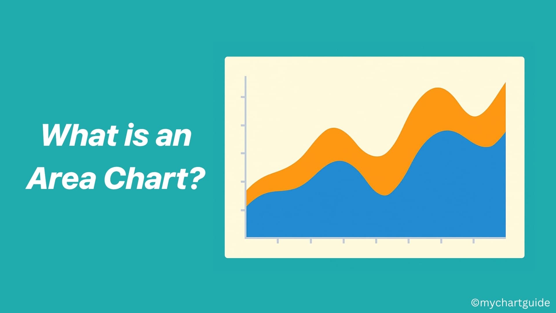
What is an Area Chart?
An area chart is a type of graph that displays quantitative data using lines and shaded regions beneath the lines. It is essentially a line chart with the area below the lines filled with color or patterns to emphasize the magnitude of values.
Area charts are ideal for showing how values develop over time and how different data sets stack or compare cumulatively.
Key Characteristics of Area Charts:
- Shows data trends over time or categories.
- Visualizes both individual and cumulative values.
- Emphasizes the volume or size of a trend.
- Uses filled areas below lines to highlight differences.
When to Use an Area Chart
Area charts are best suited for:
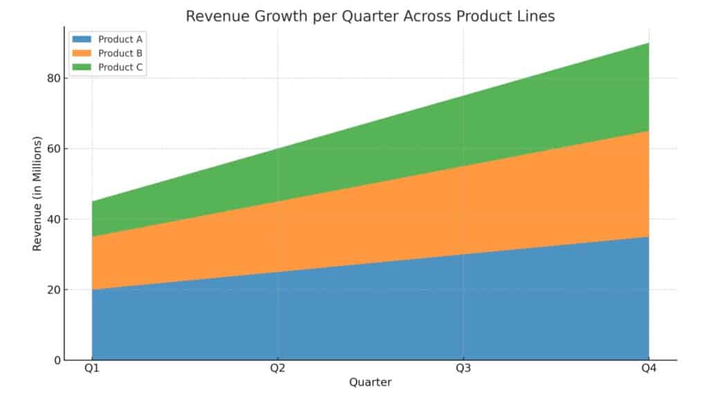
- Visualizing Trends Over Time
Example: Revenue growth per quarter across different product lines. - Comparing Cumulative Data
Example: Website traffic from various sources over a year. - Highlighting Part-to-Whole Relationships
Example: Showing how different departments contribute to total expenses. - Tracking Changes in Magnitude
Example: Population growth of countries over decades.
Types of Area Charts
There are several variations of area charts, each serving slightly different purposes:
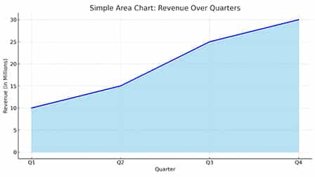
1. Simple Area Chart
- Best for simple temporal data.
- Plots a single data series.
- Emphasizes overall trend and magnitude.
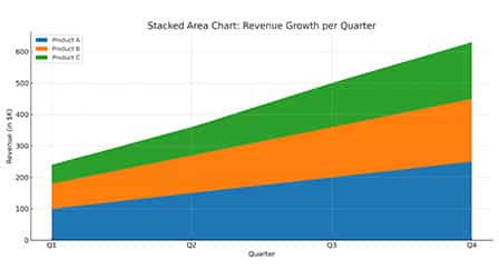
2. Stacked Area Chart
- Ideal for part-to-whole relationships over time.
- Plots multiple data series stacked on top of one another.
- Shows how individual parts contribute to a total.
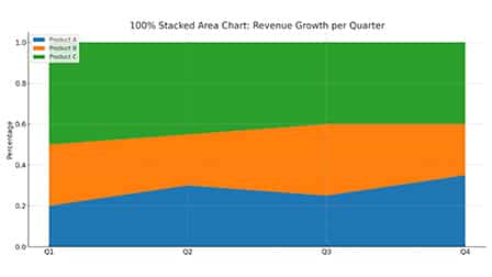
3. 100% Stacked Area Chart
- Each data series is normalized to represent a portion of 100%.
- Similar to stacked area but displays percentage contributions.
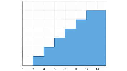
4. Step Area Chart
- Useful for showing stepwise data changes.
- Connects data points using horizontal and vertical lines.
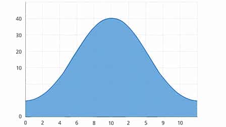
5. Spline Area Chart
- Suitable for showing gentle and gradual changes.
- Uses smooth curves instead of straight lines.
Advantages of Area Charts
- Visually Engaging: Filled areas make the data visually compelling and easy to interpret.
- Shows Cumulative Trends: Useful for viewing how different data sets contribute over time.
- Flexible: Can be adapted into different styles (stacked, 100%, etc.) depending on the data.
- Great for Big Picture Analysis: Ideal for understanding overall trends and proportions.
Disadvantages of Area Charts
- Can Be Misleading: Overlapping areas may distort interpretation.
- Not Ideal for Precise Comparisons: Especially in stacked charts, comparing individual contributions becomes harder.
- Visual Clutter: Too many data series can make the chart messy and hard to read.
- Difficult to Read with Small Differences: Minor differences between values may not be visible.
Area Chart vs Line Chart vs Bar Chart
| Feature | Area Chart | Line Chart | Bar Chart |
|---|---|---|---|
| Data Representation | Quantitative & cumulative | Quantitative only | Categorical or quantitative |
| Visual Appeal | High | Medium | Medium |
| Ease of Comparison | Medium | High | High |
| Highlights Trends | Yes | Yes | Less |
| Emphasizes Volume | Yes | No | Yes |
How to Make an Area Chart
Creating an area chart is simple with the right tools. Here’s a step-by-step guide:
Step 1: Gather Your Data
Ensure your data is structured in a time series or category-based format, with one or more data series.
Step 2: Choose the Right Tool
Some popular tools to create area charts include:
- Microsoft Excel
- Google Sheets
- Tableau
- Visme
- Power BI
- Canva (for simple visualizations)
Step 3: Insert the Area Chart
Depending on the tool, go to the “Insert Chart” menu and choose “Area Chart” or one of its variants.
Step 4: Customize the Chart
- Set axis labels, titles, and legends.
- Choose appropriate colors for readability.
- Use gridlines sparingly.
- Apply smooth lines or step lines as needed.
Step 5: Analyze and Share
Interpret the results, annotate important trends, and share or embed the chart in presentations or reports.
Real-World Examples of Area Charts
- Finance: Showing cumulative profit and expenses over time.
- Marketing: Tracking engagement from various platforms.
- Healthcare: Visualizing patient growth by department.
- Education: Enrollment across different faculties over years.
- Environment: Emissions per country contributing to global totals.
Best Practices for Area Charts
- Limit Data Series: Avoid adding more than 4–5 categories to prevent clutter.
- Use Transparency: Helps viewers differentiate overlapping areas.
- Label Clearly: Especially for stacked charts—label each area directly.
- Provide Context: Include data sources and explain the story the chart tells.
- Mobile Optimization: Ensure readability on smaller screens if shared digitally.
Common Mistakes to Avoid
- Using too many series in a stacked chart.
- Using area charts for unrelated or discrete categories.
- Ignoring the axis scale, which can mislead interpretation.
- Using inappropriate colors that blend together or lack contrast.
Alternatives to Area Charts
If an area chart doesn’t serve your purpose well, consider these:
- Line Chart – For precise comparison without volume emphasis.
- Stacked Bar Chart – For vertical data stacking.
- Heatmap – For dense data visualization with color cues.
- Treemap – For proportional comparisons in a hierarchical structure.
Conclusion
Area charts are a powerful and visually engaging way to communicate cumulative data trends over time. Whether you’re tracking revenue streams, showcasing contributions from various departments, or visualizing population growth, area charts help you tell your data story more effectively.
When used correctly, they bridge the gap between clarity and creativity, helping viewers not just see the numbers, but feel the growth.