In a world where everything has become so technology driven, we are always on the lookout for ways to make our data easier to understand. Charts on Excel make that happen quite easily. They are not just programmed to make your task of creating a chart a lot easier, it also does help you better create the necessary data into a visual format for easier understanding.
One of the most commonly used charts are the stacked column charts and the bar charts on Excel. Both of them are used to get a visual representation of data and help the users seek out any possible loopholes in the process.
If you have been meaning to learn how to make both of these charts in Excel, we have a step by step process to share with you.
Making Stacked Column Chart in Excel
Stacked column chart are usually used when there are variable data for consecutive time for a single subject. If you are confused, don’t worry, we are going to make the process easier for you to understand.
The steps include:
- Start by preparing your data on Excel or you can import your data if it is larger in size.

- Once that is done, select all your data, including the designations much like how it is shown below.

- Following that, you need to go to the “Insert” tab and from there go to the “Charts” section and select the “Stacked Column” chart from there.
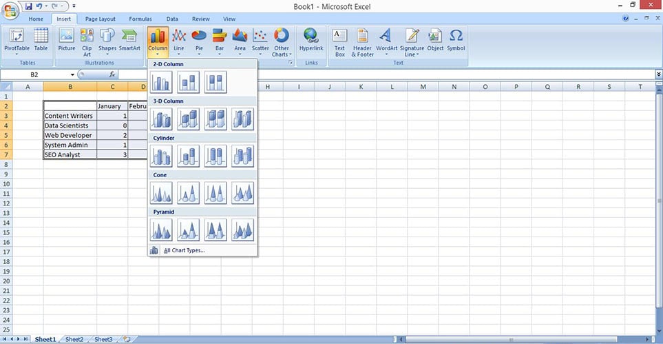
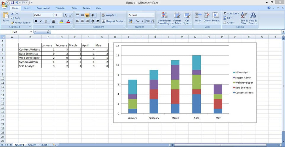
- Once you select that, Excel will automatically prepare the stacked column chart for you as shown below.
- From there on, you can select the chart and customize the chart as per your needs from the “Design” tab.
More Excel Tutorials:
- How to draw Sankey diagram in Excel?
- How to Create a Gantt Chart in Microsoft Excel (w/ Screenshots)
Making Stacked Bar Chart in Excel
Much like the Stacked column chart, even Bar Charts are used for a visual representation of the data that you have.
For the Bar Chart, we are going to be working with the same data that we did for the Stacked Column, so it is easier for you to compare the both.
Let us take a look at the steps of how to make it, shall we?
- Start by arranging the data as per your needs as shown below.

- Once that is done, you need to select the data that you have, all the cells included.

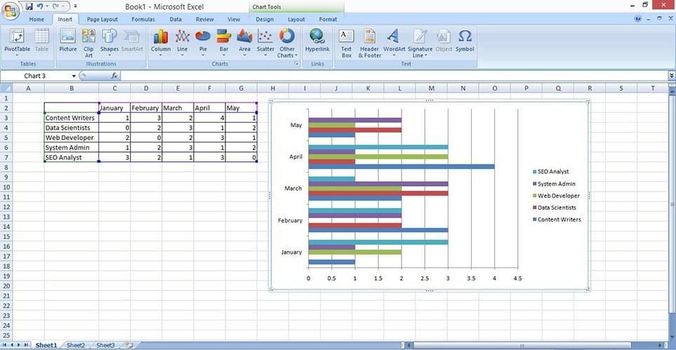
- Following that, go to the “Insert” tab and from there, go to the “Charts” section and click on the “Bar” chart section and then select the Clustered Bar option under the 2D section. Excel will automatically prepare the chart for you then like show below.
- If you want your bar charts to be vertical instead of horizontal, the alternative way to do that is by selecting the data, and choosing the Stacked Column option under the Column chart section. Excel will then again prepare the bar chart for you in the vertical direction like shown below.

- From there on, you can easily customize the chart as per your requirements and needs.
If you have been meaning to make column and bar charts on Excel, these are some of the exhibits that you can try out for yourself. The process is possibly one of the simplest but the results are pretty amazing in the end and helps visualize your data in the way that you want.
THANKS
Does not work on the current versions of excel.