Graphs are one of the most prominent forms of Data Visualization. You see them in almost every report or presentation. Have you ever wondered what is the significance of them?
Well for starters, they make things a whole lot easier not only for the stakeholders but for the one who create them as well. Graphs were invented to consume complicated information in an easier manner. They literally simplified complex numbers and data and helped various stakeholders understand the situation at hand whether it be organizational performance, employee performance, etc.
The thing about Graphs is that they are not only used at a corporate level but also at an individual level. Graphs can be used by high school students to analyze how they spend their pocket money and understand which areas they can cut down to save more.
Before we go any further, let’s get into the history of Graphs. The early mathematicians found Graphs as a fun way to solve problems. They didn’t value them as a useful tool until a Swiss mathematician by the name of Leonhard Euler solved the famous Konigsberg bridge problem.
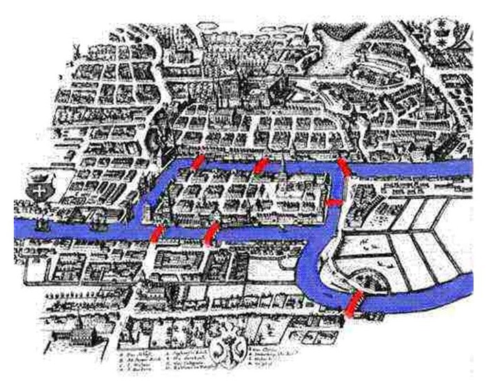
Spoiler Alert! It’s not possible. You’re probably thinking that doesn’t sound right. Especially from a subject such as Mathematics where you’re supposed to get a result for everything you do. That was the supposed guarantee of Mathematics. Not in this case scenario. Once the conclusion was achieved that it was not possible, Euler didn’t just drown in sorrow. He found something. And this discovery was the supposed fact that changed Mathematics forever. He discovered something termed as the Geometry of Position which later came to be known as Graph Theory. Now let’s look at what is the Graph Theory through the perspective of Euler’s conclusion.
The four Land masses represent what is called in Mathematical terms a Node. The bridges that connect the nodes are termed as Lines/Edges. This simplification helps us to understand the no. of bridges each land mass touches.
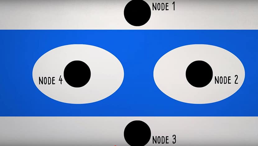
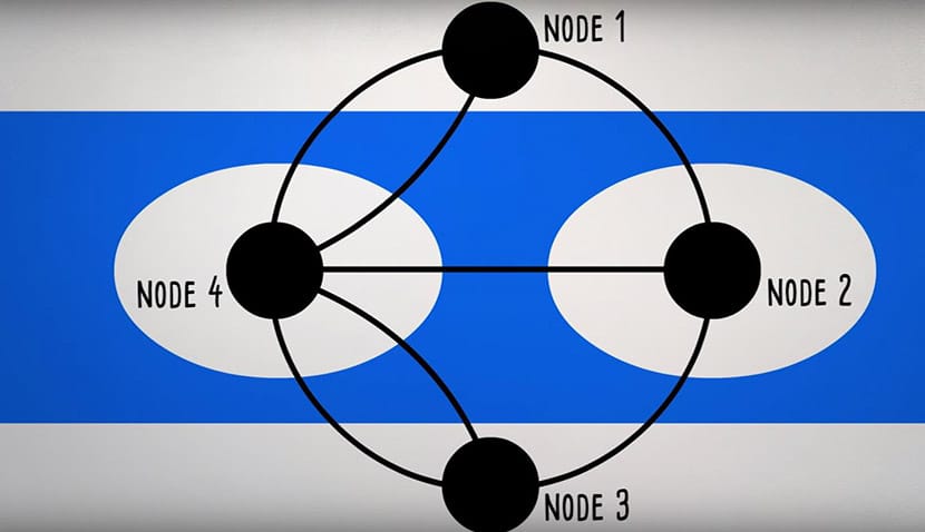
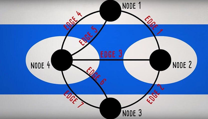
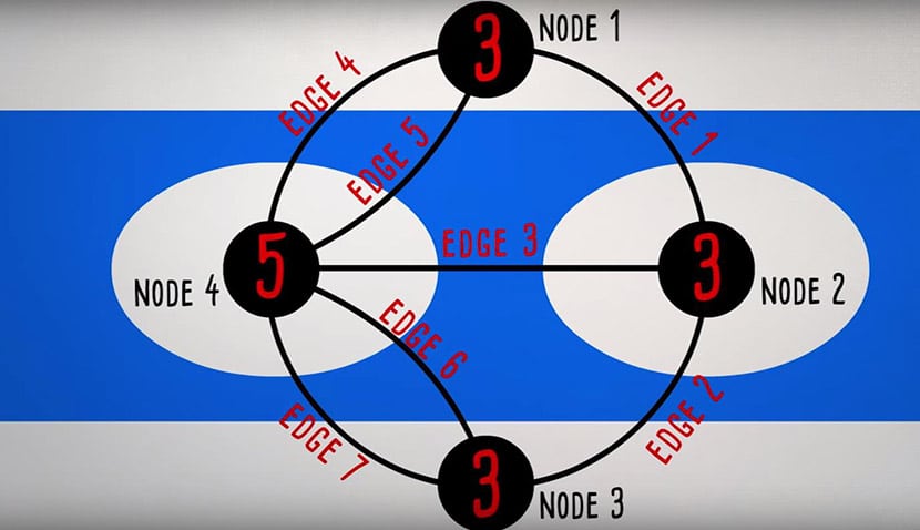
Here’s a pictorial description of the above mentioned facts. After all what are Graphs for. So as you can see above, the numbers depict the number of bridges each land mass touches.
According to the riddle, a person should be able to cross one bridge only once. So in theory, it is only possible if the no. of bridges touching each land mass is even. As you can see above all of them contain an odd number of bridges connecting them. The only possible way to solve the riddle is if one of the bridges is disappeared. Well, the Soviet Air force took care of that. During World War II, the Soviet Air force destroyed two of the city’s bridges that eventually led to the wipe-out of the entire city. If you look at the maps today, that city is now known as the Russian City of Kaliningrad.
Euler’s discovery led to the foundation of what is known as Graph Theory and it has since broadened the scope of horizon for Mathematics and Data Analysis. Today in modern day society, this process of studying relationships to reach strong conclusions and solutions has helped Business organizations to grow & expand.
Let’s now look at the key features of a Graph
- Conveying information quickly and easily.
- Highlighting most noticeable features of the data.
- Convenience in comparison.
Although over time, analysts came to the realization that one type of Graph won’t be suitable for all situations. Hence, there are numerous sorts of Graphs today.
Bar Graph
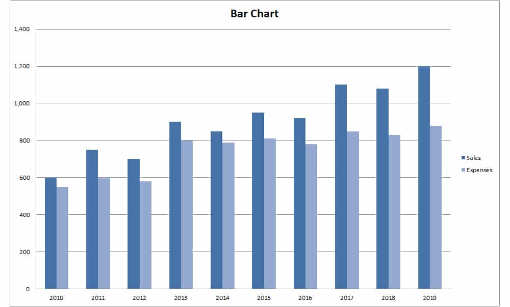
Bar Graph is one of the most common ways to represent data visually. Bar Graph provides an ease in comparing data between various sets. The design of a Bar Graph is such that they present categorical data with rectangular bars of equal width with heights or lengths proportional to the values they represent. The longer the bar, the greater the value. Bar Graphs are either single, stacked or grouped.
During it’s inception it was called a Pareto Diagram. It was invented by an Italian Economist named Vilfred Pareto when he decided to give economic decision making and analysis a more “Human” touch by plotting them on a graph paper to showcase the real impact of the results.
Pie Chart
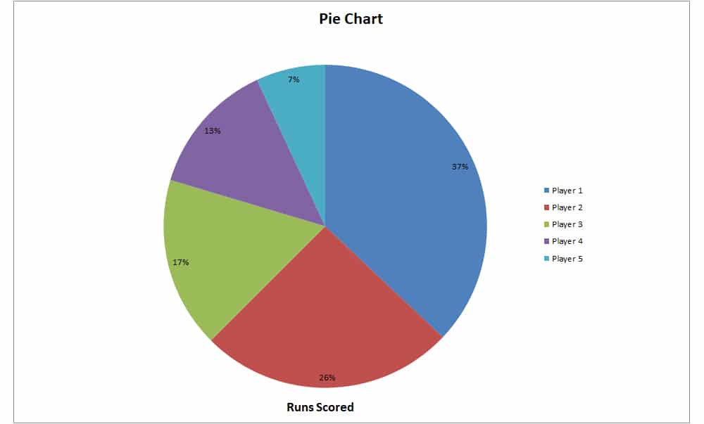
The name Pie Chart is derived from it’s physical representation which is similar to that of a pie sliced several times. Pie Charts are useful to depict quantitative data which involves factors such as trait, feature, etc. These factors cannot be described numerically. Each pie slice has a value and together they add up to create the bigger picture.
Histogram
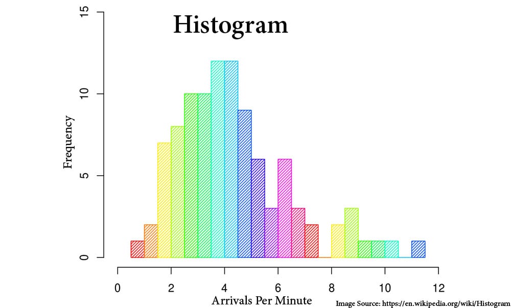
Histogram and Bar Graph look almost identical. But, the main difference lies in the fact that Histogram represents quantitative variables while Bar Graph represents categorical variables. In simple terms, the elements or variables in Histogram are grouped together while they are taken as Individual entities in a Bar Graph. In a Histogram, the bars touch each other with no space in between. The aid of a Histogram comes in situations when there are large sets of data which need to be summarized.
Stem & Leaf Plot
Stem & Leaf Plot is a method for showing the frequency in which certain values of classes occur. The process involves breaking the values of the quantitative data set into two pieces. The highest placed value is put in a column, which is called stem while the remaining values go on the other column known as Leaf.
Here’s an example to better understand this. A teacher has to create a stem & leaf plot to review her class of 10 students test performance. The scores are as follows,
77,62, 99,90,85,83,50,82,64,98.
Now we take the highest value in the stem column.
|
Stem |
Leaf |
|
1 |
0 |
|
2 |
0 |
|
3 |
0 |
|
4 |
0 |
|
5 |
1 |
|
6 |
2 |
|
7 |
1 |
|
8 |
3 |
|
9 |
3 |
As you can see from the above table, 3 students scored in the 90th percentile, 3 students also scored in the 80th percentile while 2 students scored in the 60th percentile and one each in the 70th & the 50th percentile. A simple description and summary of the performance of a class in a certain subject. Another method of representing this would’ve been a Histogram. The choice is up to the analyst.
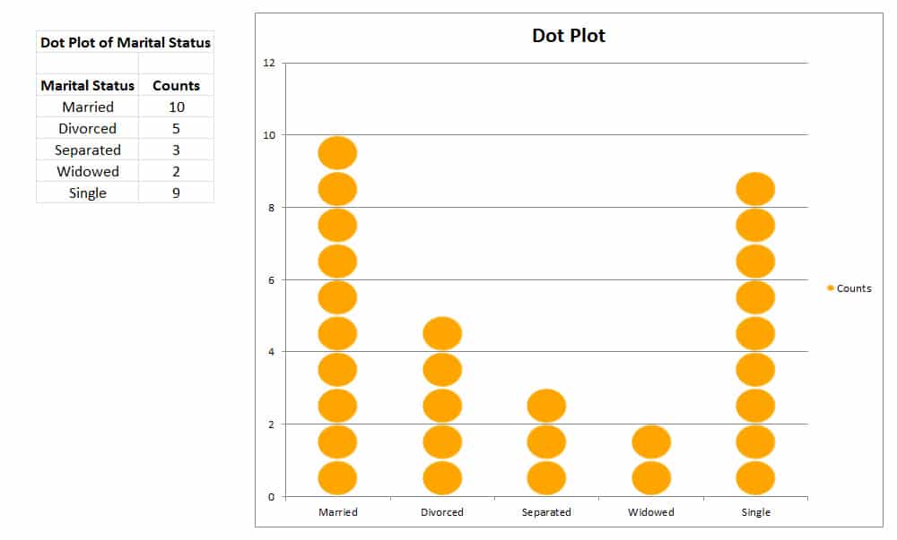
Dot Plot
A dot plot is a hybrid between a Histogram and a Stem & Leaf Plot. Instead of a numerical value, the value is represented as a dot placed against the appropriate class. It is used mainly for small sets of data which are continuous, quantitative and of a single variable.
Scatter Plot
The first mistake people tend to make is to associate Scatter Plot and Dot Plot as one. They are a collection of points using Cartesian coordinates to display values from two variables. Cartesian Coordinates is basically a system used to help us pinpoint where we are on a Map or a Graph. Scatter Plots are used for large bodies of data. The main difference between Dot Plot & Scatter Plot is that Scatter Plot shows the relationship between variables i.e. how much one variable is affected by another. In a Scatter plot, the closer the plot points when drawing a line, the stronger the correlation between the variables.
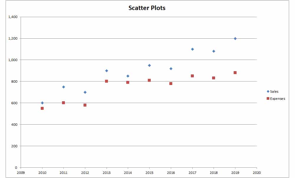
On a Scatter Plot with x and y-axis. If the line is going upwards from the origin to high values on both axes, then it is said to have a positive correlation. However if the line is from a high value on the y-axis to a high value on the x-axis, then it is said to have a negative correlation.
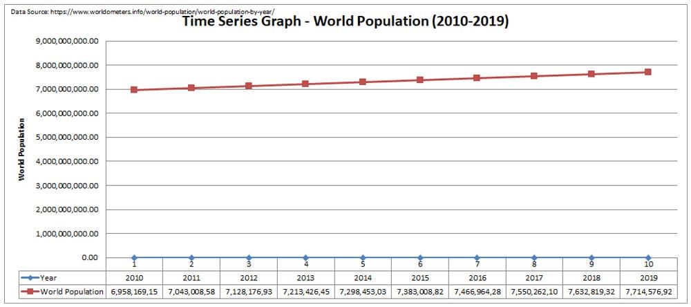
Time Series Graph
Time Series Graphs are subjective to data which contains time periods. The graph depicts measures or trends over time. The time periods can range from minutes, hours, days, months, years etc.
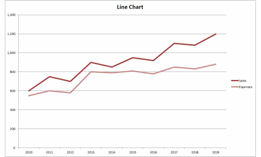
Line Graph
The Line Graph is form of data representation which helps to understand and determine the relationship between two sets of values over time. The difference between a Time Series Graph & a Line Graph is that on a Time Series Graph, the x-axis is strictly reserved for time periods which is why it’s more preferred for time series types of data.
End Note
These are the various types of Graph which are frequently used for various types and sets of data. Data collection and analysis has been a demanding profession over the last decade. With the help of technology, the process has been more simplified. The rise in demand comes with the price of delivering accurate and precise information efficiently and in a short amount of time. Hence, the pressure for companies hasn’t gone away. But slowly innovation and new software are entering the market to help employees better adapt and with the advent of Artificial Intelligence in the coming years, there is a possibility of a monumental transition in the field of Data Science unlike anything you can ever imagine.