Microsoft Excel is a go-to for data organization and management. But, are you one of those people that work with constantly changing data? If yes, dynamic charts are a better suited choice to better represent your data in real-time and with the changing updates.
Instead of updating the chart manually, you always have the option to use dynamic chart to let Excel automatically update the chart based on the new data input.
If you are new to the concept of dynamic chart in Excel, this article will explore more on that in detail.
What is Dynamic Chart?
A dynamic chart represents a data range that keeps updating itself depending on the changes made to the data source.
As you change the numbers in the data range, it continually updates automatically and then reflects on the data chart that you have on the side.
The above representation is a very basic example of how a dynamic chart works. As you change (or even add) to the data source, the chart on the side adjusts and updates itself based on the data that you have entered.
How to Create Dynamic Charts in Excel?
Now that you have a clear understanding of what a dynamic chart is and how it works, let us walk you through the steps of making one. Its fairly simple, so there’s not much hassle you have to put into it.
Creating dynamic charts in Excel isn’t as complicated as you think. The only thing worth considering is knowing the techniques.
Ideally, there are two routes for making them:
- Using Excel Table
- Using Formulas
Both of these methods work seamlessly and doesn’t take anything more than a few minutes to create, provided you are familiar with the steps involved.
If you want a pro tip, we’d recommend mastering the “Excel Table” technique since it is a lot easier and more flexible.
That said, here are the step-by-step breakdown of the two methods of creating Dynamic Chart in Excel.
1. Using Excel Table
If you want to automate the updates in the chart as you enter new information, the Excel table method is likely the better option. It’s a lot easier to master and the accuracy is fairly amazing too.
The Excel Table is accessible in Windows 7 and up, so that’s something you’d have to be mindful of. If you use an operating system before Windows 7, then this method won’t work out for you. In that case, we’d recommend using the Formula method we’ll discuss next.
That aside, here are the steps to create a dynamic chart in Excel using an Excel table:
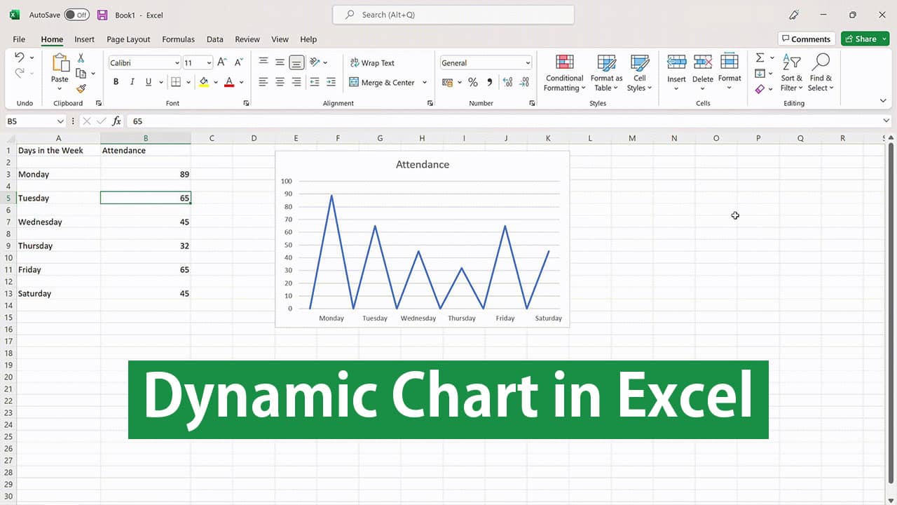
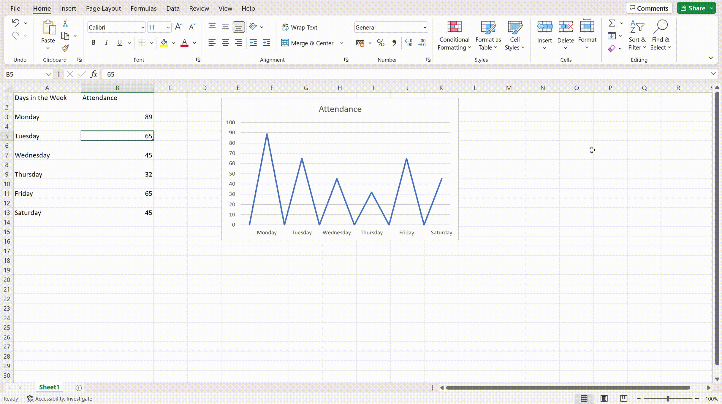
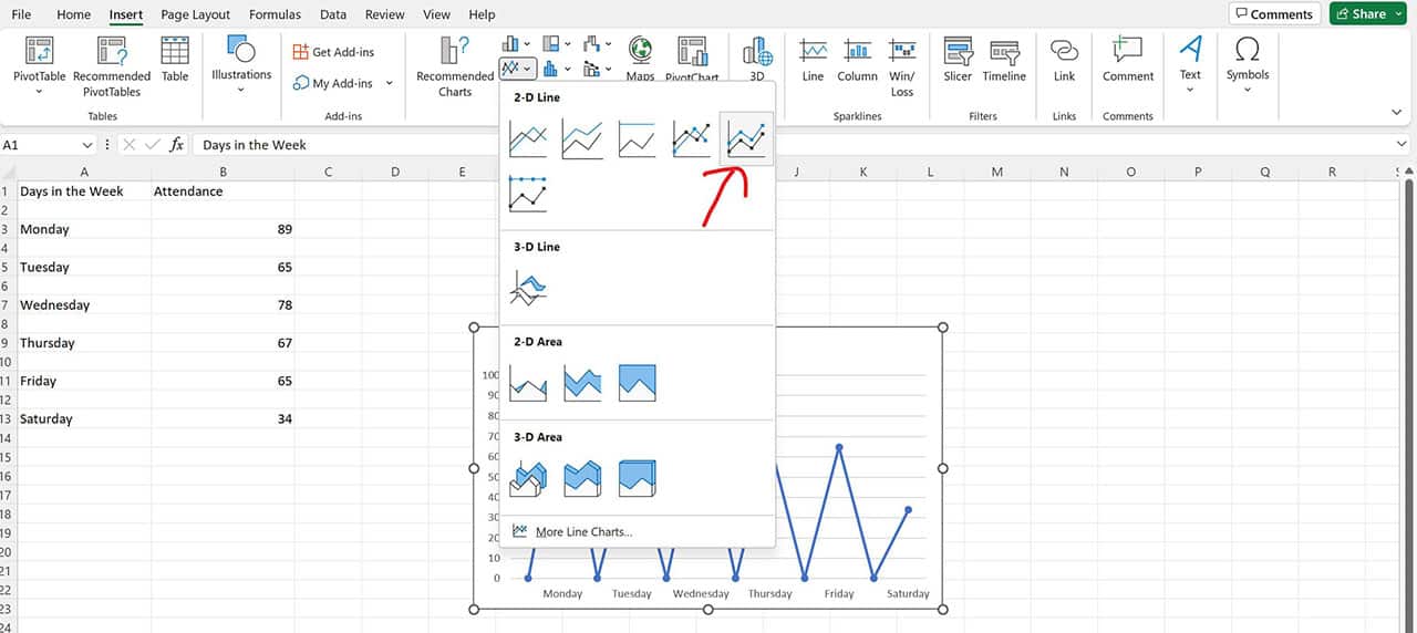
- Enter your designated data in the cells in a new Excel spreadsheet as shown below

- Select the entire table with the data you have entered

- Navigate to the Insert Tab

- Navigate to the “Charts” section and tap on “Lines with Markers” chart

And, that’s all you have to do. Once you tap on that, the Dynamic Chart should look something like its shown below.

As you change the data in your data source, the appearance of the chart will adjust and update itself accordingly.
Note: If you delete data points in the data source, it won’t entirely delete itself from the chart. Instead, you will note empty spaces in those area in the chart. Also, the dynamic chart situation not just works with line chart but works equally well with bars and column-based charts too.

Which kind of chart design you choose will depend on how you wish you data to be represented in a graphical format. It’s entirely on you.
2. Using Excel Formulas
If you are using a PC with an older operating system, access to Excel Tables isn’t an option. In that case, we’d recommend you explore this route. It is a tad bit complicated but you should be good if you follow the steps as mentioned.
Without over-complicating things, we’d recommend you follow the steps as mentioned:
Create the Dynamic Range
- Navigate to the Formulas tab

- Under that, click on “Name Manager”

- In the dialog box, type in the “Name” as “Chart Values” and then copy and paste this formula – =OFFSET(Formula!$B$2,,,COUNTIF(Formula!$B$2:$B$100,”<>”)).

- Click on “OK”
- Under the Name Manager dialogue box, create a new one mentioning Name as “Charts Days in the Week” and enter the formula – =OFFSET(Formula!$A$2,,,COUNTIF(Formula!$A$2:$A$100,”<>”)).

- From there, click on OK and then click Close.
- The above steps will create two ranges in your Excel workbook – ChartDaysInTheWeek and ChartAttendance as per the data entered.
What creates the Dynamic Chart in this is the “Offset Function”.
Create the Chart
Once you have the data sources sorted, the next thing you have to do is create the final chart. Its fairly simple, provided you follow the steps as mentioned:
- Open the Insert menu

- Then go to the Lines Chart options and select the “Lines with Marker” chart.
- Once you have selected the Chart, navigate to the “Designs” tab
- Under that, tap on “Chart Design” and tap on “Select Data Source” dialog box
- In the opened dialogue box, tap on “Add” under the “Legend Entries Series”

- Under the Series value field, enter this formula – =Formula!<name of the chart>. In our case, it will be =Formula!ChartAttendance.

- Tap on OK.
- Under the “Horizontal Category Axis Labels”, tap on the Edit button
- Under that, you have to enter – =Formula!<name of the chart range>. In our case, it will be =Formula!ChartDaysintheweek.

- From there, click on OK.
And, from there, your dynamic chart will be created as per normal. The steps in the latter method are a bit complicated. So, we’d recommend trying out the simpler technique using the Excel Table since it works more effortlessly.
Conclusion
Working with a dynamic chart is crucial if your data source is continuously changing. Although a bit complicated, we’d suggest that you keep a check on the individual steps and never miss out on any one of them since all of the steps combine to make the final result possible.