Data is everywhere, all around us. Whether you’re managing a business by increasing productivity or simply monitoring your behavior, data holds insight. However, the translations can be overwhelming and complex.
This is where data visualization tools come in handy and one of the most effective ways to visualize data trends is through Run Charts.
But what exactly are run charts? How do they work? We’ve got you covered in this guide. By the time you read this article, you will understand everything.
Contents
What arе run charts?
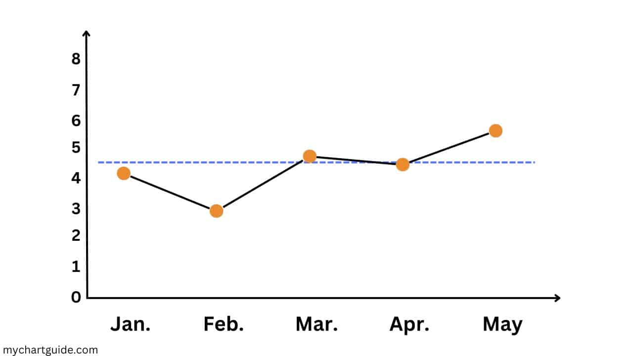
So let’s start with the basics. A run chart is basically a visualization of data points plotted over time. Unlike other charts, run charts are refreshingly simple yet powerful. A connected series of data points is displayed to reveal trends and changes over time.
Imagine you own a coffee shop and want to track your sales for a month. Each day, you diligently record sales figures until the end of the month, when you have a stack of numbers in your hand. Using a run chart allows you to understand how your sales are performing over time.
The componеnts of a run chart
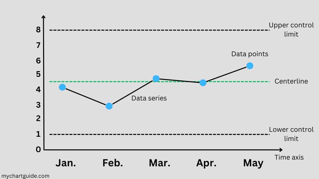
Let’s start by discussing the elements that make up a run chart, a tool for visualizing data. It’s essential to understand these components before we delve into creating and interpreting charts.
1. Timе axis:
The horizontal axis of a run chart represents time. Depending on your data context, this axis can be measured in days, weeks, months, or any other relevant unit of time. We plot time on the x axis to observe how the data changes over time.
2. Data points:
On the y axis, we plot the data points. These points represent the measurements or values that we are tracking. For instance, in our scenario of a coffee shop, the y axis would display sales figures.
3. Data sеriеs:
In a chart, each data point is connected to another using a line. This line helps us visualize trends or patterns within the data set. Sometimes we may have multiple sets of data on one chart to facilitate comparisons of different trends.
4. Cеntеrlinе:
A run chart often includes a line that signifies either the median or average value of the dataset. This line can assist you in determining if your data points consistently fall above or below the average.
5. Control limits:
In an evaluation of the disparity of your information, you may attach upper and lower control boundaries to your run graph. These control boundaries provide limits that help you discern when your data diverges from the anticipated degree of variableness. This can be of tremendous help for procedure regulation and excellence enhancement.
Having acquainted ourselves with the underlying components of a run chart, let’s discover how to build one and the information it can supply.
Crеating a run chart
Constructing a run chart is a simple task that includes a couple of straightforward steps:
Step 1: Collect data
Prior to the creation of a run chart, gather the data to visualize. It could be anything, such as sales figures, customer satisfaction scores, defect counts, or any other metrics that change with time.
Step 2: Arrange the data
Once the data is collected, set it in chronological order. Make sure the time increments are clear, like daily, weekly, and monthly intervals, since time is an important element of a run chart.
Step 3: Plot the data
Using a program like Microsoft Excel or Google Sheets, build a chart with the time on the x-axis and the data values on the y-axis. Place each data point on the graph.
Step 4: Create the Cеntеrlinе
Once the average or median of your data has been determined, draw a line on your chart to symbolise this figure. The cеntеrlinе provides a benchmark by which you can gauge whether the data is increasing or decreasing.
Step 5: Include control limits(optional)
To assess the variance in your data, you can incorporate higher and lower control limits into your chart. Control limits are usually set at a predetermined number of standard deviations from the control level. This provides a means of pinpointing elements of your data which fall outside the accepted range of variation.
Step 6: Analyze the chart
Now that your run chart is finished, take a close look at it. Inspect the trends, patterns, and deviations of your data. Is there any peculiar spikes or aberrations? Is your data inside the control limits, or are any of the points outside the limits?
Functions of run charts
One of the primary functions of a run chart is to identify trends over time. Are the data points inclining or declining, or are they more or less static? Consistent upward or downward trends can provide vital information about the trajectory of your data.
For example, if you’re monitoring your website visits, a run chart could illustrate a gradual boost in daily users over a period of months. This positive trend may provide clues that your online presence is increasing.
Conversely, examining defect rates in a manufacturing operation yields beneficial results when utilizing a run chart with a downwards trajectory indicating that quality governs are becoming efficient.
In addition, run charts are useful for recognizing discrepancies in data, whereby adding limits makes it easy to register when data points go beyond standard parameters. These points may suggest causes of deviation, prompting further investigation.
Reliability within a production procedure is an essential factor of quality control and progressive growth. When the data points are mostly held within their set boundaries and present a random pattern, it proves that the process is consistent and foreseeable. Whereas unreliable processes indicate an unexpected pattern of lapses, loops or expansions, highlighting that the process has underlying difficulties that require immediate attention.
Strategies for useful run charts
To make the most of the run charts, consider these tactics:
1. Keep it straightforward:
Run charts should be straightforward and simple to interpret. Avoid cluttering your chart with inappropriate data sets or comments. The objective is to exhibit the main trends and variations clearly.
2. Employ equal data intervals:
Maintain consistent intervals on your time axis. If you are conveying data by weeks, make sure every interval indicates the period. This reliably helps in precise trend assessment.
3. Refresh consistently:
If your particulars are progressive, such as regular sales numbers or periodic website activity, update your run chart deliberatively. This makes sure you possess the latest version of your facts.
4. Synergy and discernment:
Run charts are treasures for squad cooperation and understanding. Share your charts with associates or team members to ease exchanges and evaluations.
5. Learn from mistakes:
Whenever you discover data points outside your control limits or big fluctuations in your run chart, regard them as opportunities for growth. Probe into these anomalous entries to get an understanding of their roots and take suitable action.
Real life applications of run charts
Now that we’ve discussed the fundamentals of run charts and how to make and implement them, let’s look at some real-world uses where these charts have real utility:
1. Quality enhancement:
Run charts are largely utilized in healthcare contexts to supervise patient results, inspect infection levels, and boost the efficacy of medical activities. For example, a hospital could use a run chart to assess the time taken for patients to receive immediate treatment in the emergency department, with the aim of condensing wait times.
2. Manufacturing and quality check:
Manufacturing industries depend on run charts to survey product excellence, fault amounts, and production efficiency. Tracking data over time empowers industrialists to choose zones for refinement and enhance their operations. This chart might demonstrate a continuous decrease in fault loads, exhibiting enhanced product value.
3. Business performance:
Businesses employ these charts to trace key performance metrics (KPIs) such as sales figures, customer contentment scores, and website traffic. By picturing trends and discrepancies in these metrics, companies can make well-versed selections and progress enhancements. A run chart exhibiting a waning incline in consumer grievances reflects advanced service value.
4. Education:
In educational institutes, run charts can be employed to monitor student performance throughout a period. Instructors and directors can recognize zones where students are making accomplishments and zones demanding extra support. An uptrend indicated in the run chart represents progress.
5. Project management:
Project managers often leverage run charts to trace progress on projects, for instance, the fulfillment of tasks or adhering to project timelines. Monitoring data trends regularly assists the project team to make certain that projects move forward and adjust as necessary.
Summary
Run charts act as an easy yet invaluable means of illustrating data trends, discrepancies, and patterns through time. No matter if you are running a business, managing a health facility, or taking on a personal development project, running charts will aid you in making informed decisions, recognizing areas for improvement, and following your progress.
By executing the procedures to create a run chart and utilizing the understanding it furnishes, you can take full advantage of this diverse data visualization tool. Make sure to keep it simple, update your charts regularly, and use them as a joint tool for successful decision-making.
So, the next time you have a collection of data and need to understand how it varies with time, consider using a run chart. It could be the key to uncovering valuable insights and encouraging perpetual improvement in your objectives.