In today’s world, we need to deal with a lot of data due to information overload. And analyzing this vast amount of data can be overwhelming, and extracting meaningful insights from a plain spreadsheets can be a daunting task. However, if you use pivot charts and tables, you get some relief in such situations.
Pivot tables is an exceptional tool provided by Google Sheets that facilitates systemic data analysis. These pivot tables are flexible and versatile, which makes them faster and more convenient to use than complex mathematical formulas.
The comprehensive guide below, which is specially created for beginners, will take you to the world of pivot charts and tables, highlighting their benefits and providing helpful tips to create a pivot table successfully.
Contents
Understanding pivot tables
A pivot table is a powerful way to summarize and extracts valuable insights from large datasets in Google Sheets. You can get an overview of your information and get a better understanding of it by selecting specific data sources and condensing them into aggregated forms.
Picture this: If your standard spreadsheet with its vertical and horizontal axes represents “flat data” with pivot tables, you can add another dimension to your information and take your data analysis to the next level.
This includes isolating, grouping, expanding, and summing your data in real-time. Furthermore, it reduces the risk of human error and data inaccuracies.
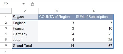
To illustrate the power of pivot tables, imagine that you need to know the revenue generated from a specific software in a certain region over a particular period. Just with a few clicks, you can transform your raw data into an aggregated form, showing you the count of software subscriptions sold in specific regions for every purchase date.
Apart from saving time and effort, with pivot tables, you can also create new reports from the same set of data quickly and easily. So, if you want to gain valuable insights from your data in a more efficient and effective way, pivot tables are the way to go!
Benefits of using pivot tables.
Pivot tables are an effective tool that can streamline your data management, sorting, and analysis processes, while also providing a a lot of other benefits, which are as follows:
- Effortlessly simple and quick
Pivot tables are phenomenal tools for analyzing data. They are incredibly easy to use, even for beginners, and require minimal effort to set up. All you need is the raw data, and click a few buttons, your pivot table is ready!
You don’t need to worry about the hassle of extracting data manually with complex formulas to gain insights. Pivot tables do the heavy lifting for you, freeing up your time to tackle more pressing data challenges.
So why waste precious time on boring tasks when you can put pivot tables to work and get meaningful insights in a snap?
- Instant data creation
With the help of pivot tables, you can instantly generate data by either by using program equations or spreadsheet formulas. This feature of pivot tables enables you to effortlessly compare different sets of data and obtain the necessary information in just a matter of seconds.
- Quick and accurate reports
If you generate reports using spreadsheets in the traditional manner, you know how time-consuming it can be. However, pivot tables provide a better way of presenting data; you can produce multiple reports from the same source data within a single file, eliminating the need to copy and paste information into different sheets.
Additionally, pivot tables decreases the chances of errors in the data, which leads to more precise and reliable reports.
- Condense huge data into bite-sized insights
Pivot tables in Google Sheets provide a convenient way to sum up huge amount of data into bite-sized information that is easily digestible to our brains. These tables are capable of aggregating data quickly and without requiring the use of complex formulas.
Pivot tables allow users to easily sort, organize and label data according to their preferences, which makes it possible to present large amounts of information in a clear and understandable format. This leads to an efficient and effective data analyzing process.
- Accelerate decision-making
To maintain the fast-paced nature of business operations and meet with demand of clients, it is essential for managers and business leaders to make critical decisions quickly.
Pivot tables can help streamline the process of decision making by providing crucial insights that can save time as well as energy. By using pivot tables, team leaders can make decisions mindfully that manage the direction and actions of their operations with speed and efficiency.
- Help in recognizing recurring trends within a set of data.
For any organization, for-profit or nonprofit, predicting outcomes is an important part of the management process. Nevertheless, having access to appropriate data is crucial in identifying trends and making accurate predictions that can lead to success.
Pivot charts help organizations find patterns by enabling the creation of custom tables from vast data sets. By manipulating data to expose repeating trends and patterns, you can make more accurate forecasts with ease.
Step by step guide to create pivot tables in Google Sheets
Here’s how to create pivot tables in Google Sheets in three easy steps:
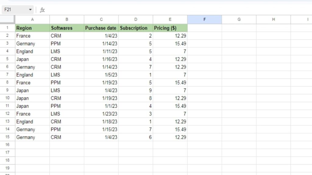
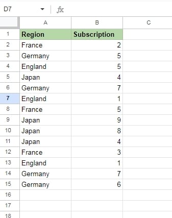
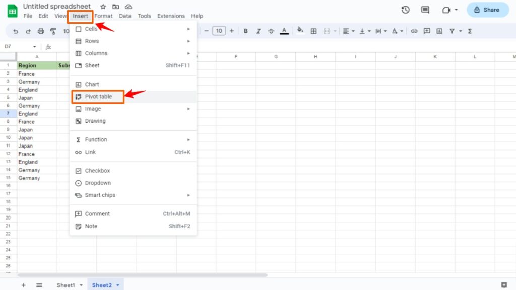
#1. First, Open the sheet that contains the raw data and click on the table. In this example, we’re taking data that has different entries of our software subscription from several regions.
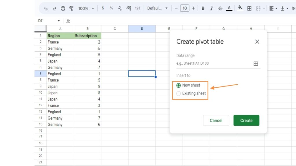
#2. Next, from the Menu, click Insert, and choose Pivot Table. Decide whether to create the pivot table on the same sheet or want a separate sheet for that.
If you create a new one, it will be named according to the number of tables you’ve create like Table 1, Table 2 etc.
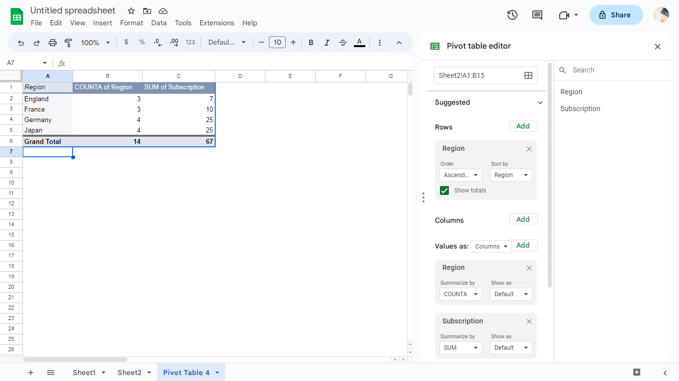
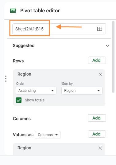
#3. In the editor, click Rows to add the data you want to appear as a row heading. For example, you could select “Region.”
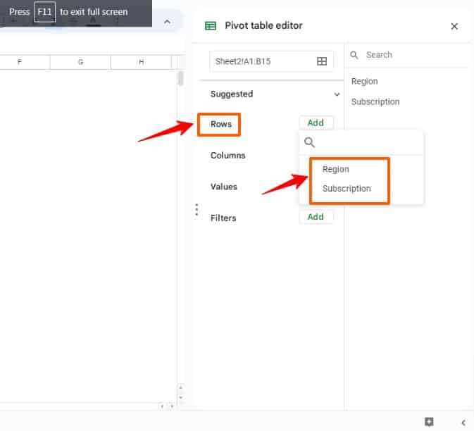
Then, in Values, choose the data you want to summarize. In this case, select “Region” again and then “Subscriptions.”
Once you’ve completed these steps, your table is complete.
To gain a better understanding of pivot tables, it’s necessary to look into a few of their key features and capabilities.
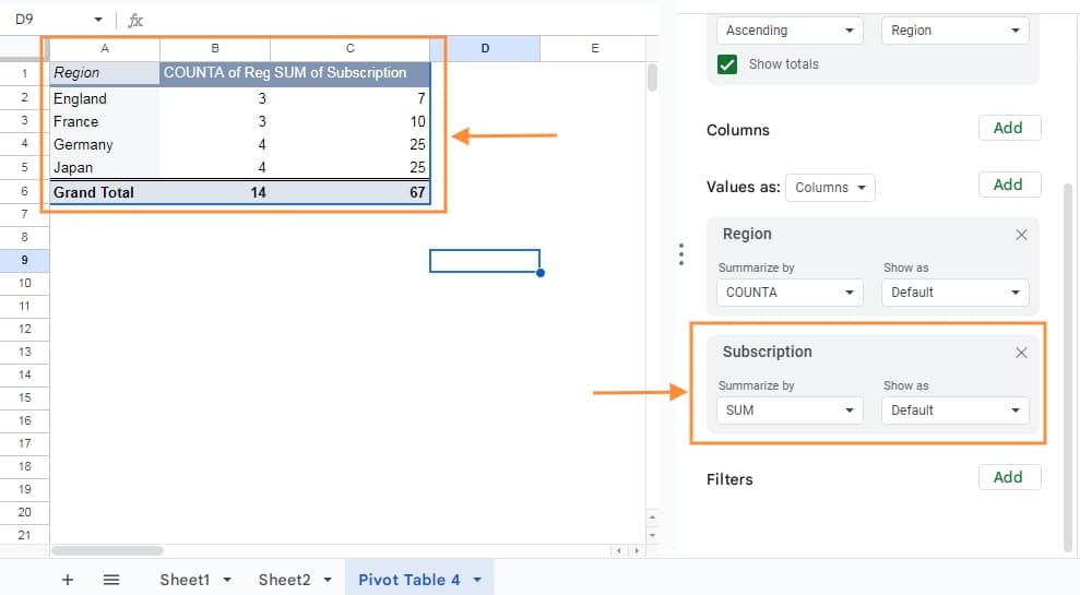
Columns
To add columns in a pivot table, select the “Add” button under the “Columns” category in the pivot table editor.
This will display a list of unique column headings in the top box of the table. The pivot table summarizes the data by displaying aggregated information for each column.
Rows
To add rows in a pivot table, select the “Add” button in “Rows” category in the editor. This will display the column headings in your table. Choose a column heading to include distinctive data from that column as heading in the pivot table.
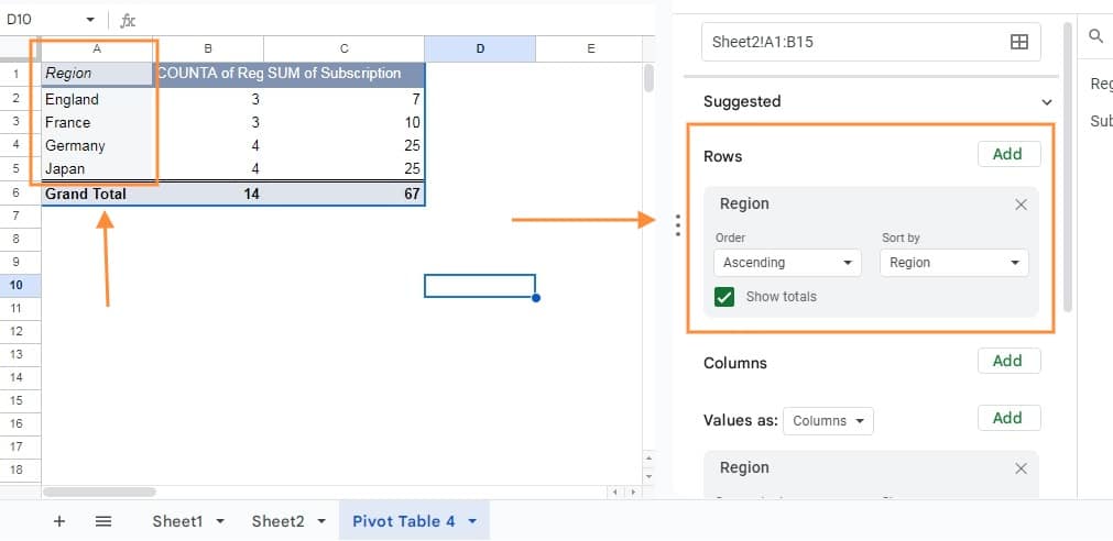
These fields appeared in the “Rows” category are in the left side of table. This pivot table summarizes the data by taking all the rows’ information and consolidating it into a smaller number of rows.
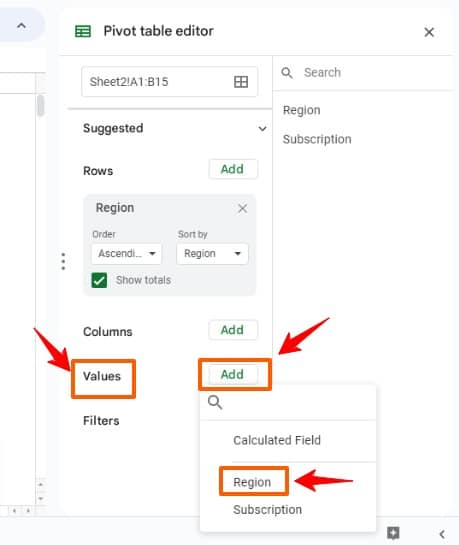
Values
Select “Value” from the editor to see a list of column headings. Selecting one of these headings will bring about the table to sum up that particular column. The fields from the category “values” appear as numbers in the middle box of the pivot table.
You can choose to summarize the data in different ways, such as by summing or averaging revenue or counting text values.
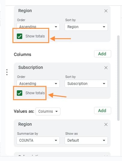
Totals
If you want, you can disable or enable the totals that display the total of “Values”. To turn this option on or off, mark the checkbox to the “Show totals” in the editor.
Refreshing pivot tables
By default, pivot tables in Google Sheets automatically update when you make changes to the original data.
But, in some cases, you may need to refresh the pivot tables manually, if they do not update automatically. There are several reasons why this may happen. Some of the reasons are mentioned here along with the solution:
#1 You are using filters
If filters are used pivot table, the data will not update automatically when you make any changes to the original set of data. To address this, remove any filters from the editor. You can do this by clicking the cross button located on top right in the Filters option.
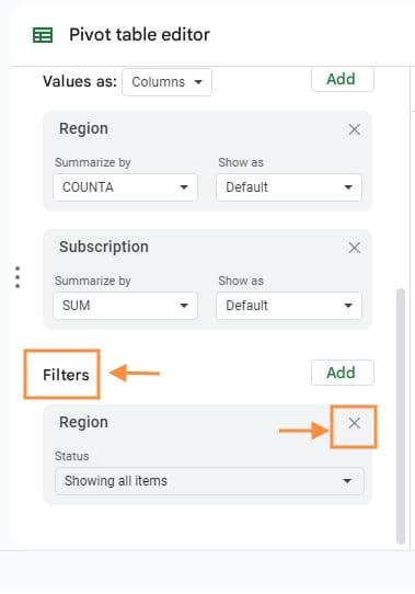
Make the required changes in the sheet and add the filter back from the editor by clicking Add button.
#2 Newly added rows are outside of the table’s range
While creating pivot tables, it use set cell ranges from the original worksheet. And if new data is added outside of this range, it will not affect the table.
To solve this, ensure that the recently added data comes in pivot table’s range.
#3 Original dataset may have functions like RANDOM, TODAY, etc.
Functions like RANDOM, TODAY, and such in the main dataset can prevent your pivot table from updating automatically. One thing you can do to avoid this situation is to remove these functions from the main dataset.
Refreshing the tables involves using the editor or modifying certain information within the source datasheets.
Moreover, you can take before and after snapshots of the pivot tables so that you can track the effects of changes made to the source data.
Conclusion
Pivot tables are one of the best features in Google Sheets that enables users to efficiently analyze and summarize data, leading to valuable insights. By leveraging this tool, you can save time and energy by avoiding the use of complex formulas and presenting information that is easily accessible to stakeholders.
Learning how to use pivot tables can simplify the data collection, analysis, organization, summarization, and reporting process. For even greater efficiency, you can explore the use of Cloud Pivot Tables.
Using pivot tables is straightforward and allows for experimentation with various fields in different parts of the Pivot table editor to uncover different data insights. Once you have mastered the fundamentals, you can take your skills to the next level by exploring more advanced features.