Effective communication relies heavily on visual elements that captivate and engage audiences. Among the most powerful tools for data visualization are charts and graphs, which condense complex information into easily understandable formats.
However, the impact of these visual representations goes beyond the data itself. Color, a fundamental aspect of design, plays a crucial role in charting a path towards captivating and persuasive visualizations.
Color theory is a popular concept in art and science which unlocks the potential to create visually appealing and impactful designs. Its significance is not limited to mere aesthetics, as colors possess the ability to evoke emotions, convey meaning and influence the viewer’s perception.
Designers seeking to create engaging charts and graphs that truly resonate with their audience, needs to understand and harness the potential of color theory.
Through this article, our purpose is to delve into the multifaceted role of color theory in designing captivating charts and graphs. We will explore the fundamental principles of color theory, examing the importance of color in data visualization, and provide practical strategies for leveraging color effectively.
So, whether you’re a data analyst, a graphic designer, or simply someone passionate about visual communication, join us as we unravel the fascinating world of color theory and discover how it can transform your charts and graphs into engaging works of art.
Contents
Understanding color theory
To completely understand the role of color in designing engaging charts and graphs, it is importance to grasp the principles of color theory. It provides a systematic framework for understanding how colors interact our visual perception. Let’s explore the key components of color theory:
Explanation of color theory principles:

Primary, secondary and tertiary colors:
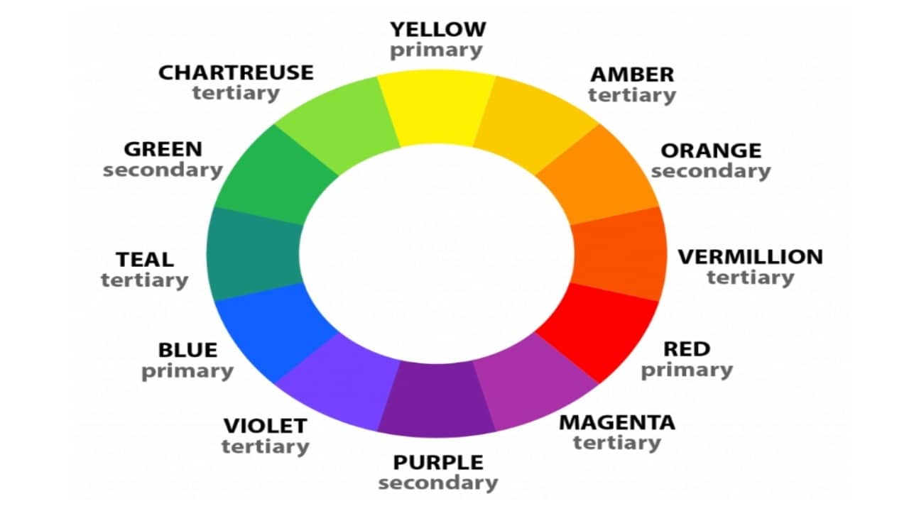
Color theory begins with the concept of primary colors – red, blue, and yellow. These colors cannot be created by mixing other colors. Secondary colors, such as orange, green, and purple, result from combining two primary colors. Tertiary colors are created by mixing a primary color with a neighboring secondary color on the color wheel.
Color wheel and its components:
Color wheel represents the relationships between colors. It consists of 12 hues arranged in a circular format. The wheel begins with primary colors, followed by secondary and tertiary colors. This arrangement aids in understanding color relationships and harmonies.
Color harmonies:
Color harmonies refer to specific combinations of colors that are visually pleasing when used together. Some common harmonies include complementary (colors opposite each other on the wheel), analogous (colors adjacent to each other), and triadic (colors forming an equilateral triangle on the wheel). These harmonies offer a balanced and cohesive visual experience when applied in designs.
Perception of colors and their psychological impact:

Emotional associations with different colors:
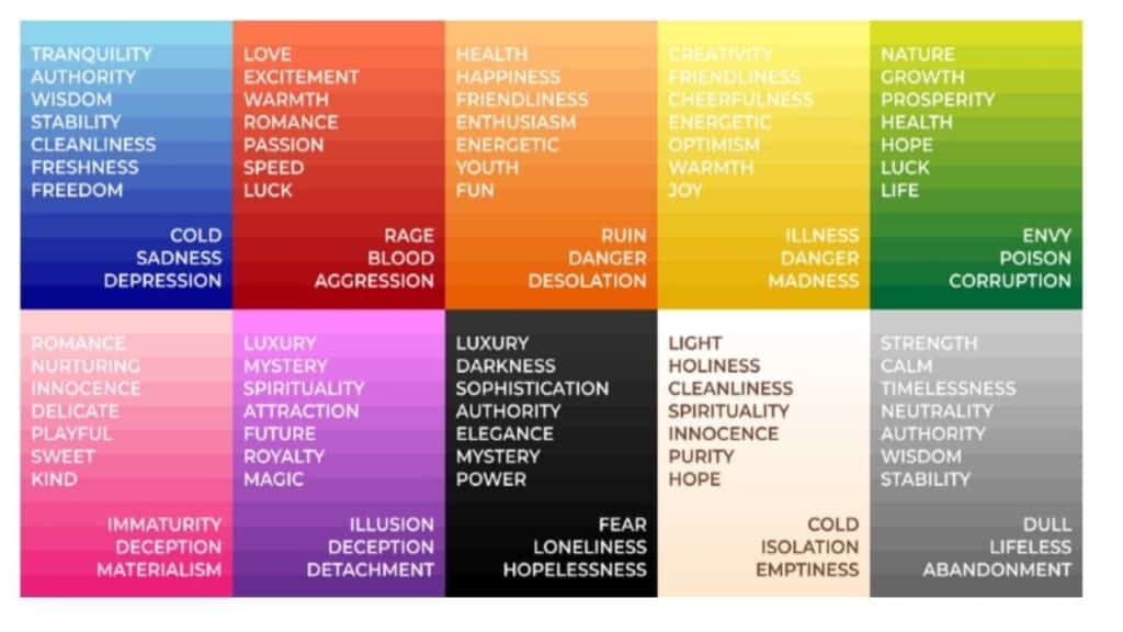
Colors have the power to evoke specific emotions and psychological responses. For example, red is often associated with passion and energy, while blue conveys calmness and trust.
Understanding these emotional associations can help designers create visualizations that align with the intended message and elicit the desired response from the audience.
Cultural and contextual influences on color perception:
The interpretation of colors can vary across different cultures and contexts. Colors that hold symbolic meanings in one culture may carry different connotations in another.
For instance, while white signifies purity and innocence in Western cultures, it symbolizes mourning in some Eastern cultures. It is crucial to consider these cultural and contextual factors to ensure the intended message is effectively conveyed.
The use of color symbolism in design:
Colors can be used symbolically to enhance the visual impact of charts and graphs. For example, green often symbolizes growth and prosperity, making it suitable for representing positive financial trends.
Similarly, yellow is associated with optimism and can be utilized to highlight positive data points. Understanding color symbolism allows designers to add depth and meaning to their visualizations.
Importance of color in data visualization

Color plays a pivotal role in data visualization. Here are several reasons why color is crucial in designing engaging charts and graphs:
- Enhancing visual appeal and user experience:
The strategic use of color can significantly enhance the visual appeal of charts and graphs, capturing the viewer’s attention and making the information more inviting.
By employing visually appealing color schemes, designers can create an enjoyable and immersive experience that encourages users to explore the data further.
- Facilitating data comprehension and interpretation:
Color aids in making complex data more accessible and understandable. By assigning different colors to distinct data categories or variables, designers can help viewers quickly distinguish between different elements within the visualization.
This facilitates faster data comprehension and simplifies the process of extracting insights from the information presented.
- Aiding in highlighting key insights and patterns:
The use of color can draw attention to critical insights and patterns within the data. By employing color strategically, designers can highlight specific data points, trends, or outliers, guiding viewers towards the most important information.
This helps users identify significant patterns and draw meaningful conclusions from the visualization.
- Guiding the viewer’s attention and emphasizing important information:
Color can be employed to direct the viewer’s focus to specific elements within the chart or graph. By using contrasting colors or bold hues for important data points or labels, designers can create visual cues that guide the viewer’s attention. This ensures that the most relevant information stands out and is easily noticed.
- Establishing visual hierarchy and organizing complex data:
Complex datasets often contain multiple layers of information that need to be organized in a clear and coherent manner. Color can be used to establish a visual hierarchy, enabling viewers to differentiate between different levels of data or categories.
This helps in structuring the information and ensuring that it is presented in a logical and digestible manner.
Color selection strategies for charts and graphs
Selecting the right colors for charts and graphs is vital for creating engaging and effective visualizations. Careful consideration of color choices ensures readability, accessibility, and meaningful representation of data. Here are some key strategies for color selection:
Considerations for color palette creation:

Color contrast and readability:
High contrast between data elements and the background is essential for readability. Select colors that provide sufficient contrast to ensure that data points, labels, and axis markings are easily distinguishable.
Color accessibility and inclusivity:
Consider the accessibility needs of your audience by adhering to color contrast guidelines and avoiding color combinations that may pose challenges for individuals with visual impairments. Ensure that color choices are inclusive and accessible to all users.
Consistency and coherence across different charts:
Maintain consistency in color usage across multiple charts and graphs within the same project. Consistent color schemes establish visual coherence and aid in the seamless comparison of data across different visualizations.
Using color to represent data categories:
Choosing distinct colors for different data sets:
Assign visually distinct colors to different data sets or categories to facilitate differentiation and enhance visual clarity. Avoid using similar colors that may cause confusion or make it challenging to distinguish between data elements.
Using color to convey qualitative or categorical information:
Leverage color to represent qualitative or categorical data. Assigning different colors to distinct categories helps viewers easily identify and understand the relationships or differences between various data groups.
Utilizing color for quantitative data representation:
Color gradients and scales for continuous data:
For representing continuous or numerical data, utilize color gradients or scales. Gradual transitions between colors can visually communicate the range or progression of values, making it easier to perceive variations in magnitude.
Applying color intensity or saturation to indicate magnitude:
Altering the intensity or saturation of a color can effectively represent different levels of magnitude within a dataset. For example, darker shades can indicate higher values, while lighter shades can represent lower values.
Avoiding common pitfalls and misconceptions in color usage:
Ensuring color-blind friendly designs:
Take into account the needs of individuals with color vision deficiencies by using color combinations that are easily distinguishable for color-blind viewers. Test your designs using color-blind simulation tools to ensure clarity and accessibility.
Addressing cultural considerations:
Be mindful of cultural associations and symbolism attached to certain colors. Colors may carry different meanings in different cultures, so consider the cultural context of your audience to avoid misinterpretations or unintended messages.
Accounting for color reproduction variations:
Colors can appear differently on various devices and when printed. Consider the medium of presentation and calibrate your color choices accordingly to ensure consistent and accurate representation across different platforms.
Best practices for effective color implementation
While understanding color theory and selecting appropriate colors are crucial, effectively implementing colors in charts and graphs requires attention to detail and adherence to best practices. Here are some key considerations for ensuring the successful implementation of colors in your visualizations:
Maintaining simplicity and minimalism:
Avoid overwhelming your charts and graphs with an excessive number of colors. Keep the color palette simple and use only the necessary colors to convey the intended information. A clutter-free visualization allows viewers to focus on the data itself without distraction.
Prioritizing readability and clarity:
Legibility should be a top priority when using colors in your visualizations. Ensure that text, labels, and data points are easily readable against the chosen background and color combinations. Test the readability of your charts, particularly when using smaller font sizes, to guarantee clarity for all viewers.
Ensuring color consistency throughout the design:
Consistency in color usage is essential for creating a cohesive visual experience. Establish a clear and well-defined color scheme and apply it consistently across all elements of the chart or graph. Consistent color usage aids in reinforcing the relationships between data points and enhances the overall coherence of the visualization.
Testing and iterating designs for user feedback:
Test your visualizations with a diverse set of users and gather feedback on the effectiveness of the colors used. User testing provides valuable insights into how viewers interpret and engage with the visualization. Use the feedback to refine your color choices and make necessary adjustments for improved user understanding and engagement.
Adapting color choices for different mediums (print, web, mobile):
Consider the medium of presentation when finalizing color choices. Colors can appear differently on various mediums such as print, web, or mobile screens. Make adjustments and test your visualizations across different platforms to ensure consistency and optimal color reproduction.
Conclusion
The role of color theory in designing engaging charts and graphs cannot be understated. Color serves as a powerful tool for enhancing data visualization, improving user experience, and conveying information effectively. By understanding and applying color theory principles, designers can create visually compelling and impactful visualizations that captivate and engage viewers.
Throughout this article, we explored the principles of color theory, the psychological impact of colors, and the significance of color selection in data visualization.
We discussed the importance of maintaining simplicity, prioritizing readability, ensuring color consistency, testing designs for user feedback, and adapting color choices for different mediums. These best practices enable designers to harness the full potential of color to convey complex data in a visually appealing and accessible manner.
By employing the principles outlined in this article, designers can take their charts and graphs to new heights, creating engaging and impactful visualizations that resonate with audiences.
