Google Sheets are one of the most popular spreadsheet programs out there to organize and analyze information. And if you are looking to visually represent the flow of data or information in your Google Sheets but don’t know where to start, this article is just for you.
In this article, we’ll show you how to create a Sankey diagram in Google Sheets using the ChartExpo add-on.
With ChartExpo, creating a professional-looking Sankey diagram has never been easier. So, roll up your sleeves and get ready to impress your colleagues with your data visualization skills.
Contents
What is a Sankey Diagram?
Before we dive into the process of creating a Sankey diagram, let’s first discuss what a Sankey diagram is and how it can help your data visualization efforts.
Sankey diagrams are a type of flow chart that displays the movement of data, energy, or money between various entities. In the chart, nodes represent entities, while links demonstrate their flow.
Each link’s width corresponds to the quantity or amount of flow – providing an intuitive understanding of the variables’ relationships with one another.
Sankey diagrams are an efficient method for visualizing complex data sets and helping identify patterns, trends, and relationships that may not be possible from raw data alone.
They’re widely used in fields such as engineering, economics, and environmental science to assist researchers and decision-makers in understanding resource movement and the effects of different variables.
Components of Sankey Diagram
The Sankey diagram has three primary components:
- Nodes: These nodes represent different variables or categories within the data set and are typically displayed as rectangles or circles whose size reflects their magnitude.
- Links: Links connect nodes and represent the flow of data, energy, or money between them. The thickness of these links reflects the magnitude of that flow.
- Flows: Flows refer to the quantities of data, energy, or money that flow between nodes. They are typically represented as arrows or ribbons, with their width varying according to how much flow there is between each node.
Now that you understand the fundamentals of Sankey diagrams let’s move on to creating one.
You may like: How To Draw Sankey Diagram in Excel and Using Tableau
A step-by-step guide to drawing Sankey diagrams in Google Sheets using ChartExpo
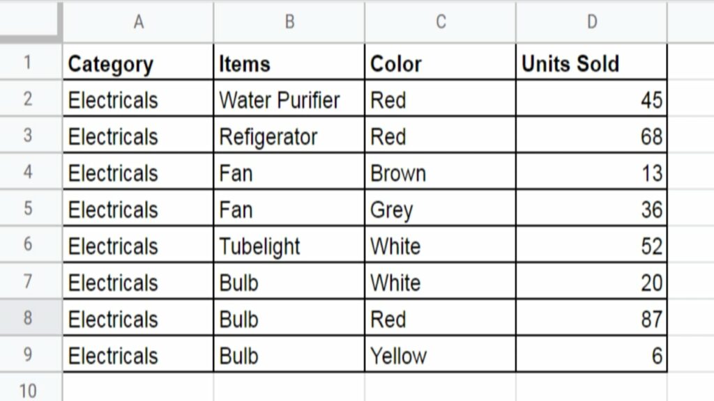
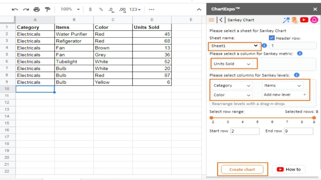
Step 1: Open the Google Sheets that contains the data you want to visualize. For this guide, we’re going to use the below data as an example.
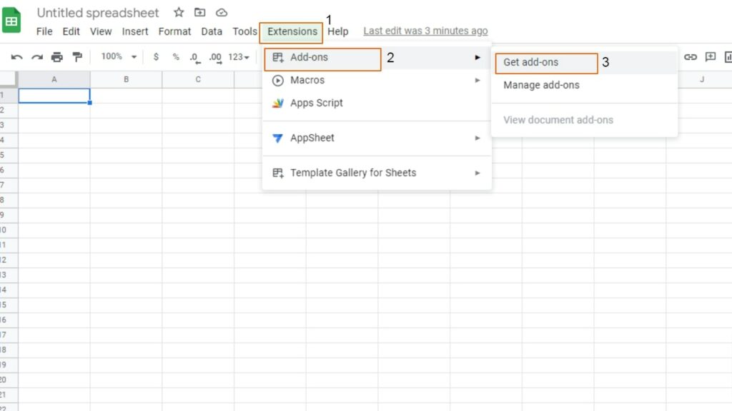
Step 2: In the top toolbar of Google Sheets, you’ll see an option for “Extensions.” Click on it and click on “Add-ons” and then “Get add-ons.”
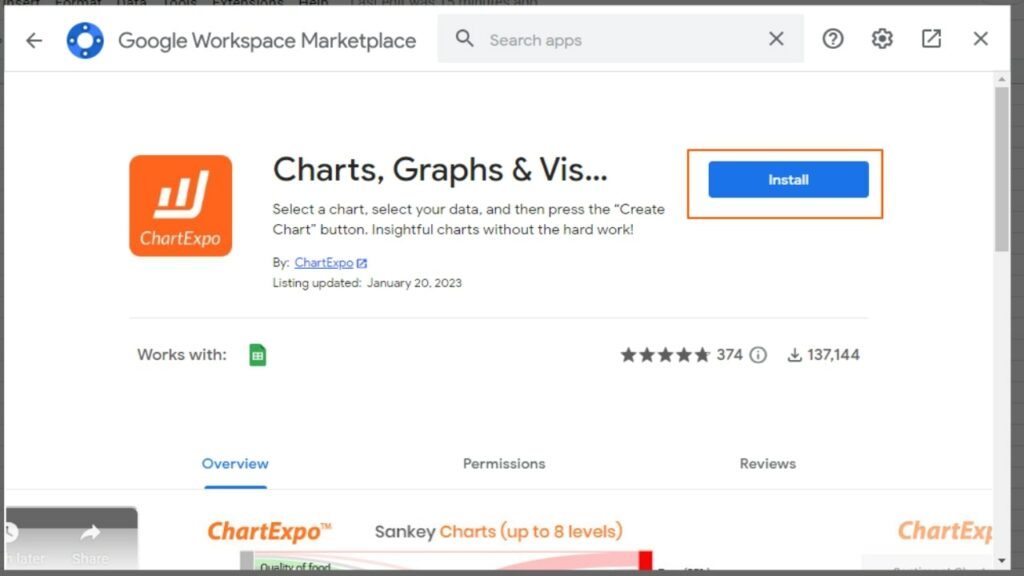
Step 3: Type “ChartExpo” in the search bar and hit Enter button.

Click on the ChartExpo extension
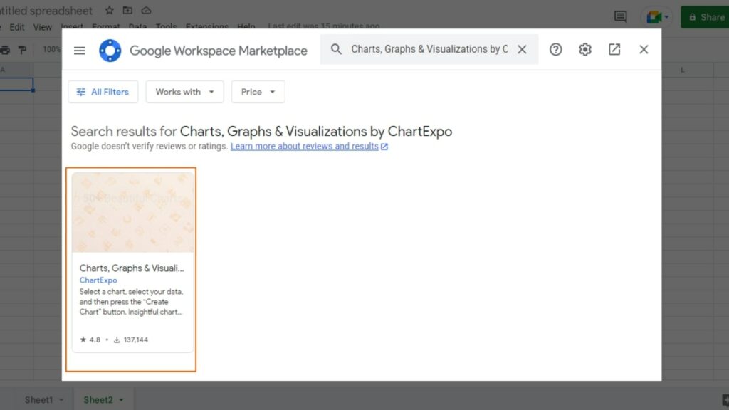
Click on the Install button to install the add-on in your Google Sheets.
It may ask you for permission to install; click on Continue and give the required permission.

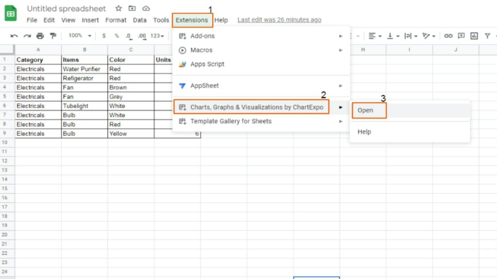
Step 4: Once the add-on is installed, it will appear in the Extension drop-down menu. Open the sheet that contains the data, click on Extension, and then load the ChartExpo add-on.
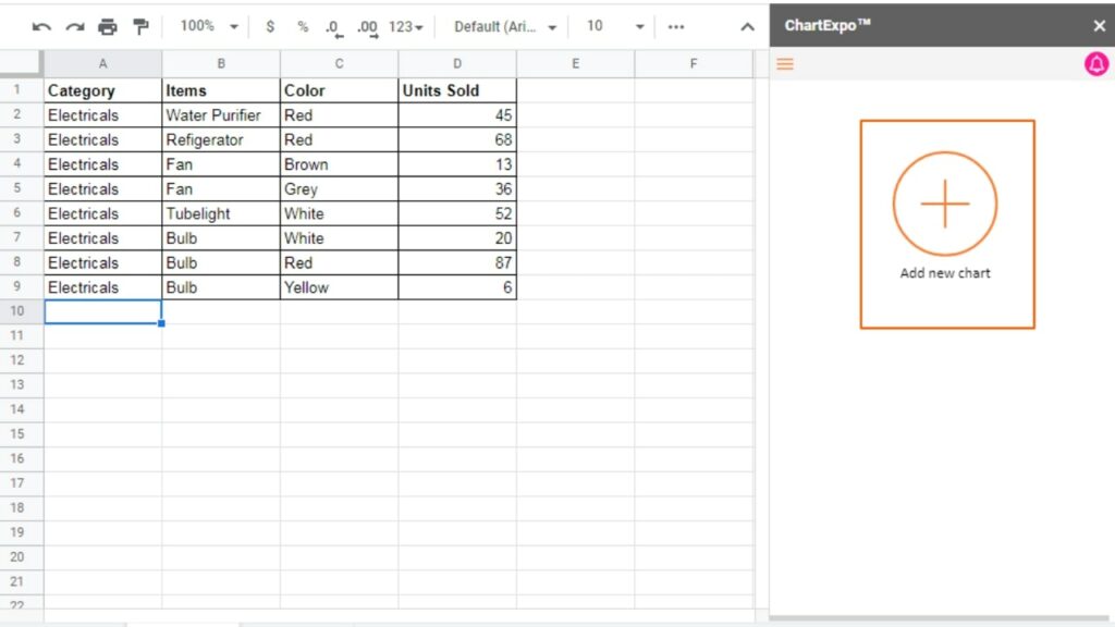
Step 5: When the ChartExpo add-on loads, it will appear on the right side of the spreadsheet. Press the large, circled plus sign to begin creating a new chart.
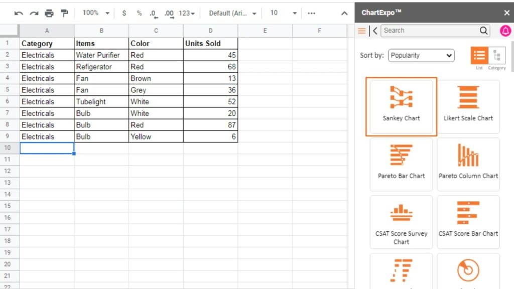
Step 6: Once clicked, you’ll see many chart options. Click on the “Sankey Chart” from there.
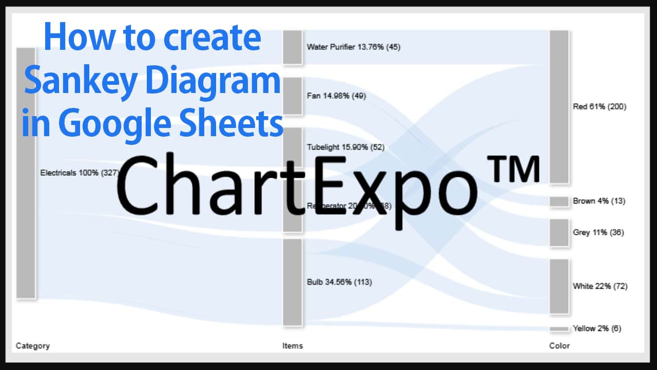
Step 7: Now select the sheet and metrics. The metric column should contain numerical values. In our case, the sheet name is “Sheet 1,” and the metrics column is “Units Sold.”
Select other columns as levels. For this example, we’ll use Category, Items, and Color.
Finally, click the “Create Chart” button.
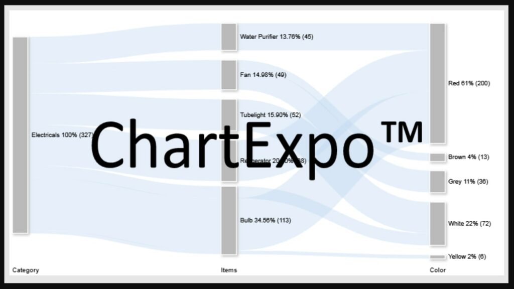
The resulting Sankey chart will look something like this.
Step 8: The chart you see may look plain and dull and lack certain elements like title, level headings, colors, etc. Click on the “Edit chart” button, as shown below.
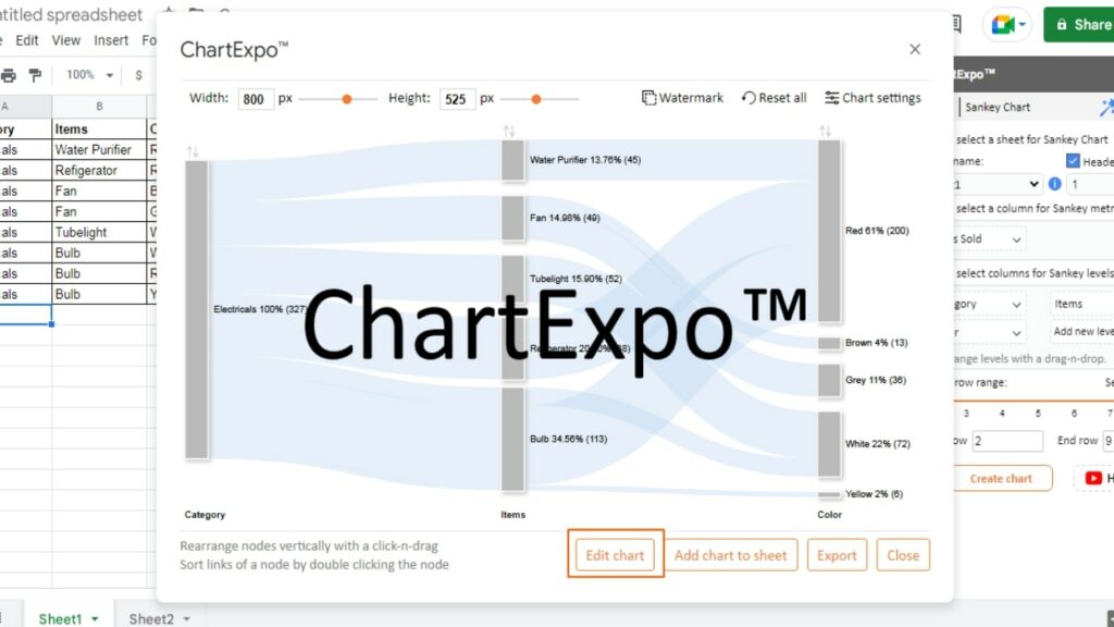
Step 9: To give a title to the chart, click on the pencil icon next to the “Chart Header” at the top of the chart.
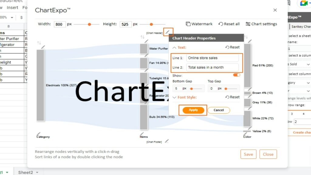
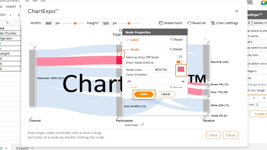
Step 10: Just like you changed the title of the chart, you have the option to change the name of levels, the color of the nodes, etc. Simply click on the pencil icon next to the thing you want to change, and you’ll see different options.
For example, the below screenshot shows you how to change the color of the nodes.
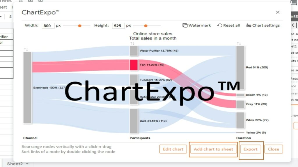
Step 11: Once you finish editing your Sankey diagram, exit the editing mode. Now you can either add the chart to your Google Sheets or download it to use elsewhere in presentations.
Benefits of a Sankey diagram
The chart makes it simple to recognize the most significant changes in the key indicators that are important to you.
The Sankey diagram is versatile and adaptable, which makes it a great tool for tracking metrics. This means you can use it for tracking costs and materials, as well as marketing analytics and other things.
Be aware that the flow of the data is very important in the chart. The primary objective of the Sankey analysis is to present the reason behind why and how certain metrics are moving.
The Sankey diagram helps you identify the most significant changes in your data over various types or stages that matter to you.
The size of the nodes and links in the Sankey diagram represents the critical elements of your data sets.
Apart from the data flow, the second important benefit of Sankey is the ability to see the most important data details from a bird’s eye view.
This high-level perspective is invaluable, especially when you’re trying to assess the effectiveness of a process such as budget management.
You can use the Sankey diagram to display data from a wide range of industries. For example:
- Renewable energy chart
- SWOT analysis
- Energy production
- Business process
- Cash flow analysis in finance and budget
- Visualize customer journey
- Marketing analysis
What does the Sankey diagram represents?
A Sankey diagram is an effective way of analyzing data that involves flow attributes, such as materials, funds, and energy.
The diagram shows nodes that are linked to each other, with the width of the flow lines indicating the metric value being studied. To differentiate between different metrics, contrasting colors are used.
For instance, if you want to analyze your household budget, a Sankey diagram can provide a bird’s-eye view of your entire budget.
Essential and non-essential costs can be differentiated by using separate nodes. The size of each node represents the significance of each cost to the household.
By observing the largest flow, you can identify the most substantial expenses, such as eating at restaurants and make decisions on whether to reduce them.
FAQs
Do Google Sheets have an in-built Sankey diagram feature?
No, Google Sheets doesn’t have a Sankey diagram builder.
When should you not use Sankey diagrams?
When your data sample size is small, you won’t get accurate and reliable insights. Furthermore, your data should consist of more than three attributes to the Sankey chart to display insights easily and conveniently without clutter or distortion.
Wrapping up
Sankey diagrams are an effective tool for visually representing the relationship between different variables. With ChartExpo, creating a professional-looking Sankey diagram in Google Sheets is simple and straightforward.
Sankey diagrams are an efficient method for visualizing complex data sets and can assist in recognizing patterns, trends, and relationships that may not be attainable from raw data alone.