Getting a clear picture of the forward flow of the things is a factor that is worth noticing. If you have been wondering whether the same can be done in a diagrammatic form, the Sankey diagram helps achieve just that. This designed diagrammatic representation helps in better understanding of the directed flows in the process.
If you have been inquisitive about known what a Sankey diagram is, we have sorted out some of the most important pointers.
Contents
What is Sankey diagram?

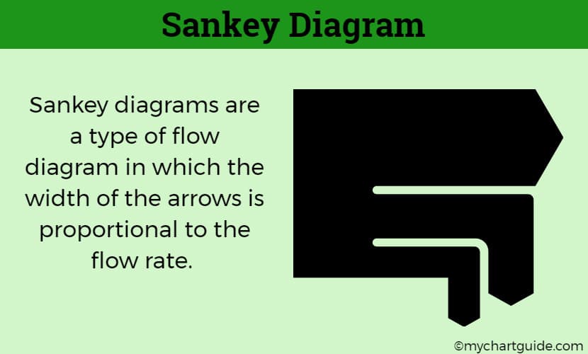
As mentioned before, a Sankey diagram is a visual representation of the flow involved in a process. What makes this one different is the fact that the arrows used in them come with the width that is proportional to the flow quantity.
They are predominantly use as a mode of visualizing both the energy or material transfers that are involved in a process of system.
Say, if the flow is twice as the normal, the width of the arrow will be just as similar. This is the reason why it is important that one understand the flow better to be able to depict accurate representation of the same on the charts.
Where did it originate?

Before we end up delving more into it, it is important that we do discuss about the history of this charting and how it originated.
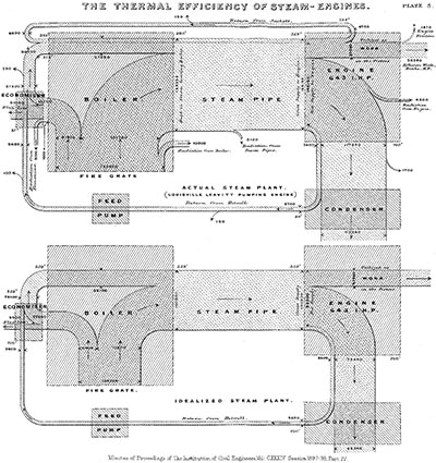
The Sankey diagram was first drawn and illustrated by an Irish engineer Captain Matthew Henry Phineas Riall Sankey back in 1898 and hence the name. He used the same to make comparisons between the energy balance in the steam engines.
Before it became popularized, Charles Joseph Minard also used the same back in 1812 for Napolean’s Russian campaign.
Later between the years of 1850 to 1936, Austrian mechanical engineer Alois Riedler started making use of these flowcharts for better a better analysis of the energy flow in a system.
This diagram did garner a lot of popularity over time, especially in Germany where it was used for deducing the material and energy efficiency involved in a process.
In the current world scenario, the same is used for the data visualization and to keep an eye out of the flow involved in a process.
Why should one use Sankey diagram?
Given the kind of popularity that the Sankey diagram has garnered, it isn’t a surprise at all that people still question the significance of using this diagram.
If you are wondering what, the Sankey diagram does help provide better understanding of the balance between the energy and material flow in a system or process.
Some of the other reasons why the Sankey diagram is a must use include:
i. Helps better communication
One of the primary and most important reasons why the Sankey diagram is a good one is because it promotes easier communication of the processes of the energy flow in a process to your customers. The visual representation provides with real time knowledge of the same, helping get a better look at things.
ii. Better detection of inconsistencies
When you have a drawn out process of the data, it helps in better understanding of the loopholes in the process. It is actually very effective in helping understand any inconsistencies in the process before it does take a turn for the worse. It helps mitigate the shortcomings right before it takes a worse shape.
iii. Better outreach
Lastly, one of the reasons Sankey diagram is so good is because it accommodates larger applications and processes with ease. What this means is that you wouldn’t have to worry about the same in case you are stuck with a large application that needs better diagramming.
How can one draw a Sankey diagram?
For those wondering, you can either use manual tools to draw the Sankey diagram for your need but the same doesn’t always suffice, especially when you are dealing with bigger projects and processes.
It is quite common for many to depend on the manual means but if you are working on a project that demands the input of a large database, it is quite important that you do have some important insights sorted out.
- Go through: How to create Sankey diagram in Excel and in Tableu.
Doing it manually doesn’t necessarily come in handy during such situations. There aren’t many platforms that come with templates for Sankey diagram but Tableu is often considered good enough if you are asking for one.
Make sure that you do work out the basics first because that is what matters in the end. For better representation of the energy flow, it is a necessity that you have a complete idea of the data visualization, the energy flow and the overall process for it to be done effectively.

Thanks! I needed this information for a school presetation and u helped me a lot!
I searched a lot for a proper definition for my bachelor research but I couldn’t find anything helpful, thank you a lot for doing us a big favor