Diagramming can get tough when it comes to Sankey charts, especially because of the fact that it doesn’t come with standard flowchart or tree diagram templates. But, with special add ins like Power User, the process does become a lot easier and more streamlined that what you could even think of.
To be honest, creating a Sankey diagram with Power User on MS Excel takes you about 5-10 minutes, even with all the customizations. It is the data entry part that takes you the maximum time. So, if you have been wondering how to draw a Sankey diagram in Excel, follow through the steps that we have mentioned below.

How to draw Sankey charts in MS Excel?
Before we shed some light on the step by step breakdown of how to draw Sankey charts in Excel, we would like to give a brief description of what Sankey charts actually are.
The Sankey charts or diagrams are a form of flow diagram which helps in representing the flow rate, ensuring that the width of the diagram is proportional to the flow rate as well.
- Also check: Sankey Diagram in Tableau Tutorial here.
This helps in highlighting the primary energy flow involved in any process, be it with the energy or even with the money involved in a process.
So, how can you draw the Sankey Chart on MS Excel using Power User? Let us take a look at the steps, shall we?
Step 1: Installing Power User
Before we start creating the Sankey diagram, it is necessary that one installs the Power User first.
For this, follow through the following steps.
- Go to https://www.powerusersoftwares.com/ and from there click on the “Free Download” option on the top.
- Once the download is complete, click on the downloaded file and install it.
- To add it in MS Excel, click on the “File” option and then click on the “Excel Options” on the bottom.
- From there, go to “Add Ins” and enable the Power User option.
- Once that is enabled, you will be able to see it on the Toolbar of MS Excel.
Step 2: Drawing the Sankey Chart
Once you have installed the Power User, the next steps are where you follow through to create the Sankey chart. Let us take a look.
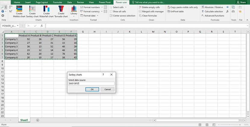
- Start by opening your MS Excel sheet and enter the data that you want to be transformed into a chart.
- On the top, on the tool bar, you will find the “Power User” tab. Click on that and you will find the Create Sankey Chart Option.
- Select the cells with the input data and then click on “OK” to proceed creating the chart.
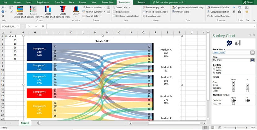
- The moment you click on “OK”, the Power User add in creates the Sankey chart automatically for you as shown below.
- Once the chart has been created, you can open the customization options on the right and change the color scheme, the titles and the rest of the prospects that you need to be changed in accordance to your needs.
- Following that, you can save the changes and finally save the Excel sheet with the final Sankey chart prepared.

Often times, the installation process under the Power User can be a bit difficult and can show errors. For any such issues and discrepancies that you are facing, make sure that you go through the Power User FAQs to get a better idea of things.
about it give it a shot, sounds simple!
Sadly, the free version does not include charts. 🙁
It would be most helpful if there were instructions on how to created a two tiered Sankey diagram. I have searched and can find no information connected with Power-user.
Any help, greatfully received!
Could describe what you mean by a 2-tiered Sankey diagram (or better yet, include a picture)?
it means 2 or more layers