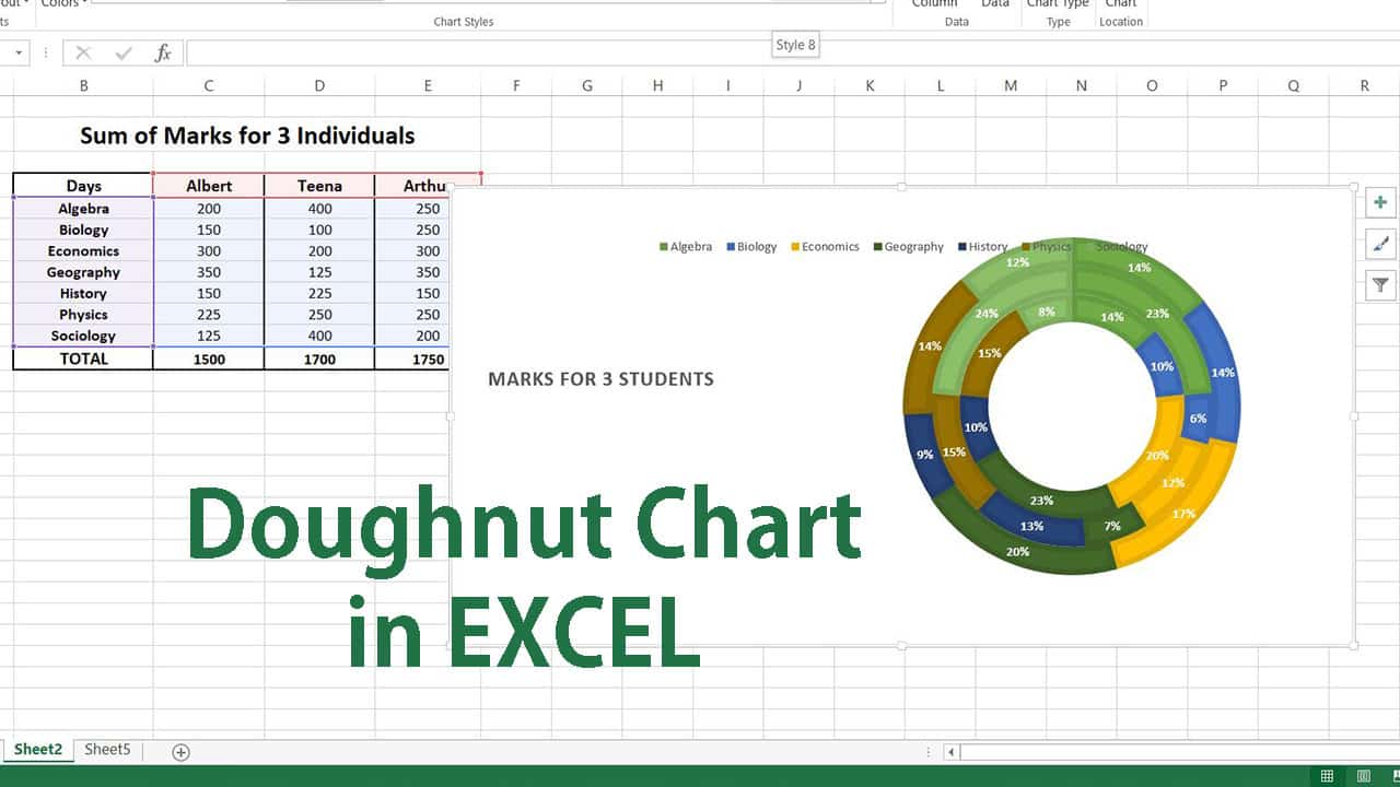
A Doughnut chart can be touted as an extended visual depiction of a pie chart, which makes the graph more illustrative and appealing to the viewer.
The charts constitute of multiple colorfully attractive circular figures that appear as a doughnut encircled one below the other in the overall circular structure. While pie charts are used to represent and compare values for only one series of categorical data, doughnut charts offer data comparison for multiple series of information.
This facilitates the generation of multiple doughnuts in the graph, where each doughnut corresponds to an individual data series.
The charts are found to be more efficient and pronounced for use across various business and team communication activities as they impose a coherent understanding of the contributions and goals, which brings simplicity of data analysis.
Doughnuts charts witness higher use in team meetings and presentations as they help to enforce an easy understanding of the results in terms of profit, loss and productivity for an organization.
Creation of doughnut charts in the Excel application does not necessitate any prior designing skills or expertise. Microsoft Excel is well equipped and configured to fabricate a wide span of graphs and charts, which can be handy to a user in a jiffy upon selection by a click on the chart icon.
Once the chart is inserted into the workspace on the spreadsheet, it can be enhanced with numerous customization attributes to render maximum impact and clarity of understanding to the viewer.
Steps involved in generating Doughnut Charts in Microsoft Excel
The procedure associated with crafting a doughnut chart or graph in the Excel software can be accomplished in a matter of a few instances that demand navigating around the interactive interface.
The doughnut chart option is readily available on the menu bar under the graph options in the insert tab and can be embedded with just a click of a mouse.
Once inserted, it can be decorated with customizable colors, text, fonts, titles, background effects and layouts. One of the key features of creating the doughnut chart in Excel is that the data values can be illustrated in the form of percentages for every data series.
Available Data:
On the basis of an example of marks obtained by 3 different individuals across 7 diverse segments, let us consider the creation of a doughnut chart in the application. The foremost activity in the process is to pen down all the cell data values in the form of rows and columns into a tabular format on the spreadsheet.
Step 1:
Once all the data is entered on the excel sheet, find the sum of all the values for each of the columns in the table by simply inserting the formula for the sum on the respective cell as pictured below.

Once the value for the first average is created, simply drag the cell towards the end of the table to generate the values for the other columns as shown below.

Step 2:
After all the data is distributed on the sheet, select the data and go to the insert tab on the menu bar and choose the doughnut chart option from all the available chart icons.

Once the graph is inserted on the screen, format the chart structure for the existing text as well as its associated font and color.

With a right-click on the plot area and selection of Format Chart Area as pictured below, a palate of customization options pops up on the screen.

The chart can be formatted with respect to doughnut hole size, doughnut expansion as well as angles of the slices for every individual doughnut.

In addition, the circular structure can be formatted for colors, style and addition of data labels, legends as well as the chart title as illustrated one below the other. The chart can be also styled to include the percentage values instead of numerical.
Colors

Data Labels

Style

The resulting doughnut chart can be finally be personalized for the choice of layout from the format tab option on the menu bar as seen below.

Introspecting the doughnut chart generating process in Microsoft Excel, it is safe to say that the application offers a user-friendly and interactive interface that makes navigating across the workspace easy.
As the insertion and designing procedure is done in instances of a few clicks, it saves a lot of time for the user without having to creatively invest or think on the designing perspective.
Overall, doughnut charts derived in Excel can be saved and exported to other spreadsheets for sharing and team collaboration purposes. The graphs also impose a coherent understanding for comparison of data owing to the simplicity and clarity of the created structure.
