Pie charts might sound old school but they are still effective enough in expressing ratios of a data without any hassle. If you have been planning to make one on Excel, the steps are pretty easy and self explanatory.
It doesn’t require a lot of hassle if you do follow through the steps that we are going to mention around. Just ensure that you have the relevant data that you would like to be expressed into a pie chart.
What is a Pie Chart?
A pie chart is a circular diagrammatic representation of the statistical data to get a clear picture of things without any further complications. The reason why it is called pie chart is because the segments are divided into slices much like how you do with a pie.
The divided slices are proportional to the statistical data that comes against the same. Some of the significance and benefits of pie chart include:
- Better display of the relative proportions in the data
- Helps provide a better summary of the entire statistical data
- Easier to understand visually in comparison to the other available diagrammatic representation
- Helps take a look at the loopholes to promote better accuracy
How to create a Pie Chart in Excel?
Making a pie chart on Excel is a cakewalk. Everything is almost right there as pre-requisites. Some of the steps included in making this include:
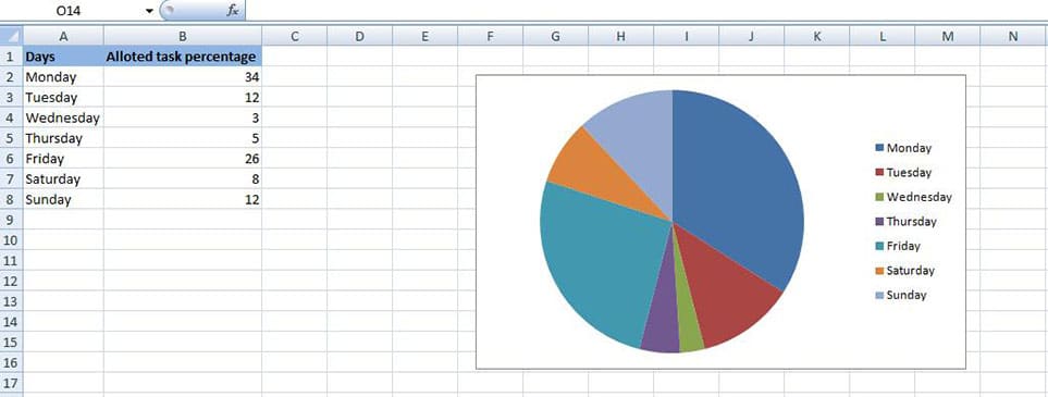
- Start by preparing the data as shown in the picture below. You need to input the data according to your needs.

- Once the data has been written down, select the data, go to Insert and from there, select the “Pie chart” option from the “Charts” section.
- Once you click on that, the Pie chart is automatically created for you on the side like shown below.

- You can leave it at that or go ahead and customize it according to your needs.
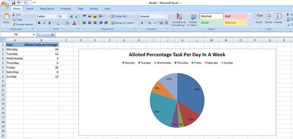
- For customization, you can easily go select the chart first and select Design option from the menu.
- Once there, you can change the layout and the overall look of the chart as show below.

- If required, you can even change the overall background and the color of each of the slices in the chart.
- It all does come down to your requirements and the kind of data that you are working with.
Making a pie chart on Excel is literally like a piece of cake. If you have all the data sorted out, just ensure to follow through the steps as we mentioned above. It is always important that you cross check that the valuation of the data that you are going to input should always come down to 100% because that is a criteria for pie chart you can’t miss out on.
Related:
