In the statistical scenario, frequency denotes the number of repetitions or occurrences of a particular event or value.
A frequency table, as the name rightfully indicates, is a collection or a list of items in a tabular format with their corresponding frequencies i.e. each data entry can be referred as the count of how many times the value has occurred in a specific time interval.
To quote an instance, say, two individuals, Maya and Tanya have been binge-watching some of the latest TV series multiple times in the past month.
The count or the number of times each of them has watched the particular TV show in that specified month can be approached as ‘frequency’.
A frequency table or a frequency distribution table can be touted as a basic tool used for displaying and offering a quick understanding of the distribution of data in a single glance.
These tables are helpful to enlist large quantities of data sets in a concise arrangement and are hence easy to interpret.
The prime purpose of deploying frequency tables is to analyze and compare categorical data as well as to inspect the data entries for errors with regards to frequencies.
The data items in the table are mainly arranged in increasing or decreasing order of their magnitude to know the minimum and maximum values.
These tables make their presence significant in business statistics and are extensively utilized across enterprises, small and big to draft an understanding of the business parameters and their probable shortcomings to yield successful outcomes.
With an ample number of online and offline applications available for the creation of the tables, MS Excel can be treated as a one-stop solution to curate an effectively enhanced and customized frequency distribution table.
Frequency Table Chart in Microsoft Excel
Microsoft Excel is an open platform that is easily accessible to any user around the world for depicting and generating frequency distributions with the help of various chart structures.
The data whose frequency needs to be worked on is either manually entered or pasted on the Excel spreadsheet and all the key parameters whose values need to be defined are generated from inbuilt functions.
Histograms and pivot tables are two of the most effective and well-rounded graph options in Excel that are highly deployed to picture and derive the frequency values.
In this instance, let us consider a frequency distribution framework employing a histogram that can be later personalized as per a user’s preference.
Available Data
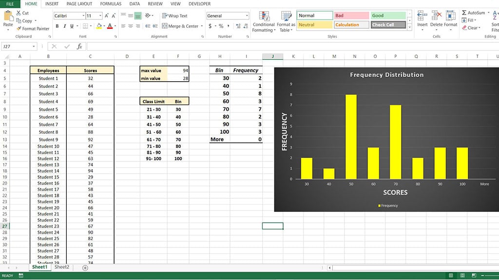
Let us consider an educational scenario consisting of 30 students and the marks scored by them in a recent examination. The first step would be to get all the data and place it on the Excel sheet in a tabular format as shown in the illustration below.
Step 1
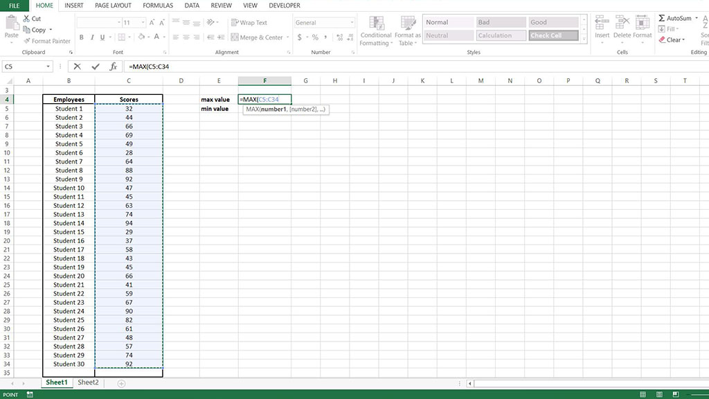
Once all the pre-determined data is present on the worksheet, the first step would be to find out the maximum and minimum values of all the scores.
This data can be easily derived with the help of some of the inbuilt formulas configured in the Excel workspace.
The max value is generated by appending all the existing values with the MAX function from the list of formulas offered by MS Excel as shown below.
Similarly, find the minimum value of all the scores from the MIN function from the same list as demonstrated below.
In this instance, the min value can be identified as 28, while the maximum value stands at 94.
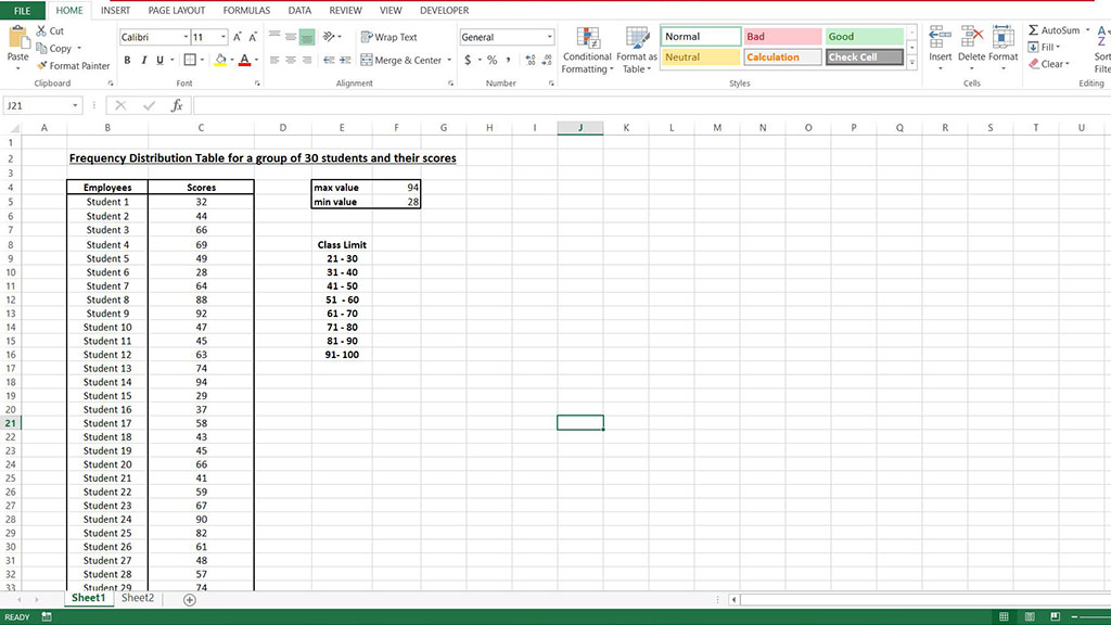
Step 2
The next step would be to work out the class limits, i.e. the intervals with regard to all the scores to establish the frequencies.
Class limits are calculated and used to facilitate an accurate distribution and arrangement of data in order to generate the frequency values.
As the scores range in this instance from 28 to 94, let us consider the class limit in the multiple of 10. This is illustrated below.
Step 3
Post the findings of the class limits, it is necessary to determine the bin values i.e. the highest value in each of the class limits.
These values are used for a better representation concerning the distribution of the frequencies in the graphical structures.
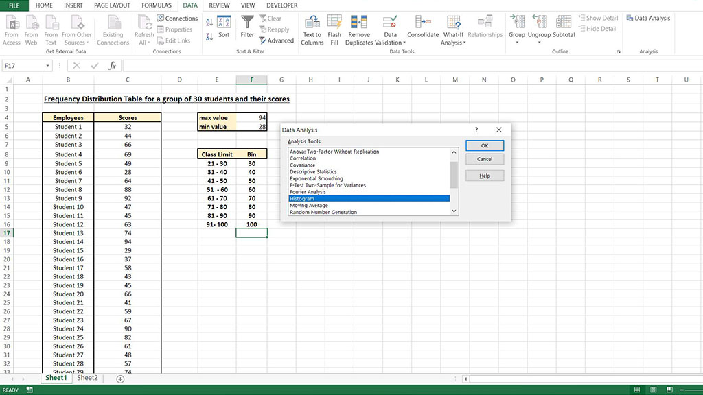
Step 4
The next important step is the insertion of a histogram into the Excel spreadsheet to derive the frequency of each of the score.
This is done by navigation to the DATA option on the menu bar. Once there, click on data analysis and select Histogram from the list of chart options mentioned in the pop-up menu.
Upon selection, enter the values for the input range, bin range as well as the output range in the dialogue box that appears on the screen.
The pop-up also displays choices for the representation of the scores in the form of a chart, a Pareto or a cumulative percentage and also provides the insertion of data labels.
Here, the output range is completely user-determined and represents the cell value where the resulting chart needs to be inserted.
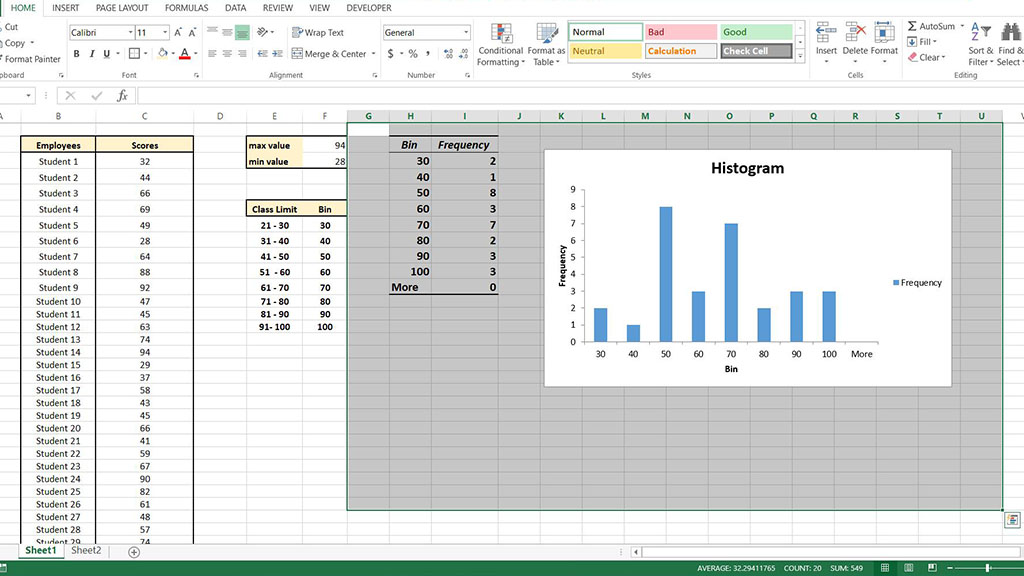
Step 5
Once all the values are entered, a resulting histogram showing the frequency of the score values is displayed on the screen as shown in the highlighted portion below.
After getting hold of the histogram and the frequency values, the chart can be enhanced with colors, layouts as well as chart and axis titles as pictured in the snapshot below.
Conclusion
Reflecting on the steps accomplished to garner the frequency distribution values in the MS Excel application above, one can conclude that the procedure helps save a lot of time and is very effective in execution.
This can be attributed to the versatility of the Excel application from performing calculations with its inbuilt functions to the projection of the derived parameters on the numerous graph options.
Overall, Microsoft Excel is highly recommended in instances involving the display of a frequency distribution of categorical data that needs a graphical platform.