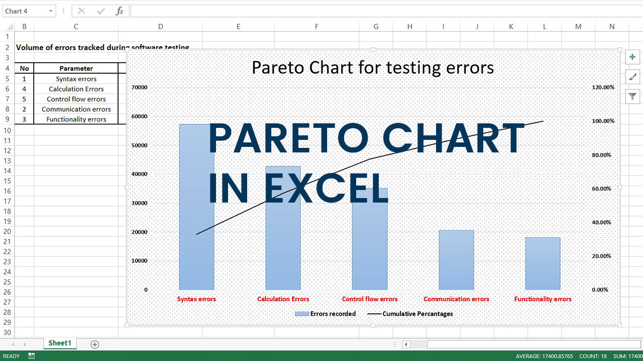
Pareto chart is a distribution diagram, working on the lines on the Pareto principle or the 80-20 rule that draws the relation between the causes and effects in an event. They are effectively functional to portray and analyze the inconsistencies in values across relative and categorical data.
Pareto charts blend a bar chart and a line graph in appearance as well as functionality and are predominantly focused on defects or deficiencies and their cumulative impact in a business process.
They are essentially histograms or combo charts where data in the form of vertical bars are ordered from higher to lower chronology. The graph is also helpful to pick and prioritize these flaws for improved productivity of results.
Pareto charts bring out the point of commonality and its structure exhibits descending columns in the form of bars (bar chart), along with a line stretching over the plot across the bars (line graph). The bars represent the defects or relative comparative data while the line corresponds to the cumulative total of the defects or the data values.
Steps involved in creating a Pareto Chart in Microsoft Excel
Creation of Pareto charts or Pareto diagrams in Microsoft Excel 2013 revolves around the insertion of a combo chart.
The inserted graph bearing the relevant information exhibits descending data values and does not support an integral Pareto chart menu or structure that can be easily be accessed with a click.
Although the latest versions of the Excel application offer an inbuilt histogram option that can be quickly embedded into the workspace to procure the chart.
In this article, we will focus on the procedure of generation of the Pareto diagrams with the help of a clustered combo chart and how it can be filtered and modified for enhanced visibility and operation.
Once all the required and necessary data values in the Excel spreadsheet are entered, the steps followed are extremely basic and assist in graph generation without consuming more than five minutes of a user’s time.
Available Data:
Let us consider a software testing process likely to generate numerous, wide variety of errors that can are repetitive in frequency. Syntax, communication, functionality, calculation and control flow errors and their occurrences have been noted down in the excel sheet in a tabular format.

Step 1:
The very first step in the chart making method is to order the values for the errors in the descending pattern.
This can be achieved by simply selecting the values, and navigating to the Sort & Filter icon on the menu bar. Once clicked, choose the applicable option, in this case, largest to lowest for the descending assortment of the values.

Step 2:
The proceeding step is to calculate the cumulative total as well as the percentages employing the formula as mentioned below. The cumulative total is basically calculated by adding the data values in the errors recorded column to the value in the previous row in the cumulative total column.
For better understanding, the values are conceived as follows:
- E5 = E5; as it is the first value
- E6 = E5 + D6
- E7 = E6 + D7
- E8 = E7 + D8
- E9 = E8 + D9

Once done estimating, all the resulting data for the cumulative total column values should be noted down along with the average sum of all error recorded values in the enumeration as quoted below.

Step 3:
The next step in the process is to calculatedly figure out the cumulative frequency for all the values enlisted in the previous column. The values in the frequency column are derived by dividing each of the cumulative value by the average sum of the errors as illustrated below.
- F5 = E5 / D10
- F6 = E6 / D10
- F7 = E7 / D10
- F8 = E8 / D10
- F9 = E9 / D10

Now change the generated estimated figure format so that they can be perceived as percentages for better illustration and understanding by selecting the data and choosing the percentage option in the number format menu.


Step 4:
Once all the data is imposed on the spreadsheet, select all the values in the parameter, errors recorded and the cumulative percentages column, then navigate to the charts option on the menu bar and insert a clustered combo chart into the spreadsheet.

Step 5:
The resulting graph displays the volume of errors in the form of blue-colored bars, while the red colored line corresponds to the cumulative percentage values.
The chart can now be amended and beautified for varied and diverse customization requisites concerning text fonts, data labels, outline, colors, and patterns from a palette of options appended on the workspace.

Pictured below is a final Pareto chart or diagram representation enhanced with text, bar and line colors as well as customized pattern along with a resized plot area.

Pareto charts furnished in Microsoft Excel give a quick understanding and insight on the clarity of results on areas of inefficiencies and improvement.
Every software process in a cycle demands the implementation of Pareto analysis as they yield solutions to various conflicts arising in the processes.
Excel offers a distinguished and lucrative platform for the users owing to its ease of accessibility and operation. Hence creating Pareto charts through the Excel application is highly recommended for rapid analysis and visual explanation of the comparative data.
