Gauge charts are best used in conveying a single value within a specific range. They hold audiences’ attention with their dynamic appearance and make it incredibly easy to interpret and analyze data.
Gauge chart serves as powerful storytelling devices, that transforms raw data into visually compelling narratives. They enable viewers to grasp information at a glance, by representing a single value within a defined range.
Now let’s see the types of gauge charts and data they are suited for.
Contents
What are the different types of Gauge Charts?
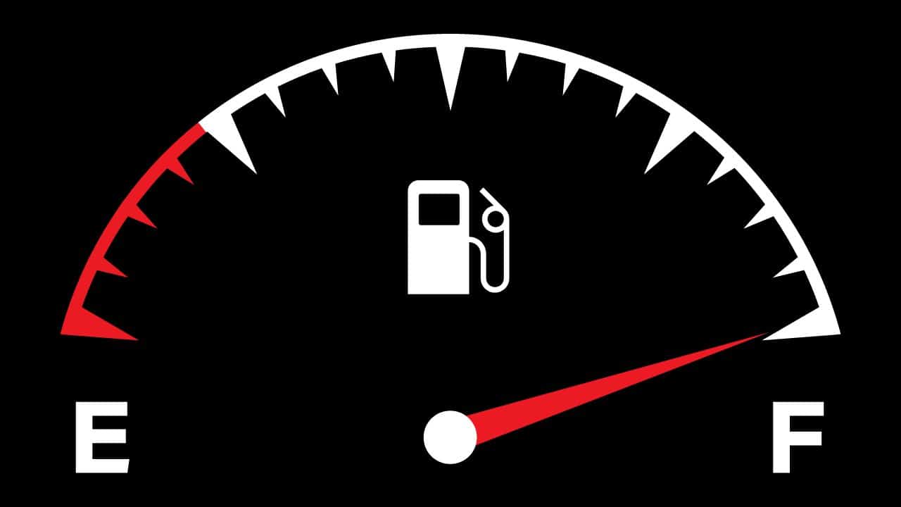
Radial Gauge Charts
Radial gauge charts, with their looks similar to traditional speedometers, captivate viewers with their visual appeal. They are perfect for the data that falls within a specific range such as speed, completion percentages, or progress towards a goal.
Example: If you want to track the progress of a fundraising campaign. A radial gauge chart can vividly display the percentage of the target amount raised, providing an instant understanding of the campaign’s performance.
- Tutorial: Create Speedometer Chart in Excel
Linear Gauge Charts
Linear gauge charts can be used to present data in a linear format, typically resembling horizontal or vertical bars.
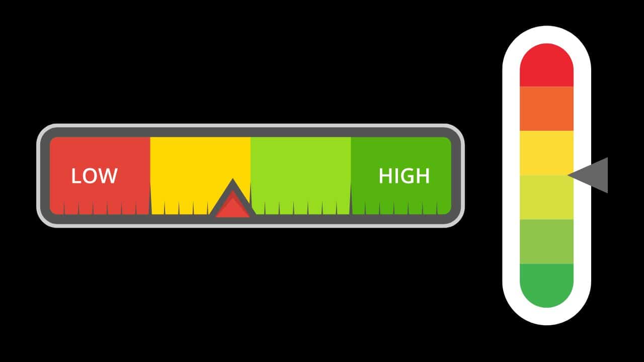
They are excellent for illustrating values that range from one point to another, such as temperature ranges, battery levels, or satisfaction scores.
Example: Consider a scenario where you need to display the temperature range for a particular day. A linear gauge chart can show the minimum and maximum temperatures, allowing viewers to grasp the day’s temperature variations.
Circular Gauge Charts
Circular gauge charts present data compactly and elegantly. They are commonly used for displaying data within angular measurements, such as angles of rotation, compass direction, or percentages.
Example: If analyzing customer satisfaction levels across different regions, you can use a gauge chart to show the satisfaction percentages so the viewers can compare and contract satisfaction levels effortlessly.
What are the different components of Gauge Charts?
Before using the gauge charts, it’s essential to understand the key components that contribute to their impact.
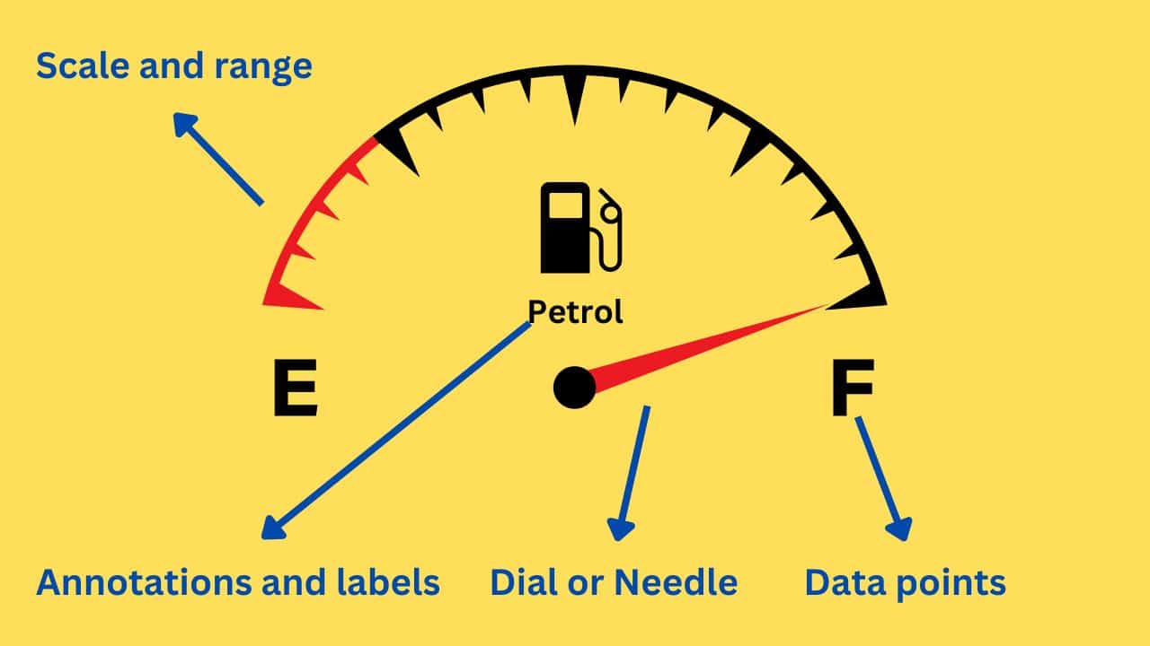
Dial or Needle
The dial or needle serves as the main indicator in gauge charts which provides a visual representation of the data value within the defined range.
The position of the needle or the angle of the dial indicates the specific value being represented. By design, the needle or dial draws the viewer’s attention and conveys the most critical information at a glance.
Scale and Range
The scale and range define the boundaries and divisions within the gauge chart. They determine the minimum and maximum values displayed and provide reference points for interpreting the data. An appropriate scale and range ensure that the data is presented accurately and in a way that is easily understood by viewers.
For instance, when representing temperature ranges, the scale, and range would define the lowest and highest temperatures displayed, as well as the intervals between them. This enables viewers to gauge the temperature variations with precision.
Data Point and Representation
Data point representation refers to the visual elements used to represent individual data values within the gauge chart. These elements can include color gradients, symbols, or data labels. Thoughtfully chosen representations add clarity, context, and aesthetic appeal to the chart
A color gradient can be applied to the dial or needle, visually indicating the magnitude or significance of the data. Symbols or icons can also be incorporated to enhance the chart’s aesthetics.
Annotations and Labels
Clear labeling and annotations make the gauge chart more comprehensible. They provide context, identify specific data points, and enhance the overall clarity of the visualization.
Annotations can include titles, subtitles, axis labels, and descriptions that provide additional information and ensure the viewer understands the chart’s purpose.
By strategically placing annotations and labels, you can guide viewers’ understanding and facilitate their interpretation of the data. Well-crafted annotations and labels help viewers grasp the chart’s context, the represented values, and any additional insights you wish to convey.
Design principles for effective Gauge Charts
To maximize the impact of the gauge chart, you’ll need to apply design principles to it. Let’s explore these principles:
Simplification
Simplification is key to effective gauge chart design. Avoid clutter and focus on the most essential information to ensure that the chart conveys a clear and concise message. Simplify the design by removing unnecessary elements that may distract or confuse viewers.
Consider the data you want to highlight and eliminate any other elements that do not contribute to the understanding of that data. By embracing simplicity, you allow the data to take center stage which makes it easier for viewers to interpret and absorb the information.
Color Choice
Colors also have great importance in gauge chart design. They help convey meaning, evoke emotions, and enhance visual appeal. Choose colors that align with the data you’re representing and consider color theory principles to create harmonious and impactful color palettes.
Like, when displaying temperature ranges, you can utilize a color gradient that transitions from cool blues to warm oranges and reds. This color choice intuitively conveys the progression from low to high temperatures and reinforces the understanding of the data.
Size and Placement
Optimal sizing and placement of the gauge chart is also an important factor to bring impact in your presentation.
The size should be appropriate for the display medium to ensure that the chart remains clear and legible. Consider the available space and the context in which the chart will be presented to determine the optimal size.
Placement within the context of the overall design is equally important. Gauge charts should be positioned strategically to draw attention and create visual balance within the composition.
You should place the chart in a prominent location, such as the center or focal point of the design so that viewer’s eyes are immediately drawn to it.
Visual Hierarchy
A clear visual hierarchy in your gauge charts will help guide the viewer’s attention and further enhance comprehension.
Visual hierarchy is achieved through the deliberate arrangement of elements, emphasizing the most important information and providing a logical flow for viewers to follow.
To create an effective visual hierarchy, consider the relative importance of different elements within the gauge chart. Use size, color, contrast, and positioning to differentiate between primary, secondary, and tertiary elements.
For example, you can use a larger font size or a vibrant color to highlight the current value indicated by the needle, while using a subtler color for the range labels.
Tips for creating effective Gauge Charts
Creating effective gauge charts requires a combination of technical skill and artistic sensibility. Let’s explore some tips to help you master the art of gauge chart creation:
Customization options and best practices
Gauge charts offer numerous customization options to personalize your visualizations. Experiment with colors, fonts, sizes, and symbols to match your branding or design requirements. However, remember to maintain clarity and readability. Here are some best practices for customization:
- Color choice: Select colors that complement each other and effectively convey the data values. Use color gradients or color coding to represent different ranges or categories.
- Font selection: Choose a font that is legible and visually appealing. Opt for a font size that ensures readability, especially for labels and annotations.
- Symbolic elements: Consider incorporating symbols or icons that are relevant to your data or industry. These can enhance visual storytelling and make your gauge charts more engaging.
- Data labels: Ensure that data labels are clear, concise, and positioned appropriately. Use contrasting colors or background shading to make labels stand out.
Ensuring accessibility and readability
Make your gauge charts accessible to a wide audience by following these guidelines:
- Font size and style: Use a font size that is easily readable across different devices and screen sizes. Choose clear fonts, and avoid decorative or complex styles
- Color contrast: Ensure sufficient contrast between text, data points, and background colors. This ensures that individuals with visual impairments can perceive the information accurately.
- Alt Text: Provide alternative text descriptions for gauge charts when sharing them in formats that do not support visual content. Alt text allows screen readers to convey information to visually impaired individuals.
Testing and refining Gauge Charts for optimal impact
Iterative testing and refinement are essential for creating gauge charts that have the desired impact. Consider the following steps to optimize your charts:
- Seek feedback: Share your gauge charts with colleagues or stakeholders and gather their feedback. Pay attention to their understanding, interpretation, and any areas of confusion.
- Iterative refinement: Based on feedback, refine your gauge charts by making necessary adjustments to elements such as scale, range, labels, colors, or symbols. Strive for clarity and simplicity.
- A/B testing: If possible, conduct A/B testing by creating different versions of your gauge charts and comparing their effectiveness. This helps you identify the most effective design choices.
Conclusion
Gauge charts are powerful tools for conveying a single value within a specific range and transforming raw data into visually compelling narratives. Their dynamic appearance captivates audiences and allows for easy data interpretation.
To create effective gauge charts, focus on simplification, appropriate color choice, optimal sizing and placement, and clear visual hierarchy. Accessibility and readability are also crucial factors.
By following these principles and engaging in iterative refinement, you can create impactful gauge charts that effectively communicate data insights to a wide audience.