How to Make a Speedometer Chart in Excel?

Below blog gives an insight on speedometer or doughnut charts and the process on how to make speedometers in Microsoft Excel with customization features.
Below blog gives an insight on speedometer or doughnut charts and the process on how to make speedometers in Microsoft Excel with customization features.

This article is an elaboration on the meaning of standard deviation graph or bell curve, its advantages, uses, creation and design in Microsoft Excel. Standard Deviation Graphs A standard deviation graph is a graphical presentation that illustrates the distribution of categorical data with regards to standard deviation. It is also familiar by the name ‘bell … Read more

This article elaborates the importance of frequency distribution tables and the steps involved in its creation and customization in Microsoft Excel.

This article explains the benefits along with the steps followed to create and design error bars in Microsoft Excel with mean and standard deviation values.

The article scripted below describes the use and operation of Microsoft Excel in creating and designing colorful, basic, interactive organizational charts.
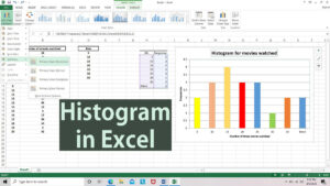
This article explains the demand for histograms and how to create histograms in Microsoft Excel and simultaneously enhance them with customization features.
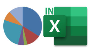
If you are wondering to make a pie chart using Excel, there are a few steps that one needs to follow to get the desired results in no time at all.
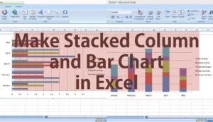
If you have always wanted to get a better visual representation of your data in a column or bar chart format on Excel, we have it sorted out for you here.
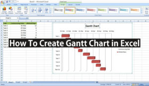
If you have been meaning to create a Gantt Chart in Excel, the process is quite simple. It also does come down to following the steps as we are going to show you.

When it comes to drawing a Sankey diagram, you can do it on the standard work page of MS Excel. The only thing that you need is knowledge of that and an add-in that we have mentioned in this.