Industrial expansion is likely to drive the employee population in companies as more number of people get associated and employed in the organizations with every passing day. All individuals in the industries are conferred with designations based on their experience of work.
Owing to this, it becomes quite crucial for them to manage and arrange this data with growing positions and reformations happening on a frequent basis. Organizational charts come into picture for easily ordering and representing the designation in terms of hierarchies across the companies.
They are very effective data structures and can render the precise distribution of an enormous amount of information across the various levels in the hierarchy.
- You may like: Top 10 Best Organizational Chart Software (Tools)
Organizational charts can be simple or can be forked into different segments and layers across the spreadsheet to show the arrangement and placement of data. With an instant of a glance, any viewer can get a glimpse of the leadership in the management and all their corporate level relations along with their reporting subordinates.
Owing to the frequency of newer joiners, consistent addition of newbies and departures of experienced employees, the charts need to be timely amended to align with the changes. Several software and tools with interactive interfaces have emerged recently and can be accessed for generating efficient and attractively pleasing organizational charts.
These application programs are built, installed or browsed to assist users to cater to effective designing and customization of the charts and are very basic in use besides being loaded with enhancement features. Their work spaces abet the users to have the charts handy in minutes.
Organizational Charts in Microsoft Excel
Out of an array of applications available to serve organizational chart making processes, Microsoft Excel stands out for its simplicity and feasibility of operation. The application software is a spreadsheet offering from the elite Microsoft Office family and is seamlessly configured as an inbuilt software in almost every desktop, laptop and tablet.
The spreadsheet is extensively utilized across the globe and serves diverse demands of users. Also, it is a well-noted platform to create and master a wide dimension of shapes, graphical charts and SmartArt visual structure components. Let us look deeper into how to manifest effectual organizational charts in the application.
Steps involved in creating an Organizational Chart in Microsoft Excel
The technique of making the chart diagram involves a stroke of a pen, in other words, with the data available with the users, the chart making process is a work of a few clicks of the mouse. Once done with generating the graph, they can be customized with a bunch of beautification features.
Available Data: To quote an instance to create an organizational chart in MS Excel, we have considered a list of higher leadership employees in a corporate scenario along with their designations.
The completed graph will impose a clear and precise understanding of the management flow of the employees across the organization specific to their reporting and career levels.
Step 1:
The foremost move to launch into the organizational chart making procedure would be to note down all the information with regards to employee names and their respective designations.
This arrangement of data on the spreadsheet in the form of a list needs to be copied so that it can be pasted while building the diagram in further references to reduce the efforts and time consumption.

Step 2:
Navigate to the Insert tab on the topmost bar and click on the SmartArt button from the options provided. Once done, a pop-up menu box emerges on the screen with a bunch of options to insert one among the diverse SmartArt graphics.

Step 3:
Out of all the enumerated options, choose Hierarchy and pick the desired layout to represent the chart. To begin the process, select one of the designs and click on OK. The design can later be changed to any of the other structures once the chart is completed with data depiction and is ready to be used.

Step 4:
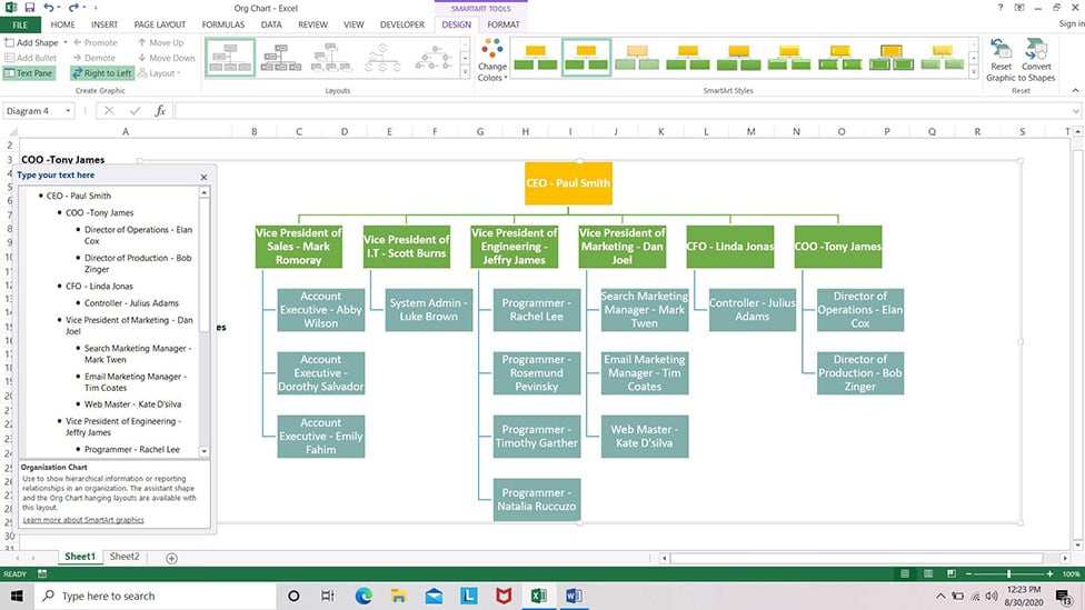
Once the outline for the graph is narrowed down to, start entering or simply paste the available data onto the text screen area available as a part of the pop up for the chart. Bullets and their placement in the “type your text” screen perform a vital role in the arrangement of data.
Inspecting the screenshot below, giving an instance for the hierarchy between the COO reporting into the CEO will be in the format as below.
- CEO
- CFO
- Director
- CFO

All the information needs to be arranged in the same pattern as mentioned above to bring out the relevant associations in the hierarchy between the employees in the available data list.
Step 5:
Once all the data is sorted in the prescribed format, the organizational charts can be patented as per requirements with a flair for designing. Also, cordon off the extra boxes that will not be required in the chart. After this is done, an organizational chart transpires on the screen.
It can immediately be changed to another layout for convenience of presentation. Some of the patterns also provide inclusion of pictures onto the boxes.

The whole structure with its components can be reversed in position from right to left or vice versa for better appearance of content distribution with options available in the menu bar under the SmartArt tools as seen below.

A random right click of the mouse will pop up options to format the chart with style, colors and layouts together with resizing and resetting of shapes and graphics. It can also be customized with shape and text options for changes in height and width of the boxes as well as text gradients.
The chart configured can be seen magnified with color and a change in the outline. One can get rid of the gridlines by unchecking the option under the View tab.
The individual boxes can also be customized for shape outline and colors from the palette of features incorporated in the design tab on the clipboard. Featured below is a color enhanced, personalized organizational chart in Microsoft Excel.
With over a dozen organizational chart patterns available within the application that can be amplified for a variety of enhancement attributes, MS Excel is one winner of a chart maker in current day statistics.
Organizational charts can, in addition, be converted and formatted into a shape composition in the application which can be embedded in numerous documents and other spreadsheets for rendering various purposes. Insertion of images onto the diagram is another highlight associated with the process that makes Excel the most sought after software with respect to organizational charts.
Related: